PASINI REPORTS
Adobe, NAPP Celebrate
20 Years of Photoshop
By MIKE PASINI
Editor
The Imaging Resource Digital Photography Newsletter
Palace of Fine Arts party showcases 20 years of development -- and we're there with a Sony HX5V
SAN FRANCISCO -- The fog could not obscure the significance of the twentieth anniversary of Adobe Photoshop's first release. As National Association of Photoshop Professionals President Scott Kelby observed, the software took image editing out of the hands of a small group of technicians running minicomputers and put it into the hands of artists.

Photoshop 2.0 filters disk
Twenty years later, no one's complaining.
On Thursday, Feb. 18, roughly half the seats in the Palace of Fine Arts theater, which holds 979, were filled with Photoshop engineers, Adobe executives, photographers and painters who have built careers using a program that began life in a basement. Video of the event is available online.
Originally the work of Thomas and John Knoll, the early version was no more than a file format converter named Display. John added gamma correction to properly display translated images on screen and there was no stopping after that.
A LITTLE PERSPECTIVE | Back to Contents
Our own association with Photoshop began after a seminar in 1991 in which Russell Brown showed off Version 2.0.1.b14 by demonstrating everything from using Levels to creating 3D images by shifting the red channel. He'd promised attendees a demo version but it didn't actually exist. Instead, he shipped the real thing to us.
The digital camera of those days was a scanner. In fact the seminar was devoted to acquiring the right hardware, calibrating your display, scanning images and editing those scanned images for press.
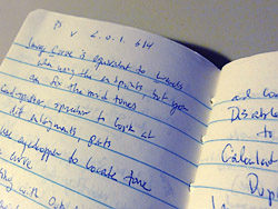
Notes from a long-ago seminar (Photoshop version number at top)
The breakthrough Photoshop represented twenty years ago, however, wasn't as obvious then as it is today.
At the time, we were helping a photo lab that was curious about moving retouching and image compositing out of the darkroom and onto computers. Photoshop wasn't in the running.
But as we sat in on one presentation or another from firms trying to commercialize development begun for aerospace projects, we kept wondering if these very expensive systems couldn't be matched by a personal computer running Photoshop.
Turns out they could.
PAINTING FOR THE MASSES | Back to Contents
But that professional use of Photoshop only foreshadowed adoption of the program by creatives of all stripes. The fun of drawing PostScript output with Illustrator for output to a PostScript printer had prepared graphic artists for the thrill of painting with Photoshop just a few years later.
With both vector and bit-mapped imaging options available on an affordable platform, the creative community enjoyed a new suite of tools designed for the digital age. Before anyone thought to call it a "creative suite."
And when digital photography came on the scene in the late 1990s, Photoshop was already there -- ready and waiting.
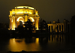
The Palace of Fine Arts using Handheld Twilight mode
We arrived at the Palace of Fine Arts early but after the sun had set somewhere beyond the fog bank. The building itself, described by its creator Bernard Maybeck as beauty tempered by sadness, is illuminated by floodlights at night. So we wandered around taking a few shots of it, some using Sony's innovative Handheld Twilight mode, others just at high ISO.
And we weren't alone. There were several other photographers aiming their glass at the colonnades and caryatids of the last remaining building from the 1915 Panama-Pacific Exposition, celebrating San Francisco's rebirth from the 1906 earthquake.
Our glass happened to be a recently-arrived Sony HX5V review unit, a 10-Mp digicam with built-in HDR, Handheld Twilight mode and that Exmor-R sensor that can see in the dark with little noise at high ISO settings. All the shots in this article were taken with that camera.
We shot everything in Program mode, with -1.75 EV because both the Palace and the theater were dark settings, relying on the multi-segment metering mode. We set ISO to 800 because we really didn't need ISO 1600.
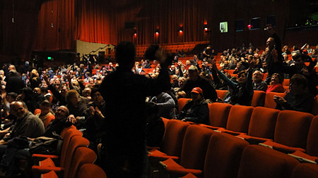
T-shirt toss for early (seat) adopters
Although our shots for this article are crops resized to fit a 250-pixel maximum frame, the originals are remarkably clear and noise free. We'll be posting a few of them in full resolution in a gallery accompanying our review of the camera.
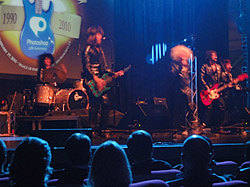
The band kicks the evening off
The party kicked off with a video sketch of Kelby and crew trying to sell a Photoshop party to, well, Photoshop (played by a box). The sketch described all the ideas they had which gradually evolved into what was going to happen on stage.
And that started with a musical number before Kelby took the stage, going through a typical image edit using Photoshop. The joke was that every tool he used to do the edit in Photoshop CS4 existed in the very first version.
Even Gaussian Blur was in Version 1. And Levels, which Russell Brown has called the soul of Photoshop, was there, too.
Jeff Schewe did a video tour of Version 1.0.7, released just five days after the originally shipping version. He had discovered it still runs on a G4 Mac running Tiger.

Jeff Schewe |

Scott Kelby |
He pulled up "the most manipulated file in the history of Photoshop," known as Jennifer in paradise, a photo of John Knoll's future wife. He made a Levels adjustment, clicking the Preview button to see the effect of his changes. He cloned and painted clouds, loaded an alpha selection, flipped it and placed it by dropping the floating selection.
Continuing the Photoshop story, Kelby promised (not) to go through each version in detail. Instead, he said he had asked various Photoshop mavens to demonstrate one feature from each release. Quickly. That turned out to be riotously entertaining, particularly if you lived through those days when graphic artists had to pull teeth without the benefit of anesthesia.
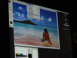
Jennifer in paradise
- Dave Cross began the tour by showing how to do a drop shadow in Version 2 with no Layers and no Editable Type.
- Matt Kloskowski demonstrated Layers in Version 3, bringing back detail from a background layer using the Blend If option in the Layer Style palette.
- Adobe's Julieanne Kost showed off Version 4's Actions, Guides, the Navigator Panel, Adjustment Layers and Gallery Effects, among other new features like Free Transform and Gradients.
- Rafael "RC" Concepcion worked with Version 5's History Brush. This version also introduced Editable Text, Color Management and the History Brush.
- Adobe's Terry White discussed a few ways to use Version 5.5's Extract filter (and where to find it in CS4). And the Background Eraser's benefits.
- Corey Barker demonstrated Version 6's Layer Styles by comparing how to modify type before Layer Styles and after.
- Kloskowski returned to show off the Healing Brush in Version 7, building a torn edge on an image.
- Kelby showed Adobe Camera Raw's retouching prowess in the first version of the Creative Suite, turning a bland male portrait into a pseudo-HDR shot and then laboring over every blemish on a female face.
- Cross returned to show CS2's Smart Objects, setting up a multi-image layout and, by opening the image as a Smart Object being able to reuse the layout.
- Barker demonstrated CS3's 3D editing capabilities on a logo.
- And Concepcion concluded the feature fest with a demo of CS4's content-aware scaling, fitting his 4:3 photos onto paper sizes of other aspect ratios.

Dave Cross |

Matt Kloskowski |
|

Julieanne Kost |

RC Concepcion |
|

Terry White |

Corey Barker |
RUSSELL BROWN | Back to Contents
But wait, there's more, as Russell Brown famously likes to say. And Russell Brown himself was the "more" this time.
After an old video clip of a younger Brown demonstrating how to paste himself into a photo of Ron and Nancy Reagan, Brown himself took the stage not at the podium to command some laptop but at a desk where his magical Epson overhead projector had been set up.
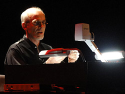
Brown sits down at his overhead projector
One of the first things he examined was his iPhone, which had Photoshop 1.0.7 on it. He too brought up Jennifer in paradise and adjusted Levels. But that's about all this app imitation could do. It was built in just a few days by Ansca using its Corona iPhone development platform. And 40 people in the audience won a copy on a 2-GB USB thumbdrive attached to their chair. Including the guy sitting next to us.
Then Brown went back to the dawn of man, the beginning of time, way back when "they used real mice to start their presentation" (as he displays a toy mouse in his hairy ape mitts on the projector). The presentation? Oh, the history of Photoshop.
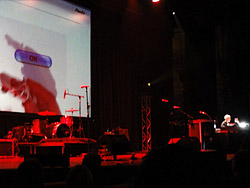
3D into 2D without glasses
He displayed stone interfaces for Photoshop 2.0 during "early slate computing" in which the cave painters had Macs and the stone counters used PCs.
Layers in Photoshop 3 were demonstrated with a layered Photoshop startup screen. Version 4 showed Layers by magically turning an image of dominoes into real ones that fall down and recompose themselves into an image.
Brown slid a slice of bread on the projector's table and used French's mustard to write "PS 5" on it ("in Frankfurter typeface"). Then he picked it up and took a bite out of it before returning the partly-consumed slice to the table. "Edible text," he mumbled, illustrating the editable text feature introduced in Photoshop 5. Then he used Undo to restore the bite.
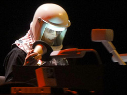
Brown prepared for the future
But wait, he bit into it three more times and undid it all, too. "Multiple Undo!" he explained.
Version 6 used an overlay of an animated blender to manage color. Nobody remembered that feature, though.
The Healing Brush restored his amputated hand in Version 7, even cleaning up the green blood.
The first Creative Suite version used his glasses to show Lens Blur and how to make money with Photoshop by magically upgrading coins until he got to paper money, which CS wouldn't reproduce.
CS 2 showed off Noise Reduction with a marker interface that took you from street level to outer space, where it's much quieter.
The Auto Blending demo for CS 3 merged slices of an image into a photo of an auto that turned into a 3D model that drove off the table.
Content-aware scaling in CS 4 was illustrated by an overlay of a bathroom scale that reported not the weight of what had been put on it but the name of the object. When Brown put his watch on it, for example, it dialed in "Russell's Watch." When he put a picture of Steve Jobs on it, it swung wildly to the right over a word we can't recall before settling on "Steve Jobs."
And in the future? A future X-Acto blade cuts out the globe in a shot from outer space and automatically fills it in with space, a black hole, that sucks us all in.
Senior Vice President and General Manager of Adobe's Creative Solution's Business Unit John Loiacono came to Brown's aid just before he was sucked into his own black hole. "We're done with your analog world," he told Brown, sending him off.
Instead, Loiacono said, we need a digital equivalent to fill Brown's black hole. He introduced Kevin Connor, Adobe product manager for all things digital, to demonstrate how fills can be context aware.
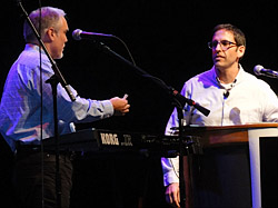
Loiacono with Connor
Connor introduced the audience to PatchMatch technology, which treats your image like a set of puzzle pieces. You can remove a selection from the scene without leaving a hole or move a tower to a different part of the building, shuffling the building parts around.
"Let's ship it," Loiacono said. But Connor demurred, suggesting it needed to be polished a bit. This led to a short private chat (overheard by all) in which Connor was convinced to give the people something now. Right now.
So Connor opened an image of a fellow standing in front of a stone wall. He selected the figure and expanded the selection a few more pixels before removing the guy from in front of the wall. Instead of leaving a white hole in the image, PatchMatch seamlessly filled the cut with stones. Applause.
Thomas and John Knoll (before the HX5V knew where they were)
"But wait! There's more," Loiacono prompted.
Connor then showed a panorama that had been stitched together with a very uneven border. You can crop it, of course, but using PatchMatch, the gaps around the edges were credibly filled. Applause.
"OK, Kevin, you can keep your job another week," Loiacono promised.
Loiacono then introduced the Knoll brothers who had started all this. Yes, applause. They modestly stood up, turned around and sat down faster than the HX5V could focus on them, unfortunately, but the blurred image has a sort of ghostly poetry to it.
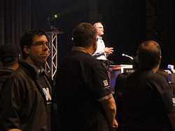
A few of the engineers
And then he asked the nearly 70 engineers working on Photoshop now to stand up and take a bow. And yes, more applause.
Loiacono went through each version of Photoshop's code names and then thanked Kelby for his organization's work in supporting the product. Kelby told everyone there was a T-shirt and poster for them in the lobby and brought out the band for one last tune before everyone filed for the exits.
THE COOL NIGHT | Back to Contents
The fog had lifted by the time we left the theater. Entertaining and amusing as the party had been, we were surprised to find ourselves feeling a little sad.
Revisiting the glow of Photoshop 2.0, 2.5, 3.0 reminded us of those days and nights at the nine-inch black and white monitor of a Macintosh SE. Saving to floppy disks. Before some long-ago deadline. For clients no longer in business.
We felt a little like those beautiful women who look over the ramparts of the Palace of Fine Arts, weeping. Beauty tempered by sadness.
But, we thought as we walked on, we are still launching Photoshop and buffing up our images to a high gloss, creating in our small bunker work that makes us smile.
So make a wish and blow out the candles, Photoshop. We'll take the picture.
