SUITE PROJECTS
Adobe CS2 -- Running the Suite
 By MIKE PASINI
Editor
The Imaging Resource Digital Photography Newsletter
Review Date: August 2005
Because of, rather than despite, our focus on imaging, we've wanted to review the entire Creative Suite since we started using it. How does it change what you do, what you can do, when you match Photoshop with InDesign, Illustrator, GoLive and Acrobat Pro?
So we're concluding our three-part review of CS2 with this look at using the Suite on real projects. It was preceded by our review of Bridge (http://www.imaging-resource.com/SOFT/CS2/CS2BR.HTM) and Photoshop (http://www.imaging-resource.com/SOFT/CS2/CS2PS.HTM).
|
See Also: |
The Suite can take you from producing prints in Photoshop using Bridge for browsing and even batch editing your images to constructing pages for either print, the Web or the screen (including the screens of mobile devices). Video production is missing, as is slide show production. If you're looking for either of those, the Suite won't help.
The Suite is about the Page.
And (we smile conspiratorially), there's no escaping the Page. There are pages on the Web, pages in our documents, pages in print. And central to this concept of pages is Adobe's PDF document model.
FROM POSTSCRIPT TO PDF | Back to Contents
When it was introduced in 1985, Adobe's PostScript programming language entered a world where "there were no effective page-description standards, popular typefaces were used only with specific typesetting equipment, producing high-quality visual materials was restricted to specialists and the cost of producing most corporate communication pieces was prohibitive," as John Warnock and Chuck Geschke wrote in the preface to the 1990 PostScript Language Reference Manual.
But in just five years the proprietary world of the publishing industry was transformed by PostScript. "Today all major computer, printer and imagesetter vendors support the PostScript language as a standard," the preface's authors observed. "The major type libraries are becoming available in PostScript-compatible formats. The cost of producing high-quality, printed material has dropped substantially."
PostScript, Adobe's non-proprietary page description language, had become the standard. Berthold, Linotype, Merganthaler, Compugraphic and Addressograph evolved from the behemoth's of the printing industry into dinosaurs in the PostScript age.
With the development of the PostScript language into the Portable Document Format in 1993, Adobe extended its vision from imaging to document creation, from rasters to data. And they did it with a versatile cross-platform model that can be viewed on screen, on the Web or printed. Today the Web hosts over 165 million PDFs and the format has been extended with XML schemas to create intelligent documents.
The Suite's focus on the Page is, in fact, a focus on the Document. And PDFs are the consumable end of that. On the creative and production side, are applications that feature both seamless integration between themselves and non-destructive editing of assets.
DOCUMENTS & ASSETS | Back to Contents
Documents may be made of pages, but pages are built of text, images and graphics -- discrete entities that exists outside the page. Companies like Cumulus, Extensis and iView Multimedia have developed proprietary database products called asset managers to catalog these entities.
While there's no such thing as an asset manager in the Suite, the Suite does manage assets through the Bridge by building caches and adding Extensible Metadata Platform data (http://www.adobe.com/products/xmp/main.html) to the assets themselves. Your copyright notice and a color profile are common examples.
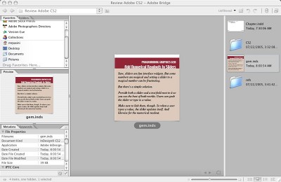 |
| The Bridge The asset here is an InDesign Snippet. |
Based on open standards (note the theme), Adobe claims adding metadata to the image data creates smart assets that "retain context" regardless of which application they are dropped into. If your application can parse the metadata, it can manage assets. Bridge is proof of that concept.
MULTIPURPOSE IMAGES | Back to Contents
One (or two) more concepts and we'll play with the Suite. This one is worth the delay, though. It's the concept of Smart Objects.
It's one thing to store information about your asset with the asset, but it's another to make that asset indestructible. Place an Illustrator vector graphic in Photoshop and it becomes a Smart Object which retains its vector data as you rasterize it. Scale, warp, rotate -- it's no problem because the operation refers to the vector data, not the bitmap display.
This can make some large files, combining both bitmapped and vector data, but the price is small in the era of multi-gigabyte drives and the age of inevitable revision.
On the other hand, just because you are collecting metadata and image data in various formats under one roof, you don't have to shellac it with style information, too. The Suite introduces the concept of Object Styles, which record graphic, text and frame-level attributes to apply to design elements.
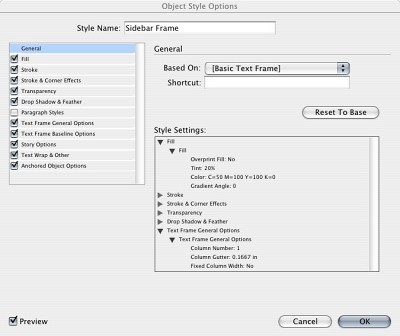 |
| Object Styles Here we're editing a few attributes. |
We're glossing over these critical technologies to show the lay of the land in CS2. A very sophisticated document architecture with complementary metadata technologies powers this version of the Suite. And it certainly whets our appetite for future versions.
GETTING TO WORK | Back to Contents
We'll take a quick look at the workflow involved in producing a simple invitation and a more complex book using the Suite. Our Bridge review described an experimental imaging workflow previously.
Let's start with a couple of general observations.
All this power is very demanding. We ran our tests on computers outfitted with 512-MB RAM and anywhere from 4-GB to 30-GB of free hard disk space, a fairly common configuration these days. We really wished we had 1-GB RAM to run the Suite efficiently, though. If you're going to play this game, you need some serious hardware.
Secondly, each of the pieces in the Suite are legacy applications. Unlike Apple's iLife, where a common interface was handed down from one application to another, these applications all started life with their own way of doing things. Some standardization is going on, certainly, but we were often disappointed to find a new feature not implemented across the Suite.
Case in point is the Photoshop's new ability to configure its menus, hiding some options and labeling others in color. That's only in Photoshop at the moment. More mystifying is why the Updater in Version Cue ignores Acrobat Pro. Another example is the non-standard but legacy keyboard commands of each application. You can defeat them to some extent by redefining keyboard commands, but it would be nice if there were simply a Suite keyboard command set to activate.
THE INVITATION | Back to Contents
Here's the job. Client comes in with a 5x7 color print and some calligraphy. They want you to create a file they can take to a copy center to run off 100 invitations. Tomorrow.
The cover image is a bit dark, a bit backlit. You'll want to shift the tonal range and probably correct the color for a little fading. You know that going in.
So you toss the print in your scanner, launch Photoshop and generously scan the print using your scanner's non-Suite plug-in at 300-dpi with 16-bit RGB channels, yielding a 48-bit color image whose tone and color you can manipulate without introducing any banding. You save it as a TIFF because you know you're going to edit it.
When the image pops up in Photoshop you make your adjustments, then change the mode to 8-bit RGB and save the image as a JPEG.
Next you scan the calligraphy. There are two pieces, one for the back cover and one for the spread (pages 2 and 3). You set the scanner for 1200-dpi and line art mode.
Those don't require any tone or color adjustments but they do need a little editing. The time of the event has changed and some punctuation has to be added. A little copy-and-pasting (with some rotation even) in Photoshop and you're there.
When you point Bridge to these three assets stored in one folder, you'll have large, clear thumbnails that help you see what you have without opening every file. You then assemble them in an InDesign document paginated for printing with the cover and back page on one side of a 7x10 page and the spread on the other side.
After defining the document size and drawing guides on a master page, you create two new pages in the document and drag your assets from Bridge to the appropriate pages. Save the document and print a dummy with crop marks on your laser printer. Trim and assemble for approval.
The client, right there every step of the way, approves. But you aren't quite done. You don't know if the copy center has InDesign CS2. Without it, they won't be able to print it. So you export it, using InDesign's built-in PDF preset for high-quality output. And you burn a CD (non-Suitely).
Next day you get a glowing email from the client, delighted with the invitation. And no distress call from the copy center.
Printing a book is a collaboration. And the collaborating starts early. As you generate assets -- text, images and illustrations -- you work in three of the Suite's applications, using Bridge to view the collection.
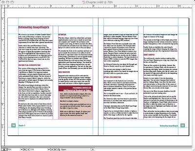 |
| InDesign Spread. Object Styles format the text frames and the page numbers. Paragraph Styles format the heads and text. The sidebar is a snippet that combines Object Styles and Paragraph Styles. |
Setting up the InDesign document is the obvious requirement. Designing the master pages and setting up a hierarchy of text styles and a library of design elements is the usual process. But the Suite also let's you develop Object Styles to apply uniform wraps to your images, let's say. And it lets you save XML Snippets of design elements (including their position on the page) simply by dragging them to Bridge. All of these aspects of the document are, of course, editable, effortlessly evolving as the design evolves.
And they evolve beyond a single file when you create an InDesign Book document, which can regenerate page numbers, synchronize styles, build a Table of Contents, build an Index and provide access to each InDesign file in the book.
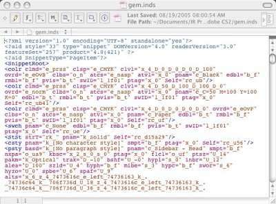 |
| Inside a Snippet Yep, just XML. So you can email your snippets to collaborators. |
While the Suite doesn't include a word processor, InDesign itself functions admirably as one in either of two modes (especially since drag and drop editing has finally been implemented). You can use the Story Editor for a typewriter view of the text or you can simply edit the layout view. You don't have revision tracking and mail merge, but you have something more useful in our view. You can add layers to your document, which can themselves be visible or not. So you can have a notes or revision layer that comments on your final text.
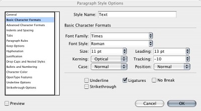 |
| Paragraph Styles Not to mention Character Styles. |
With some text placed, it's time to bring in a few photos. You can simply drag them from Bridge and apply the appropriate Object Style to a Smart Object, which will retain any scaling or rotation if you replace the image. Of course, you've previously used Photoshop's Image Processor (perhaps from Bridge itself) to edit them non-destructively in Raw format and add a copyright notice to them.
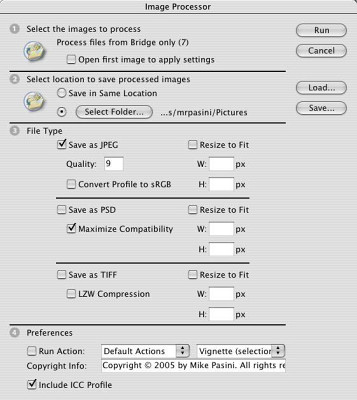 |
| Image Processor We selected seven images in Bridge first. |
Graphics generated in Illustrator can also be dragged into the InDesign document. But generating graphics in Illustrator has become much easier with Live Trace, which can automatically create a vector image from a bitmapped image and, with Live Paint, intelligently fill opened paths. Object Styles work here too, so you can update any number of graphics automatically just by editing the style they use.
Back to collaboration. Clearly, not everyone who needs to review the book is going to have the Suite. Again, the solution is to Export the document as a PDF, this time as the smallest size possible so it can be emailed. A quick trip to Acrobat Pro to turn on the ability to add Notes to the file using the free Reader 7 and everyone can view and annotate the book. Version Cue can even serve the draft as an online reviewable PDF to a small group of collaborators.
And if this book is going to press, make sure you take advantage of Bridge's ability to manage color consistently throughout the Suite.
Throughout this whole process, the assets you placed and the elements you created were all editable and easily archived for reuse in other projects or by other collaborators. Object Styles let us dress page elements like sidebars in different attributes all at once by changing the style or one at a time by applying a different style. Smart Objects let us change content while maintaining quality and object properties. Over and over again, the Suite graciously welcomes revision.
And with GoLive integrated into the Suite, you can repurpose the document into a Web site complete with site diagrams, Cascading Style Sheets and Smart Objects. With hypertext links, you can have all the functionality of a browser with the added ability to comment on pages by exporting the site to a PDF.
There's a lot more to the Suite than we've been able to describe in even three reviews. We neglected both Version Cue and Adobe Stock Photos, for example, subjects worth their own reviews.
But we hope we've clarified what Adobe is doing with the Suite -- and how it can do it. Where some companies live and die by proprietary formats, Adobe has profited from developing comprehensive and powerful open formats. No mean feat.