MINIPHOTOKINA REVIEW
Creative Suite 4 For Photographers
 By MIKE PASINI
Editor
The Imaging Resource Digital Photography Newsletter
Review Date: September 2008
When Adobe shipped Creative Suite 3 in March 2007, the company was already hard at work on the just-announced Creative Suite 4. We were among a group of reviewers and analysts who attended a CS4 boot camp for two days in July and we've been using a beta version of the Master Collection since August.
|
|
At breakfast on the second day of the boot camp, John Feld, editor of The Graphics Report (http://www.thegraphicsreport.com), asked us if this was "a compelling update" for our readers.
That's really the question we all have, the heart of the matter. Do you need this?
It's an especially difficult question for photographers. Adobe has been generous to us with the recently released Lightroom 2, adding local corrections and some essential output sharpening smarts to what had been a comfortable but not comprehensive infrastructure for a photographic workflow.
Where does that put Photoshop?
Right where it's always been, really. We still feel a tingle remembering our joy when Russell Brown sent us a copy of Photoshop 1.0. We had an application that allowed us to do on a nine-inch black and white screen what we'd only been able to do in a darkroom. Images were acquired with a scanner not a camera but the game was the same: optimize them for reproduction.
Today Photoshop remains the easel on which we do our most deliberate work. It's the application that can get the most out of any particular image. It isn't the one we use to generate a Web gallery or edit a selection of images. And we don't manage our image collection with it. Lightroom is far more nimble at those tasks.
But when it comes to "developing" a single image, Photoshop remains our tool of choice. If we can't do it in Photoshop, it can't be done.
SUITE COMPONENTS & EDITIONS | Back to Contents
The suite is more than Photoshop, of course. It's a creative arsenal that has grown to 14 applications in CS4. They include Acrobat 9 Pro, Contribute, Dreamweaver, Encore, Fireworks, Flash, Illustrator, InCopy, InDesign, OnLocation, Photoshop, Premiere and Soundbooth.
That covers so much ground that Adobe offers various collections of the applications so you can buy just what you need. There is the Design Premium and Standard editions, the Web Premium and Standard editions, the Production Premium edition and the Master Collection.
The press release explains what each involves, so we'll refer you there. In this article, we'll look at the suite's innovations in general before looking at what's new in several of the more photo-centric applications.
We've also put up a Flash-based gallery of screen shots that opens in a separate browser window rather than weave them into this review to get this to you sooner. You can manually follow the bouncing ball or use the built-in Flash slideshow to go through the set of captioned images.
SYSTEM REQUIREMENTS | Back to Contents
The complexity of just the possible CS4 configurations required a 21-page PDF on the system requirements alone. We won't rehash the details of all that here, but we will make some general observations. A lot has changed in the hardware and software world since March 2007, after all.
For Mac users, that change has included the move to Intel processors and CS4 takes full advantage of both the Intel core duo processor and Apple's OS X 10.5 Leopard operating system. It even includes being multi-touch aware on the new laptops. Apple and Adobe are in sync in that respect.
For Windows users, that change has included the release of Windows Vista and 64-bit computing (CS4 does run in 64-bit mode on the Mac).
64-bit. The 64-bit question is an interesting one, but hardly a critical one. A 64-bit application simply uses pointers that are 64 bits wide rather than 32 (and it wasn't long ago they were just 16). A 32-bit pointer can address at most 4GB of memory. So that 64-bit pointer can address more than 4GB of RAM.
You'll notice in that description no reference to speed increases. Probably more relevant to performance is your system's bus speed or how fast data travels between the processor and memory.
Where 64-bit pointers come into play today is with very large images. For example, opening a 3.75 gigapixel image on a 4-core machine with 32GB RAM is about 10x faster with the 64-bit version of Photoshop. If you have a file that takes 20 minutes to open, it will open in about two minutes. But the difference in opening your common Raw files is unobservable.
Adobe has planned for 64-bit on the Mac since CS3 (Lightroom in fact is a 64-bit Cocoa app) but Apple's decision to phase out Carbon 64 in favor of Cocoa means Photoshop requires a rewrite of much of the application and its plug-ins, affecting over a million lines of code. That doesn't happen quickly. But Adobe told us they'll get there but not in this release.
That doesn't mean this is old slow stuff. There are significant performance improvements in CS4, primarily from Adobe's decision to write OpenGL code to run on GPUs.
GPU. One of the more interesting things we learned at boot camp was just how important the graphics processing unit has become. The GPU is becoming not just the way stuff gets drawn on your screen but an increasingly important data processing tool, even handling things like color correction. With CS4 Adobe has starting writing GPU code into its applications to take advantage of its performance improvements, especially for things like image rotation and color correction.
Typically, GPU specs (with performance that is doubling every year) aren't something you shop for when you're buying a new system. But they should be. Adobe is currently recommending, as a minimum, 128MB RAM on a card that's Shader Model 3.0 and OpenGL 2.0 compatible. If you plan on doing 3D, make that 512MB RAM.
Without a suitable GPU some features of CS4 just won't be available to you.
3D. If 64-bit is a bit overblown, 3D is a bit underappreciated, particularly in the 2D world of photography. But what Adobe is building into Photoshop to handle 3D tasks is the infrastructure for some fascinating new 2D features.
Photoshop's 3D engine runs programs non-destructively on a layer. What it can do for 3D imaging -- like shading surfaces -- it can do for 2D, particularly if new image sensors record 3D data about a scene. Adobe suggegsted that we may eventually see 3D lighting effects for 2D images come from the 3D work Adobe is doing today.
Which is another argument for a powerful GPU.
Scripting. For scripting CS4 apps, JavaScript is the tool of choice. Write the code once and it runs on either Windows or the Mac. If you script outside the suite, however, you may need OS-specific scripting tools like AppleScript or Visual BASIC.
And, if you're like us, that may even include Perl.
Adobe is not inclined to continue supporting OS-specific scripting. And, within the suite, there's little reason to do so. So now would be a good time to brush up on your Javascripting.
XML. While it doesn't pertain to Photoshop as much as other applications in the suite, the company's standardization on XML to describe file structures (rather than develop proprietary document formats) has huge implications for cross-application compatibility, particularly in Web and publication design.
In a sense, therefore, CS4 is an investment in infrastructure. The documents you build in CS4 will be more portable than the ones you build in CS3.
Older Systems. We have a lose plan to upgrade hardware every two years so we're able to review software on current platforms. But on the Mac side, our plans were first put on hold by Apple's delay releasing Leopard (why buy an Intel machine without an Intel OS) and recently by the rumored redesign of the MacBook Pro (we just gotta have multi-touch on the trackpad).
So when the Master Collection beta arrived we were stuck with an out-of-spec system. Specs vary depending on what edition of CS4 you buy, but not by much. Photoshop, for example, will run on a G5 processor, but the Master Collection calls for a multicore Intel processor.
And here we were with a 1.5 GHz G4, 2GB RAM, a 64MB GPU and a 167 MHz bus speed. Ouch.
For reference, the boot camp machines we used features 256MB RAM on their GPUs and 8GB RAM for main memory.
Fools that we are, we installed the beta and we've been running it just fine. It's not quite as nimble as CS3, although Photoshop generally performed comparably to CS3. But we aren't going to suffer the situation too much longer anyway, planning an upgrade before we review the shipping version. For reasons that will become obvious, we don't recommend running it on a system that doesn't meet the specs.
We installed Bridge, Photoshop, InDesign, Dreamweaver, InCopy and Flash, skipping the other components until we upgraded. We ran everything but Soundbooth and Premiere at boot camp, however.
SUITE IMPROVEMENTS | Back to Contents
There are number of suite-wide improvements worth noting. Among the most obvious is the improvement to the interface.
Interface. Adobe had acquired Macromedia prior to the release of CS3 but the Macromedia applications retained their interface for the most part. With this release, all the applications (Photoshop, Illustrator, InDesign, Flash, Fireworks, Dreamweaver) enjoy a revised and standardized interface that makes it a lot easier to move between applications.
And it isn't just because the interface is more consistent across applications. It's because the interface, which had grown rather cluttered, is a good deal cleaner, easier on the eyes. And since you can customize it with workspaces of your own devising no matter the application, there's little room for grumbling.
We particularly like two aspects of the new interface:
- Improved panel management that lets us get everything we want in the panels, accessible with a single click, and
- A new application frame that includes the panels and toolbars with the document
The first of these is just an evolution in the panel concept which has finally made panels (formerly known as palettes) comfortable to work with. Previously they required a lot of fiddling. Yes, they snapped into position and could be grouped in tabs but they didn't expand very intelligently and quickly took over the screen. The only way we could manage them in CS3 was to use them one at a time.
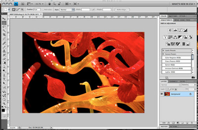
Application Frame. The new interface in Photoshop keeps tools and documents in one window.
But in CS4, we're finding we can use two at a time easily. They are smart enough to expand within the panel section of the screen and collapse with a click. We have 12 tabs in our Photoshop CS4 panel where we had nine in the same space in CS3.
The little rounded corner tabs with upper and lower case legends have been replaced with square tabs and upper case and embossed legends that are simply a lot more readable. By making them more menu-like than folder like, the effect is a cleaner, more comprehensible arrangement. You don't spend as much time scanning the panels for what you want.
But you can also just drag the tabbed panel out from its dock and it will float over your image. These flotillas, as they're called, can be moved to another mnitor, too.
The controversial application frame brings to the Mac an interface nuance familiar to Windows users. But combining the tools with the document (and multiple documents in the same window via a tabbed document interface), yields several important benefits:
- Live window tiling for comparing multiple documents or images
- Easier multi-screen management (dragging a window moves the application)
- Panels do not obscure documents
- Minimizes visual clutter by blocking the desktop
It's the default in the CS4 beta but it's also optional for Mac users. The shipping version will, we were told, use the prior behavior to avoid being jarring. Since it was new, we decided to try it and we found we like it very much. Minimizing visual clutter is one reason but so is not blocking the image with panels. That makes it a lot easier on our eyes, like having a desk drawer for your pens instead of just the top of your desk.
You get one other benefit with the application frame. You can resize it by dragging the sides of the window, not just the corner. Very nice.
How does it handle multiple documents? With tabbed documents, much like your browser. Which can be tiled, too. But the windows won't be shuffled around as you work. Your layout is respected.
Flash Panels. In CS3, Flash, Fireworks, Dreamweaver, Illustrator, Bridge and Soundbooth could be extended with Flash or Flex widgets. With CS4, this capability is part of the interface.
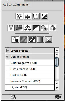
Adjustments Panel. Flash-based interface is non-modal.
In Photoshop itself you can see it in the new Adjustments panel. Adjustments presents a set of icons in three rows with a list of presets just below them. Select an icon (Curves for example) and the panel changes to the Curves tool. No modal dialog box, just a panel that can do Levels, Curves, whatever you need. And do it all non-destructively in adjustment layers.
But Adobe will make this feature available to the rest of us with its free Configurator application to be released shortly after CS4, probably via Adobe Labs. Configurator lets you build your own Photoshop control panels written in Flash (without having to learn Flash). Configurator, an AIR-based application, lets you drag and drop widgets and controls to build your own tool, which can easily be shared with your coworkers.
We saw a brief demo of this during boot camp and while it wasn't as polished yet as the rest of the interface, it was very impressive. Imagine dragging a preview window and sliders with text boxes linked to them to set up Unsharp Masking. But let's go beyond the Photoshop dialog box and recommend sets of those three settings. And even explain them with, say, text hints.
All of this helps manage the suite's complexity by letting you tailor it to the tasks you have to do rather than navigate a general purpose interface to do a few specific things. That's just one of the compelling reasons to consider this upgrade.
Flash Filters. Deep breath. That's not all Adobe is doing with Flash. Pixel Bender (http://labs.adobe.com/wiki/index.php/AIF_Toolkit) is Adobe's new scripting language for writing fast imaging filters. It's actually more of a graphics programming language that can tap into that GPU as well as multicore, multiprocessor systems. To use it, we needed the Flash Player 10 beta (http://labs.adobe.com/downloads/flashplayer10.html), but the final version is expected to be released with CS4.
Pixel Bender not only makes faster filters feasible, it makes writing them easier, too. All you need is a text editor.
Already implemented in After Effects, there's also a Photoshop plug-in that runs it and, while Photoshop CS4 won't support Pixel Bender itself, you can download the plug-in to run Pixel Bender filters.
BRIDGE | Back to Contents
Bridge features a number of improvements over its CS3 counterpart. The design goal was to polish what was good about it and make its capabilities more obvious while speeding up launch and reducing RAM requirements to make it more responsive. OpenGL code running on the GPU go a long way toward those ends.
The interface enjoys the new scheme with a workspace switcher than makes it easy to briefly change views to add metadata or set up a PDF contact sheet. The Output workspace, in fact, includes Lightroom-like PDF and Web gallery options (Flash or HTML) that can be saved to disk or uploaded to your server.
Collapsible panels and breadcrumbs for your directory listing (so you can quickly go back or use a pulldown menu to dig deeper) also help a lot. And list view makes it easy to sort your images by clicking on any particular column.
But Adobe has put some serious effort in making Bridge more of a review tool than it has been in the past.
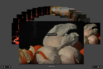
Review Mode. Arrow keys or swipes to navigate.
That starts with an easier way to check sharpness. Just tap the spacebar for a fullscreen view of any selected image and click in the image for a 100 percent view. Hit Escape to return to Bridge.
But it goes a lot further with the new Review Mode under the View menu. At first it turns any selection of images into what looks like Apple's Cover Flow. But it shows your selection in more context than Cover Flow, which is designed to show only one image at a time. You can quickly cycle through your images using the arrow keys (or swipe gestures on multitouch systems). The Down key removes an image from the selection, R takes you to Camera Raw and there is a Loupe tool to inspect detail.
Once you've narrowed your selection down, you can save it as a Collection simply by clicking the folder icon at the bottom of the screen.
Query-based Smart Collections aren't new, but Bridge can now tap into Spotlight or Windows Desktop search to find anything on your hard disk.
We have not been great fans of Bridge, preferring simpler applications to review a set of images, but with current generation hardware, Bridge CS4 looks like a contender for our workflow.
ADOBE CAMERA RAW | Back to Contents
Adobe's plan has been to keep Lightroom and the Adobe Camera Raw plug-in in sync with each other. With Lightroom 2, Adobe introduced local edits and they will be a part of Camera Raw 5, too.
Using the new Adjustment Brush tool, you can set sliders for Exposure, Brightness, Contrast, Saturation, Clarity, Sharpness and Color. Then modify brush features like Size, Feather, Flow and Density. After you've painted over the image, a pin is displayed to mark the editable stroke. Hover over the pin and you'll see a mask of what's been affected. And the mask (via the brush controls) as well as the effect is editable.
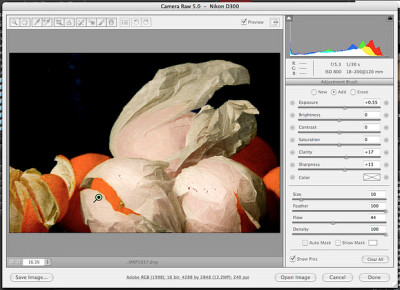
Local Corrections. Note the new brush and gradient tools on the toolbar. Here a pin on the left-most tissue indicates our brush stroke.
There's also a new Graduated Filter tool. It works much the same way. Set your parameters and then drag between two points to create the editable filter.
Both these local edits are nondestructive, never touching the original pixel data. It's lightweight, easily saved to DNG files or XMP sidecar files and simple to copy among images.
PHOTOSHOP 11 | Back to Contents
We haven't used Photoshop 10 since we installed CS4's Photoshop 11, doing our routine work for review illustrations and news items with it. Yes, even on our G4. It launches as quickly as 10 and every one of our plug-ins runs without incident.
That includes some old favorites like iCorrect for one-click color correction, Noiseware Pro and Nik products like Sharpener (2.0 and 3.0), Viveza, Silver Efex and Dfine. Our scanner plug-ins also work as expected. And for the most part plug-in installation required nothing more than making an alias to the CS3 plug-in.
Getting our custom actions loaded was no big deal either. We launched PS CS3, saved them as an .atn file and went back to PS CS4 to load them.
Version 11 is about 50MB bigger than v10's 217MB size, we noticed. With today's hard disks that isn't really much of a consideration any more, though. It's more an argument that v11 has a few things that v10 does not.

Photoshop. Panels are now self-adjusting. Note the document tab above the image area.
One thing that didn't work quite as well on our out-of-spec system was dragging an image in the document window. The image broke up and we lost track of where it was. This wasn't the case on a more powerful machine at boot camp, however. And the reason was simple. Our GPU didn't support OpenGL drawing.
New Features. Highlights of the new features in this version include:
- Adjustments Panel. Skip the dialogs and click any of 15 non-destructive, interactive adjustment layer controls, many with presets.
- Editable Masks. Like Adjustments, the Masks panel makes it easy to see your options (which now include opacity) and edit them later.
- Refined Dodge, Burn and Sponge tools.
- Enhanced Auto-Align, Auto-Blend and 360 degree panoramas. Photomerge has improved vignetting and geometric distortion control.
- Extended depth of field. Combine a series of shots to build one image with greater depth of field than your camera alone can capture.
- Fluid canvas rotation. If you draw, you can draw more comfortably by rotating the canvas to accommodate your stroke.
- 64-bit memory addressing for Windows and multi-touch gesture support for Macs.
- Flash user interface support.
- Spring-loaded keys to temporarily shift between tools.
OpenGL. Photoshop now draws pixels on your screen through OpenGL. Hardware accelerated panning and zooming makes for a much smoother close-up inspection of your image if your GPU is up to the task. Even on a portable's GPU, memory management is a lot smoother. We didn't see that on our system, whose video card could not support OpenGL drawing, but we did at boot camp. Even color correction is being done by the GPU now.
Another example of this is the new bird's eye view feature. At a full screen view of your image just hold down the H key and click to see a small rectangle on the zoomed out image. Just move the rectangle to whatever you want to inspect at 100 percent and the screen instantly enlarges that part of the image.
There is also a Rotate document command (hit the R key) with OpenGL that can rotate your image in the document window so you can draw on it at a more natural angle.
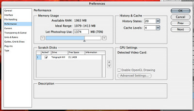
Preference Panel. Note the GPU Settings. Our laptop is a bit out of spec.
There is now a Performance preference panel to enable or disable OpenGL drawing on systems where it is supported and to set other performance-related options.
OpenGL drawing using the GPU is a new strategy for both display and data processing within Photoshop. If you've bought a machine within the last two years, you'll appreciate it now but it will become even more important in the future as Adobe moves more operations to the GPU. Older machines that don't support it won't have these feature enabled.
Brush Resizing. The brush tool can now be resized interactively by dragging. A simple key modifier allows you to drag to resize the brush.
Spring-loaded Keyboard Shortcuts. There's now a distinction between tapping a keyboard shortcut key and holding it, which changes it temporarily. It works with any tool combo. Adobe has actually run out of available modifier keys, so you can now jump from anything to anything else with just a gesture. Why didn't they think of that years ago?
Best Practices. Rather than giving you yet another way to do something, what about giving you the best way to do it? Sound good? It's been how ACR and Lightroom are evolving and it's how Photoshop is going, too, with the new Adjustments and Masks panels.
Adjustments displays all the adjustments Photoshop can render as non-destructive adjustment layers. That's 15 in three rows of icons including Brightness/Contrast, Levels, Curves, Exposure, Vibrance, Hue/Saturation, Color Balance, Black & White, Photo Filter, Channel Mixer, Invert, Posterize, Threshold, Gradient Map and Selective Color.
Many of these also include presets. The Curves adjustment, for example, includes presets for Color Negative, Cross Process, Darker, Increase Contrast, Lighter, Linear Contrast, Medium Contrast, Negative and Strong Contrast. Select a preset and the Curve tool will reshape itself automatically modifying the image's tone and color with a new adjustment layer.
Exposure, to take another example, has Minus 2.0, Minus 1.0, Plus 1.0 and Plus 2.0 presets to quickly change exposure.
These are non-modal operations so you don't have to work within a dialog box to get these effects. You're working interactively, so you can leave the Adjustment panel to do something else and just return to it to finish. In practice, it's just a much smoother editing experience.
Some of these adjustment tools also include an on-canvas tool that let's you modify, say, the curve by dragging across a part of the image you want to change.
Adjustment layers aren't an obvious power tool for new users, but the Adjustments panel makes them your first choice. And that's all good.
The Mask panel allows you to vary the opacity of a mask. And you can adjust the feather on a mask, essentially running a filter on the mask. Those options are displayed on the panel, no hunting around, inviting new users to play with them. And, again, they're editable.
Beyond the Single Image. The HDR merge of Photoshop 9 and the Photomerge features of Photoshop 10 were just a hint at where the product was going. Processing multiple images to create an image that can not be photographed in a single snap of the shutter has been expanded in Photoshop 10 to extend depth of field.
Multiple images shot with a different plane in focus can be aligned and blended into a single image using the Edit menu Auto Blend Layers on a stack of images. Photoshop looks for the regions of highest sharpness and synthesizes a shot with extended depth of field.
The result is built with a series of masks revealing the sharpest area of each image. Alignment is run first then sharpness is detected and the masks built.
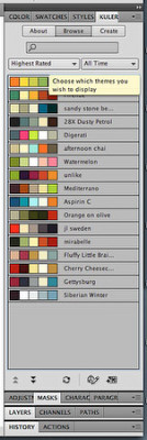
Cool Kuler. A Flash-based panel that dynamically taps into the Web for its options.
Developer Friendliness. With CS4, the suite is more developer friendly so you needn't rely entirely on Adobe for new features. The CS4 apps can be extended by others with Flash using Flash user interface elements.
An example of that is the new Kuler panel, which finds and displays color harmonies. It can consult the Adobe Kuler site on the Web to download the latest or highest rated harmonies other users have created, expanding Photoshop -- and the other CS4 applications -- beyond the latest build.
Content-Aware Scaling. One of the two Israelis who demoed their magical image resizing with a YouTube video last August is now working for Adobe. And by no coincidence, Photoshop now includes content-aware scaling.
CAS is the fancy name for cropping out homgeneous areas of a scene while leaving more complex slices alone. So a beach scene with a figure on the left would leave the figure unsqueezed while cropping slices of the sky, ocean and sand that are the same. It recomposes -- even enlarging -- the shot without distortion of key elements.
And you can direct it to protect skin tones, too, so people are protected from distortion.
Tooling the Tools. The Dodge, Burn and Sponge tools have also been refined, preserving tonal quality while correcting exposure and color saturation.
THERE'S MORE | Back to Contents
There's a lot more to the suite than Bridge and Photoshop, of course, but photographers will focus on those two products in judging how compelling this upgrade is.
No image, however, is an island. It inhabits other locales or, you might say, is repurposed to death. And if you're in business for yourself or your talents include but are not circumscribed by your camera gear, the rest of the suite has some interesting new capabilities.
In the last few weeks, we've focused on the two main applications we rely on: Dreamweaver and InDesign. But at boot camp we were impressed by the evolution of Illustrator as its interface absorbs more of what made Freehand so popular and by the radical change in just how Flash does animations.
Flash introduces a whole new object-based model without abandoning the frame-based model it has always employed. Where you had to learn the old method to do an animation in Flash, the new model makes it easy to animate anything.
We've had our late nights making Flash ads like the newsletter banners you see on the site. But at boot camp we were animating oil derricks and snakes as easily as we used to make ashtrays at summer camp.
We're happy to answer your questions about either of those application. But for now, we'll conclude this overview with a few notes from our experiences with Dreamweaver and InDesign.
DREAMWEAVER | Back to Contents
We had been working on an experimental Web site before CS4 arrived. The site taps into Adobe's free Spry framework for Ajax to enhance the user interface with collapsible panels and slide shows. Dreamweaver has offered support for Spry in CS3 but CS4 takes it a lot further, so we opened our prototype home page in Dreamweaver.
Our usual tool is a simple text editor with our browser open on the page we're working on. It's a pretty efficient approach although it has it's drawbacks.
Working with Dreamweaver had some advantages. The breadcrumb file dependency display above the code window was a real blessing, letting us switch between the source, the CSS and any JavaScript called by the pages to work on one problem or another.
On our ancient system, the Live View mode that renders the code as if you were in a real browser wasn't as convenient as switching to our browser and reloading the page. And the Design display, when using sophisticated Spry techniques like panels and accordians, wasn't very helpful either.
The worst problem, though, was selecting full lines. For some reason the program insisted on not selecting the first tab in a line.
We did like the autocompletion and code verification utilities, although we inadvertently closed some divs that the verification only hinted at.
In some cases, difficult divs were debugged by inspecting the controlling styles and properties. There's a lot to this that we appreciated, allowing us to edit the CSS using dialog boxes rather than CSS. The advantage isn't in the forms so much as being able to see all the possible sources that can affect the object in question and being able to apply a change without committing to it.
Dreamweaver is a code-oriented approach to HTML editing, although it's come a long way in displaying what the code describes and letting you easily find and edit what controls the appearance.
INDESIGN | Back to Contents
We spend a lot of time in InDesign, using it as our word processor when we aren't composing pages in it. We've always been annoyed it won't scroll the active page up when you keyboard beyond the bottom of the window. And CS4 doesn't fix that -- at least on the PowerPC. We had less trouble with that on the Intel machine, oddly.
But the application frame was a real blessing for our InDesign work, blocking out the distracting background of other open documents (we seem to be running half a dozen applications all the time) and making obscure panels just a click away. For some reason InDesign has always required a few more clicks than we like to apply a style or perform some routine operation.
The most exciting thing about InDesign, though, is also one of the more dispiriting things about it.
There was a time when graphic designers were rooted in the soil watered by ink and solvents. They came from printing backgrounds and understood page creep and bleeds and undercolor removal and the foolishness of reversing eight point serif type. No more. Today's graphic designer learns the trade on the Web and only acquires a printing sensibility press check by expensive press check.
InDesign has always been a tool for print production, the land where a page has dimensions, but in CS4 it is making a bold move into Web production with a Flash export that can add navigation buttons to pages.
The goal is to give print production pros some Web cross-over capability without requiring them to learn a new application. And it works. But it does make us sad.
CONCLUSION | Back to Contents
How old is our hardware, we kept wondering, as we worked through the suite the last few weeks. Seems like only yesterday we broke open the piggy bank to buy this thing and only this morning we got everything running smoothly on it. But in fact it was made in July 2004. That's a good four years ago and long before the Intel revolution.
So we were surprised we could run CS4 on it at all and certainly won't base our shipping product review on it. We know better from running CS4 on a current Mac Pro at boot camp.
But there's a lesson in there.
To really enjoy the benefits of CS4, you need recent hardware (and, really, we wouldn't have it any other way). Much of what CS4 can do is simply disabled without a powerful GPU.
But if you've got recent hardware, you're in for a treat. The move to GPU code is a big performance hit. And, as they say at Adobe, performance is the best feature of all. There's nothing to learn to take advantage of it.
That may be the most compelling reason for the upgrade. But we've found plenty of others, too. It may be over 18 months since the last upgrade by time CS4 ships, but you have to wonder if anybody ever sleeps at Adobe.