XMP, RAW & A FUN INTERFACE
Elements 3.0 --
More Than Meets the Eye
 By MIKE PASINI
Editor
The Imaging Resource Digital Photography Newsletter
Updated: Dec. 10, 2004
It's been over two years since Elements has been updated. It wasn't broke, but at that rate, Adobe might be. Still, how could Adobe possibly improve its competent entry-level image editing software famous for its extraordinary HTML Help and Tutorials on image editing?
Well, Adobe is not an ordinary company. Sometimes we wonder if it's a company at all. It seems more like a movement. A movement inspired by the Spot and then the Pixel. There's always more to Adobe than meets the eye.
And that goes double for Elements 3.0. As we used the new version, we kept interrupting ourselves to ask how they implemented this or that. We'd look it up in the Help system and find out a whole new architecture had been implemented. Elements 3.0 lays some cornerstones for imaging we find very exciting.
TALE OF TWO CITIES | Back to Contents
We remain a bit perplexed, however, by the twin versions. The Windows and Macintosh versions do not share the same feature set. Nor the same price.
We spent no little time comparing Mac and Windows version 2 with this latest release to uncover exactly what was new. And we can tell you both versions include the following new features:
- Camera Raw and 16-bit channel support
- A Noise removal filter
- Healing Brush and Spot Healing Brush to wipe away image flaws
- New and improved automatic image enhancement tools including Smart Fix, Shadow/Highlight Adjustment and revised Redeye Removal
- A Styles & Effects palette with over 100 customizable filters, effects and layer styles
- A Cookie Cutter tool to crop photos in predefined shapes
- A Photo Bin to quickly switch among several open images
- A command to divide a page of scanned photos into individual image files
- Dynamic PDF slide shows with transitions, captions, music and narration
- Flexible print options including multiple images, contact sheets and labels
The $89.99 Mac version for OS X adds the Cookie Cutter to create decorative edges. It does not have the Album-inspired organizing or sharing features but does integrate nicely as iPhoto's image editor.
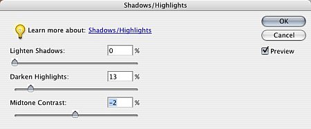 |
| Shadows/Highlights Command Easier than explaining Levels |
In this review, we'll look at the image editing features shared by both versions.
SYSTEM REQUIREMENTS | Back to Contents
System requirements for either system include a color monitor with 16-bit color or greater video card, 1024x768 or greater monitor resolution and a CD-ROM drive.
Windows system requirements are an Intel Pentium III or 4 (or compatible) 800 MHz or faster processor, Windows XP Professional or Home Edition with Service Pack 1; Windows 2000 with Service Pack 4 or later (Adobe applications on Windows XP with Service Pack 2), 256-MB of RAM (512-MB or more recommended), 800-MB of available hard-disk space, Adobe Reader 6.0.1 and Microsoft DirectX 9.0 software (included on application CD).
Mac system requirements are a PowerPC G3, G4 or G5 processor, Mac OS X 10.2.8 or 10.3, 256-MB of RAM, 200-MB of available hard-disk space.
Included in the box is a $20 Rebate Claim Form valid through April 30, 2005 if you have a previous version of the program (serial number of photocopy of the CD or manual cover required). We strongly dislike this way of handling updates but when a product is so thoroughly rewritten it requires a CD, there really isn't a more efficient way of doing it.
INSTALLATION | Back to Contents
Installation on either system is a breeze. Just pop in the CD and let the installer do all the work. It takes only a few minutes. We do recommend poking around the CD afterwards, though, for the Goodies.
One we especially appreciate is Epson's PIM plug-in to read PIM data stored in an image's Exif header on import to Elements.
Our favorite Photoshop plug-ins seemed happy in the Elements Plug-ins folder, but we didn't comprehensively test them. Other add-ons didn't fare as well, as we explain below.
We did experience one install problem. A second Mac copy installed on our backup system simply failed to launch. We held down the Shift-Option-Command key on launch to rebuild Preferences but that didn't help either. Turned out to be a missing font: Arial.
SERIOUS STUFF | Back to Contents
Before we look at individual features and tools, we should point out some interesting things under the hood. Can you say, "Hemi?"
First to catch our eye were Keywords. The File Browser includes a Keyword palette to create and apply keywords to photos. Album creates a database of your image collection, storing keywords in the database file, apart from your images (which can be on CD or DVD archives). But where is Elements storing them?
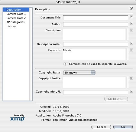 |
| File Info This dialog shows the keyword in the file itself |
It turns out Adobe is using Adobe's Extensible Metadata Platform labeling technology to add keywords to the image file itself (without requiring a database, like Album). XMP also tracks the file's history. And all this travels with the image file so it's available when you use it in, say, InDesign or Acrobat or Illustrator.
Of course, if you change a keyword (say, Peking to Beijing), files that use the old keyword (Peking) won't be updated with the new one (Beijing).
The second thing we found intriguing is 16-bit channel support and Raw file support. We hasten to point out that Canon CRW and Nikon NEF files are, in fact, Raw formats. Apart from Adobe's recently introduced DNG format, there is no standard Raw format. They're all different. Which is why Adobe developed DNG, which Elements 3 supports.
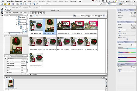 |
| Camera Raw Various Raw formats displayed in File Browser |
We've often discussed the importance of 16-bit channels for making color and tonal corrections to images. In effect, they let you make exposure adjustments after the fact. Under and overexposed shots can actually be corrected if 16-bit channels were captured using your camera's Raw file format. For more on this, see Bruce Fraser's $35 Real World Camera Raw, which takes a look at how "to set white balance, optimize contrast and saturation, handle noise, correct tint and recover lost detail in images before converting them to another format."
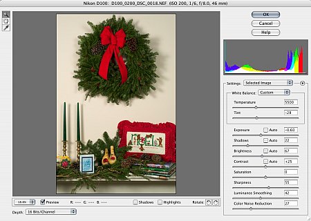 |
| A Nikon NEF Raw Image Note the various settings your can tweak as you open the file |
We applaud Adobe for supporting 16-bit channels even in Elements, where you might least expect it. We faulted Paint Shop Pro for sticking to 8-bit channels because we expect to see a new generation of tools that require 16-bit channel images to work their magic. This single capability brings a new dimension to digital photography and we're glad to see it in a $99 product, which was the price of the original Camera Raw format plug-in for Photoshop 7.
WHAT'S MISSING | Back to Contents
Support for 16-bit channels doesn't, however, mean channel support. You still can't look at the red, green or blue channel of your image. Likewise, there's no support for CMYK files, just the more common variety RGB images your digicam makes. And you can't manipulate them with Curves, either.
That is, unless you buy Richard Lynch's Hidden Powers of Elements 3, which includes a Curves tool and lets you work with channels and CMYK files. The tools are matched to each version of Elements, as Richard explained to us.
"The tools that came with the book had to be re-mastered," he said, "and are all working fine now. They are being released with the new Elements 3 version of the book (http://aps8.com/hppe3.html), on the book's CD. The tool set in the book has been moderately expanded and improved compared to the tool set for Elements 2. Some of the additions are from what was formerly the free tool set."
The free tools Richard has offered with prior versions (http://hiddenelements.com/freetools.html) were substantial so we're not surprised to hear he's including a few on the new CD. While there are none available for Elements 3 yet, he has plans. "I am currently working on some conversions of actions that were converted for Elements 2 and I'm building some new tools for Elements 3 users. Once more of those are done, I'll be updating the site to reflect Elements 3 changes and adding free stuff as I have time."
That's good news. Richard's book ought to be included with every copy of Elements.
THE INTERFACE | Back to Contents
The interface has undergone a major face lift. If the old interface seemed borrowed from Photoshop, the new one seems borrowed from Album. Despite our dislike of the complexity of Album's interface, we find it suits Elements very well.
If you want to play around with an image, you have a choice to make: Quick Fix or Standard Edit. Just click on one of the large buttons in the upper right corner to make your selection.
Quick Fix used to be a tool, an awkward one. Now it's an environment. Click on Quick Fix and the right hand side of the screen displays four palettes: General Fixes, Lighting, Color and Sharpen. Help is a click away on any of them and they each have irresistible jelly bean sliders that make you want to play with them. The color slider bars even indicate (with color) what their effect is. Saturation, for example, is gray at the left end and gradually intensifies to something like phosphorescent slime on the right. Hue, too, shows a rainbow of options. There's also an Auto button on each palette, but it's really more fun to play.
In fact, we took an image with an almost monotone blue color cast, clicked on Smart Fix to get something that resembled a bad print, decreased the Saturation and shifted the Hue from magenta to orange to get a perfectly corrected image in only three clicks.
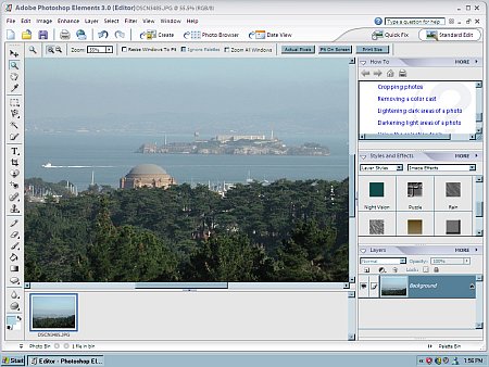 |
| The Windows Version Standard Edit selected |
The Standard Edit interface, with all the bells and whistles, has been improved immensely with the elimination of the old, cramped Tool Well in favor of a set of tabbed palettes that line the right side of the screen. With a click, you can collapse a palette, regaining screen space.
You used to have to dig around in the crammed Well to find the Filters tab, the Effects tab and the Layers tab. Now all three are combined in one palette using a popup menu. That makes a lot more sense.
We were very happy to see the Help text field is still prominently displayed. Help has always been one of the best things about Elements.
NOISE REMOVAL | Back to Contents
The new Reduce Noise filter has three settings to play with. Strength (0-10), Preserve Details (1-255) and Reduce Color Noise (0-100). But even more helpful is its live preview showing you the effect of your settings. Click in the preview and you can also make a quick comparison with the original.
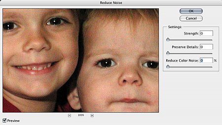 |
| Before |
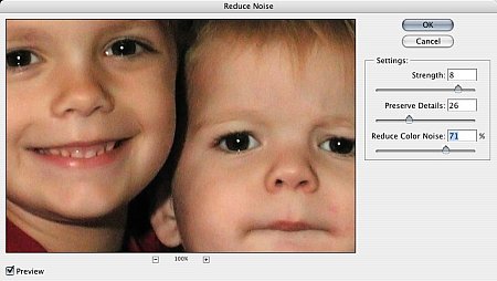 |
| After |
This is an important addition, actually. As Dave points out in camera review after camera review, the more pixels that are packed into small sensors, the noisier your images are at sensitivities above ISO 200. ISO 400, he often complains, is unusable for just that reason.
Generally speaking, the bigger the sensor, the better the image. Smaller sensors on prosumer digicams cram in as many sensors as they can to offer resolutions competitive with dSLRs but at the expense of increasing noise. The larger CCDs typically used on dSLRs have sensors that are not as small and consequently have less noise.
Results from the plug-in were pleasing if not thorough. The noise problem is really a bit more complex than it might seem. Take a look at our review of Dfine in the Aug. 8, 2003 issue to learn more about the different kinds of noise that can infect your image.
REDEYE REMOVAL | Back to Contents
Previously to remove redeye, you selected a brush and painted it away. Now you use a tool and either click on the redeye or drag a selection around it. You can adjust the pupil size and the amount to darken, both by percent. This is a small change but a welcome one for its improved usability.
HEALING BRUSHES | Back to Contents
 |
| Blemishes? |
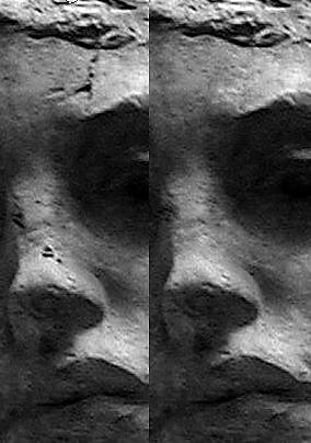
The same might be said of the two healing brushes, one to touch up spots and the other to repair larger areas. Healing brushes resemble the Clone tool, but they're a bit more sophisticated, tapping into the processing power of today's more powerful systems to not clone some aspects of an image. Think of it as being able to paint tone, color and texture without cloning detail from a similar part of the image. The healing brushes are a more usable clone tool.
Any image editing software worth its Save command offers layers but we doubt many people are comfortable applying an adjustment layer or picking a layer mode. Fortunately Elements isn't shy about doing that for you. Click on an Effect and watch Elements go to work. As it does, it tells you what it's doing and you can watch the layers build as it does. It can actually be fun to watch.
But the new Cookie Cutter tool is actually fun to use. You select a shape, of which there are many in categories from Animals to Tiles. Then you can set its options, which include drawing (just by dragging) the unconstrained shape, or in the proportions it was defined with, at the defined size or a fixed size. A checkbox determines if the shape is drawn from the center or the top left. But wait! You can also feather the edge any number of pixels and crop the image. And when you release the mouse button, you can edit the shape outline, rotate it, resize it, whatever you want before the cookie is actually cut, so to speak.
There's more to this version of Elements than we had room for in the newsletter version of this review, so we're going to cover it with updates right here during the upcoming weeks.
Digicams take great pictures and most organizing software now includes rudimentary image editing commands to handle things like rotating the image, fixing redeye and correcting color balance and contrast. But you may find yourself yearning for more.
Image editing doesn't come naturally, however. Bravo to Adobe for building such a comprehensive help system with integrated tutorials and tips. It's among the best training material for image editing we've ever seen.
And with the improved interface, Elements 3.0 encourages you to take your images farther than your camera can. Of course, it includes those rudimentary and automatic fixes most programs offer. But there's also a lot of fun built into this program that makes it a pleasure to play with your images. And even more, under the hood is an engine that is pointed to the future of imaging.