INTELLIGENT COLOR CORRECTION
iCorrect Color With a Click
 By MIKE PASINI
Editor
The Imaging Resource Digital Photography Newsletter
Review Date: August 2001
The fog was swirling down Geary Boulevard in its color-annihilating way while we warmed the stools at Edinburg Castle (where bagpipe music often accompanies the conversation) with our old buddy Lee. We were waiting for the waiter to return with our order of fish and chips from the Old Chelsea around the corner.
We stared into our lager and limes until the pipes subsided when Lee, a graduate of Rochester Institute of Technology (whose school colors are, we believe, cyan and magenta), asked if he'd ever told us about his job interview years ago at Ziba Color Labs. No, he never had, we seemed to recollect.
"It was real short," Lee said. "Sasha showed me a print and asked me what color correction I'd make."
In the habit of sympathizing on bar stools, we were prepared to gasp in astonishment at Sasha's unreasonably ridiculous test, but from long practice we held our breath.
"I told him what it needed and he hired me on the spot."
Implying, after all, it was a pretty fair test. But one we wouldn't have passed. And if you're like us, the mere thought of color correcting an image is enough to order another lager and lime.
Too much yellow? Correct the green with a shift in the red? How do you tell the cyan from the blue? Yikes. Where's that guy with the bagpipes when you need him?
SEND IN THE CAVALRY -- OR CLOWNS
Besides providing basic color correction tools that themselves offer no guidance, image editing software can often display a range of alternatives or "variations." The current image is usually in the middle. Running clockwise, the alternatives show more yellow, red, magenta, blue, cyan or green. You click on one that looks better than the original.
Programs like Test Strip and QBeo's Photogenetics enhance that process with more sophisticated algorithms that ask you to choose between two images. But even then the choice is often difficult to make and even confusing.
The problem is simple: those programs (asking you to pick a better variation) don't understand the subject of the image. They don't even try to understand it. They just ask you (repeatedly) which alternative looks better -- even if neither does. Trial and error. The blind leading the blind.
But iCorrect Professional, an Adobe plug-in from Pictographics (http://www.picto.com), provides a smarter way to color correct an image. Running under Mac OS 7.1.1 to 9.x or Windows 95/98/NT/2000, it's compatible with Photoshop 4.0 through 6.0 (PhotoDeluxe and Elements, too) and requires 32-MB RAM.
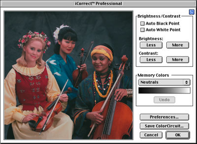 |
| iCorrect Professional 3.0 |
We simply fell in love with it. And if you're uncomfortable making color corrections, your heart may beat faster too.
JUST CLICK
Good color may be difficult to achieve but an off-color image is as obvious as an off-color joke. You open the thing and it offends. If you've installed Pictographics' filter iCorrect, you're only a click or two away from decent color.
Take our favorite problem. Flesh tones. Your digicam may handle these fine in sunlight, but do less well with flash. And if you're scanning (particularly one-hour prints), the problem is even worse. Natural skin tones are complex but our eyes are not easily fooled. Sometimes it's so bad it seems like everyone overdosed on various quick tanning creams.
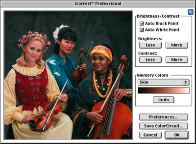 |
| Skin iCorrected |
But select iCorrect from the Filter menu, set "Skin" for the target color and just click on the bad skin and presto! you've got flesh tones. Not eFleshTones, not one-hour flesh tones, but real skin color. And race, for once, doesn't matter at all (but clicking on cosmetics can confuse the correction, so shoot for the forehead rather than the cheeks).
In the screen shot above, we clicked on the forehead of the dark skinned woman at the right. That's all it took. Note, however, we permitted iCorrect to set the black and white points. Compare this preview to the one above it to see what a dramatic effect one click can have.
Same trick for two other false friends: sky and foliage. iCorrect knows all about these three. You just select one as the subject to be corrected and click on the area that needs help. Click three times if you like. iCorrect will instantly bring the color back into reality. An Undo button lets you backtrack if you don't like the result.
And for images with none of these keys, there's a neutral color correction. You just pick what should be gray (no color) and any color cast is removed.
No evaluation required. No choices. Just tell iCorrect what you're looking at, click on the problem and it fixes it.
PREREQUISITES
Pictographics' expertise is in digital color technology. Among their other products is a digicam ICC profile generator called inCamera (which we're currently testing). And their documentation is among the best we've seen. They don't shy away from the tough subjects, but they put them in an easy-to-grasp context that make you feel like an expert just by turning the page. Really top-notch stuff.
iCorrect's documentation is no exception. iCorrect is designed for images of "unknown pedigree" (without an embedded color profile) but to get results you have to calibrate your monitor. Pictographics tells you how to do that, of course. And frankly, no matter how many lager and limes you've had, it isn't difficult.
WAIT, THERE'S ANOTHER ROUND
iCorrect does more than bring skin, skies and foliage back into the field of play. It will also help you correct the tonal range of the image. For digicam images this usually means compressing the tonal range so something in the image is really black (instead of dark gray) and something really white (instead of light gray). There's a button to automatically set the black point and another to automatically set the white point.
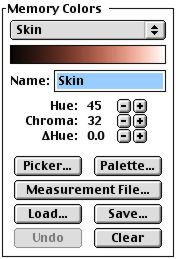 |
| Skin Memory Color |
But, just to prove our point about the documentation, we've never read a clearer explanation of why not to use these buttons. No true black in your image? Then don't set the auto black point. Nothing that's actually white? Then don't set the auto white point.
You can refine the correction further with a couple of buttons that give More or Less contrast and another set for More or Less brightness. Click until happy.
CUSTOM COLORS
Skin tones, skies, foliage and neutrals are built into iCorrect but they are actually only examples of up to 10 color ranges or memory colors (as Pictographics calls them) you can describe and store for reference.
Click on the Preferences button and there you are. Memory colors are defined by their Hue, Chroma (or saturation) and Delta Hue (representing the hue change between light and dark colors). A gradient shows you just what you've defined. And defining a memory color is as easy as selecting:
- The Color Picker,
- A Pictographics ColorSynergy palette,
- A colorimetric measurement file, or
- Colors in the image preview with a click.
And you can save and load your definitions, too (as the buttons in the Skin Memory Color illustration suggest).
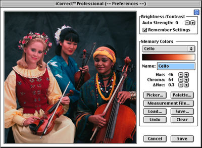 |
| iCorrect defined our custom Cello color |
In our sample above, we merely clicked the Preferences button, typed in "Cello" for the name and clicked on a cello to sample the color. iCorrect did the rest.
SAVE THAT CORRECTION
Finally, you can save the changes you've made so you can apply them to other images by clicking on the "Save ColorCircuit..." button.
Unfortunately it takes another Pictographics product to apply whatever correction you devise to a set of images. But at least that product (ColorCircuitQ 2.0) is a free download (and does a lot more, applying unsharp masking, removing noise, resampling and renaming files).
We really liked ColorCircuitQ, a stand-alone application. It was quick, ran in the background and handled lots of images effortlessly. It was like hiring a team of nine guys to fix all your images. You just drag a ColorCircuit correction file and the images onto the icon and go back to your real work. A couple of blinks later, all your images have been corrected.
Wayen Huelskoetter, Pictographs president, told us they didn't want to bloat the download file for iCorrect by including ColorCircuitQ and maybe that's a good thing. When you go to the download page you'll find quite a few tutorials, PDFs of their excellent documentation and QuickTime movies illuminating issues in color management all worth the download time.
GLOBAL WARMING
Generally iCorrect makes global corrections, but only on the active layer and only if no selection is active. To restrict the correction just make a selection. You can still apply the correction globally with a selection active by simply enabling the "Entire Image" checkbox.
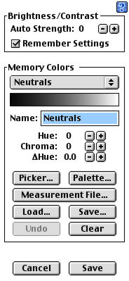 |
| Preferences |
THE WHINE OF THE BAGPIPES
At the risk of sounding a little like the guy who wanted tartar sauce after the miracle of the loaves and fishes, we did have a complaint or two about version 2.0.
Take those More or Less buttons, for example. We'd prefer a nice slider with a live update in the preview. And we're not alone. Huelskoetter told us they decided on buttons to make the interface as simple as possible, but they are reconsidering after receiving a lot of requests for sliders.
And the price, Hilda. At $139, the people who could most profit from this (like us) may be the least inclined to spring for it. Even though you're getting iCorrect Pro and ColorCircuitQ together.
We've just begun using version 3.0 (all these screen shots are of the new version). While we didn't get everything we wanted, we can already appreciate the improvement. And it's happily a free upgrade to registered users of 2.0.
With the release of version 3.0, Pictographs has added:
- 48-bit technology (16 bits per channel),
- A more intelligent auto-white and auto-black range adjustment (not quite sliders, but we'll take it) with the ability to vary the effect of this option,
- User-definable preferences,
- A "Remember Settings" button,
- More precise controls for brightness and contrast (hold down the Option/Alt key to change from 10 to 100 steps), and
- An improved user interface.
And it didn't take them long, either. First released in April, this major upgrade took only five months. Under intense questioning Huelskoetter finally revealed Pictographs relies on a secret development strategy, working only on features suggested by customers and (even) reviewers. "How's that for a concept -- listening to our customers," he laughed.
CONCLUSION
With iCorrect around, people like Sasha will have to come up with an entirely different employment test. This is really the first color correction tool we've seen that is so well designed even a colorblind operator could improve an image. You may not know how to describe skin, sky or foliage but anyone can point to them. And that's all it takes.