ILIFE '04
iLife '04 -- Harder Than It Looks
 By MIKE PASINI
Editor
The Imaging Resource Digital Photography Newsletter
Review Date: January 2004
We found it more convenient to chisel open our wallet and carve out $49 for iLife '04 (http://www.apple.com/ilife) the day it came out than to go through our usual channels (including the cardboard sign promising, "Will Review For Food"). But the experience was emblematic of the package.
Dashing into the Mac section of the BigStore, we immediately latched onto the top box of a pile of iLife boxes. Only to discover as we skipped toward the cash register that it was version 1.1, last year's model.
We dragged ourselves back to the display area and found iLife '04 in its nearly identical box, grabbed one and raced back to the checkout stand.
But the scanner priced it at $79, not $49. Nope, we stood firm, $49. "Rebate maybe?" the clerk suggested. No. "Bring me the tag on the shelf," the clerk compromised. So back we went again to the display area and found no tag. Nor clerk.
Suddenly a harried fellow in just the right polo shirt dashed by promising to be back in a minute with the Single User version. We'd inadvertently picked up the Family Pack, according to a green sticker we'd failed to notice. Well, $79 is not our idea of Family Values.
Back in the checkout line, four other guys (that's everybody) were getting the Single User version delivered to them by the polo shirt angel. The guy in front of us noted that delivering the product a week after the show was certainly one way to keep things secret. He, too, was put out.
We'd spent half an hour buying iLife. Already a net loss.
INSTALLATION
Oddly, we found the packaging fairly beat up. And we were surprised to see the interior box torn. Especially since the outer box still had the factory seal intact. Apparently, the initial run had been restocked after it was first packaged.
A few sheets of paper are included pretending to be installation instructions, tips, support options and a flyer. We did learn that the included DVD had everything on it that the CD includes. The CD lacks both GarageBand and iDVD.
One bright thing about the installation is that it will register your products as they install. Ah, multitasking OS X!
Of course, the registration server has to be up for that. And it wasn't. You'd think Apple would schedule routine maintenance around iLife releases, not during them.
The routine installation went just fine and didn't really take very long. We were able to flip through a trade publication (without actually reading anything) in the time it took.
Unfortunately, it skipped the iDVD install because our machine doesn't have a SuperDrive. One of the advantages of iLife '04 is that you can run iDVD without a SuperDrive. You can't burn a DVD, of course, but you already knew that. We were hoping we might be able to burn a DVD slide show onto a CD, actually. That doesn't seem like too much to ask.
So we had to install iDVD separately.
To do this, you control-click on the Install alias, select Show Original and wait for the Packages folder to appear. Inside you'll find iDVD.mpkg. Run that. Or be smarter than us and do a Custom Install and click on iDVD.
We weren't, however able to launch iDVD after that install successfully completed. It unexpectedly quit.
Back to the shelf, so to speak.
iPHOTO
The phrase "incremental upgrade" kept resounding in our head like a GarageBand loop as we played with iPhoto 4.0. We used to get features like this with free Software Updates.
It didn't seem noticeably faster than 2.0 on our system, although it scaled images a bit more smoothly. That may be because we keep separate Libraries, none too large to begin with -- and, frankly, mainly for testing. Others with large libraries have raved about the speed.
We don't use iPhoto to manage our images, we confess. We find it (still) missing key features like adding copyright information to the Exif header or being able to keyword on path names. But we still find it one of the easiest ways to manage collections of digital images, which we all have to do.
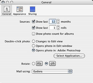 |
| iPhoto Prefs: General
|
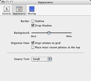 |
| iPhoto Prefs: Appearance
|
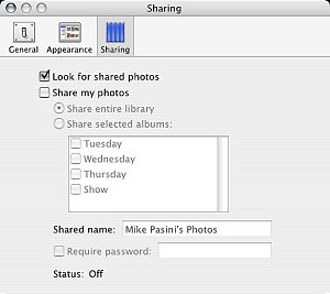 |
| iPhoto Prefs: Sharing |
But it gets a round of raspberries for library management. Just look in the Help topic that discusses how to use multiple libraries. The old renaming shell game, played at the Finder level, is still required. iPhoto only recognizes one library -- worse, only one library filename.
It gets even badder, though, folks. There's no way of consolidating your 2.0 multiple libraries in 4.0 without losing roll ID, comments, and keywords. Library management is just not part of this incremental update.
And not a few pioneers have reported library corruption as 4.0 converts their 2.0 libraries to 4.0. Be smart, backup your 2.0 libraries first. And make sure your file system is healthy by repairing permissions with Disk Utility.
Improperly rotated images can be rerotated to regain their composure. Incorrect large file sizes (like 17,592,186,044,416-MB for a 52K JPEG) can be corrected by cropping the image and then undoing the crop. Fixes seem to involve forcing iPhoto to refer back to the Exif data in the image.
And images that appear blurry when edited will look sharper if opened in a new window. Incremental downgrade, that.
But 4.0 does sport a few new features.
 |
| iPhoto: Date-Based Albums |
We found, for example, the menu command to rate a picture using from one to five stars. But we stumbled around a while looking for the quick preview with rating options we saw at Macworld. We couldn't even find it in the Help topics. It's a slide show option (to display controls, something we tend not to do). The transparent controls overlay is truly elegant (one of those OS X things) and functional (Previous, Pause, Next, Rotate either way, Rate, Trash).
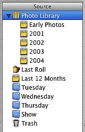
We did immediately notice the date-based schema in an album of our pictures over the last year titled "Last 12 Months." The Library itself can be viewed in annual breakouts by simply clicking on the gray triangle next to it. "Early Photos" is followed by albums for the years 2001, 2002, 2003 and 2004. Not nearly as exciting as Photoshop Album's timeline view, but useful.
Time-based albums seem to be an example of the new Smart Album feature. You're able to specify criteria for an album now. And iPhoto updates the album automatically with images from the library that meet that criteria.
We're a little hazy on the criteria, frankly. We thought we could specify Thanksgiving pictures, but that movable feast seems a bit complex for the criteria options. Still, it's a genuinely useful feature.
 |
| iPhoto: Slide Show Settings
|
 |
| iPhoto: Slide Show Music |
Rendezvous sharing may not seem like a big deal (you might ask Hewlett-Packard about that), but it's an illustration of what the future should look like. You simply Share one or another album and anyone running Rendezvous can open their copy of iPhoto and see your images, even run a slide show on their machine. If they're clients (recent bride and groom, say), you can be busy writing the order while they enthuse over the images.
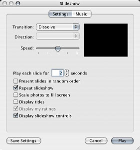
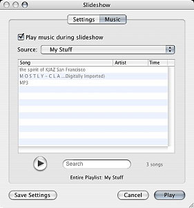
And we could see some new slide show options, too. More than one repeating tune for audio accompaniment was a welcome addition. And the new transitions are cute. They include the OS X Cube (first seen in Keynote and used by Image Capture in Panther during import), Dissolve, Mosaic Flip (which wistfully made us think of Vanna White) and Wipe. Where movement is involved, you can set a Direction. And Speed can be set by a slider. But it's one transition for the whole show. If you want more, you want iMovie.
Just for fun, we clicked on the iDVD button and told iPhoto to launch iDVD. And, mysteriously, iDVD ran as promised. But, no, we still couldn't run it from the Applications folder.
iDVD
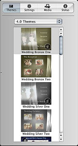
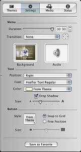
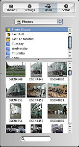
iDVD gives you a Droplet and a Page Flip transition in addition to the iPhoto transitions. You can see all your iPhoto Albums in the Media tab of the Customize drawer. Just double-click a theme button to get to the image import page to build your slide show.
 |
 |
|
| iDVD Customize: Themes
|
iDVD Customize: Settings
|
|
 |
 |
|
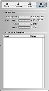
| iDVD Customize: Media |
iDVD Customize: Settings |
|
It's actually easier than it sounds. Customize. Media. Drag pictures. Set transition. Add sound. Fool around with the sequence if you like (by dragging). That's more like it. Then Preview.
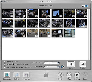 |
| iDVD Slide Show Editing a slide show is just drag, drop and click easy
|
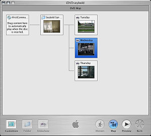 |
| iDVD Map Get lost? Just click on the Map button |
And, boy, is it easy to make a very slick presentation in just a few seconds. iDVD has been light years ahead of any other DVD authoring tool. And productions made with it have always looked significantly more sophisticated. That's even more true now.
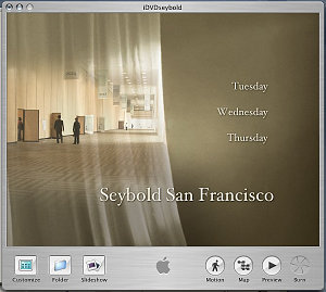 |
| iDVD Project It just took seconds to slip this Theme on our slides |
But sadly, we couldn�t figure out how to burn the show to a CD for playback in a DVD player. What law of nature does that violate?
GARAGEBAND
Just briefly. It borrows from Canto Cumulus that annoying open-last-opened-file behavior that drives us nuts.
But after we launched it and started a new tune, we were able to browse the numerous loops, put a couple of tracks together and get an actual tune going. Very easily, we might add -- although we appreciate some documentation (http://docs.info.apple.com/article.html?artnum=93615) for something so new.
Trouble was, we didn't like our tune.
Maybe if we knew what we were doing or recognized the verbal descriptions of the loops, we'd know what to do. But our tune came out dressed in Argyle socks with plaid pants and a striped shirt.
Maybe we should stick to voice-overs. GarageBand might make narrating a slide show easier than ever. Run the show and record your comments in real time. Add a little sound track, save the thing and associate it with the Album.
iMOVIE
While waiting for our polo shirt angel to deliver the goods, we were engaged in conversation with a guy who was desperately trying to learn video editing. He had a couple of books in his hands and was about to buy the Family Pack of iLife '04 until we stopped him.
The trouble with books is that they aren't updated as fast as software. He had some iMovie 2 titles. Not relevant to iMovie 4. Yeah, he said, he couldn't find the Transitions in the version of iMovie 4 running on the demo machine. Did we know where they were?
No, man, we're into stills, sorry, we explained. We just use iMovie for slide shows.
So we couldn't resist launching iMovie, one of the more polished apps in the suite, to see if we could find the transitions. Sure, right there on the little toolbar. You just drag them to the Timeline.
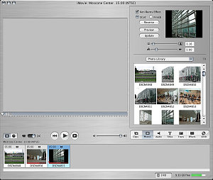 |
| iMovie: Photos Button One click and all your iPhoto Albums pop up |
So we had to try them out. We clicked the Photos button, got a peek at our iPhoto albums, opened one and started dragging Ken Burns effect zoom-ins onto the Timeline.
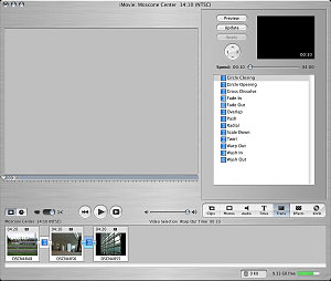 |
| iMove: Transitions Dragged from the list above, the appear as small links between images on the Timeline. |
Then we hit the Transitions button and put a different transition between each five-second image.
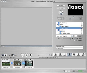 |
| iMovie: Titles More animated titles but just as simple as ever |
It took a while to render the Ken Burns effect and a little while for each transition. But when the clip had been rendered, it played very nicely. Very, very nicely.
But just for fun again, we clicked on the iDVD button and told iMovie to make an iDVD project out of our clip. And iDVD launched again. Mysterious little bugger.
iDVD AGAIN
It loaded our iDVD project, for which we could pick various themes (all the 3.0 themes and the new 4.0 themes) and preview the production.
Weird. This time we took ourselves back to the shelf and tried that Custom install, making sure iDVD was checked.
Did it work? Nope. Back to the shelf with it!
iTUNES
Somewhere in the middle of our review of the Macworld keynote address, we realized we were confused. Was iTunes an application or a music store?
We like iTunes even though we don't have any playlists. Down in the bunker where we do all our keyboarding, we like to listen to Internet radio, which never gets our PowerBook so hot the fan turns on.
That's the one part of iLife '04 we already had installed, of course. And the one we ran without disappointment.
OF UPGRADES & SHELVES
Well, an upgrade is an upgrade. Our little trials and tribulations express our disappointment in how this one flies, certainly, but we'd rather be using the new versions than the old versions, just as a matter of policy (since it lets us install the inevitable updates).
We'd just rather be using them for free in the case of iPhoto, iMovie, iDVD and iTunes. We can live without GarageBand, which is certainly worth $49. But it's a different kind of iLife (or it would have been called iCaramba).
Still, we've touted iLife's ease of use repeatedly, so we were dumbfounded to find this package so obtuse. But we weren't alone, it turned out.
The recent wedding of Larry Ellison of Oracle (once an Apple board member) was photographed by Ellison's son David and Larry's friend Steve Jobs (still an Apple board member). But the local paper had no images of the private event at Ellison's estate because, well, David and Steve were still working on the albums.
Somehow it's always tougher in real life than it looks on the Macworld stage.