PASINI REPORTS
Lightroom 2 -- Turning Work Into Play
 By MIKE PASINI
Editor
The Imaging Resource Digital Photography Newsletter
Review Date: July 2008
Interface refinements, output sharpening, non-destructive local edits, camera-specific profiles with a free profile editor, keyword suggestions, dual monitor support and more highlight the new release.
Among all the software tools we review, Adobe Lightroom is one we actually depend on.
It has made it possible for us to produce our 10-minute trade show tours minutes after the shows open without actually missing the show. And it has made it feasible for us to get a Web gallery up of one event or another (sometimes even just a product review installation) so you don't have to wait for us to finish writing our report to get a glimpse of what's going on.
It was even the tool of choice for our booth reports at this year's PMA trade show. And because it's cross-platform, when News Editor Michael Tomkins had hardware problems with his Windows laptop, we were able to finish a few of the early reports for him on a PowerBook G4.
That says a lot about the handle Lightroom gives us on our typical workflow, but we certainly don't take advantage of everything Lightroom can do. We don't make many prints, for one thing. But whether you're an amateur or a pro, it can really grease your workflow. It can make managing even a casual photo collection a lot more pleasurable for the amateur. And it can brand a wide range of output formats for the pro.
Despite our reliance on Lightroom, we've itched for a more accessible interface and the odd tweak here and there. It can do a lot for you, but it can be hard to find the tools.
So we were excited when Adobe released a public beta of Lightroom 2 with a revamped interface. But the company didn't stop there. There are a lot of new feature in this release.
Recently we attended Adobe's conference calls with Senior Product Manager Tom Hogarty on both the beta (with 130,000 downloads) and the final release versions to get a handle on what's new in Lightroom 2.
This review is based on our experience over the last few days with the gold master version of 2.0 in addition to the beta that has been available for a while now.
That beta expires Aug. 31. A 30-day trial version is available for Lightroom 2, which ships July 29 for $299 or $99 for the upgrade. Use the Imaging Resource Amazon affiliate program to get the full copy for $289.99 or the update for $94.99. And at the same time help support our efforts.
NEW FEATURES | Back to Contents
Briefly, the main enhancements to 2.0 from 1.4 include:
- Library module: Enhanced folder and collections views, suggested keywords
- Develop module: A gradient tool and local adjustment brush, vignette control, revised default camera profiles
- Print module: Picture Package support
- Web, Export and Metadata SDKs for third party add-on development
- Dual monitor support, new color picker, plug-in manager, output sharpening
That's quite a bundle of enhancements. Let's look at them in depth.
SYSTEM REQUIREMENTS | Back to Contents
On the Mac, Lightroom 2 distinguishes itself for its rather modest system requirements compared to Apple's Aperture, its main competitor. We're able to run both on our rather modest PowerBook G4 with its 1.4 GHz G4 and 2-GB RAM, but Lightroom is more responsive.
On Windows, the choices for applications that can handle import, cataloging to a database, non-destructive editing of Raw and JPEG images, 16-bit channel editing and output to print or HTML are limited to Lightroom 1.4 or 2. A few programs do some of that, but nothing is quite in the same league.
The minimum system requirements for both systems are 1-GB RAM with 1-GB of available hard disk space (although the application takes less than 14-MB itself), a CD-ROM for installation and a monitor with a minimum 1024x768 resolution.
Macintosh system requirements add a PowerPC G4, G5, or Intel-based Mac processor running Mac OS X 10.4 or 10.5.
Windows system requirements add an Intel Pentium 4 processor running Windows XP with Service Pack 2 or Windows Vista Home Premium, Business, Ultimate, Enterprise Edition or 64-bit editions.
On both platforms, Lightroom 2 now supports two monitors.
Both platforms also support 64-bit memory addressing. On Macs running Leopard, you enable 64-bit mode by using Get Info on the application and unchecking the "Open in 32 Bit Mode" option. On Windows, either the 32-bit or 64-bit version will be installed depending on the version of Vista running. The program will use up to eight cores.
INSTALLATION | Back to Contents
Before installing Lightroom 2.0, we uninstalled the beta by dragging it to the Trash. Installation from the gold master CD was trouble-free and quick.
When first launched, Lightroom 2 asked if we wanted to upgrade the Lightroom 1.4 catalog it found or create a new Lightroom 2 catalog. We created a new catalog, which is still written in SQLite format.
After that the program was ready for us, but it's wise to review the Preferences panes before actually doing anything. There are a lot of options to tailor to your own needs hidden away there.
PREFERENCES | Back to Contents
While Lightroom 2 represents a major effort to make the application's tools easier to find, the program still offers a dazzling array of options through its six-paned Preferences dialog window. They really can't be ignored.
While the number of panes hasn't changed, several of them include a few more options.
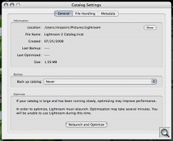
General preferences take you to the new Catalog Settings. Those settings include options for catalog location, backup behavior and catalog optimization to improve performance in its own General pane. The File Handling pane sets preview size and quality as well as when to discard 1:1 previews, plus import sequence numbers. Finally the Metadata pane enables the new suggestion behavior and clears suggestion lists, enables storing edits in metadata for file formats other than DNG and enables automatically writing changes into XMP sidecards. You an also direct Lightroom 2 to write date or time changes into Raw files.
The Presets preferences adds three Restore Presets buttons for Local Adjustments, Color Labels and Library Filters.
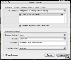
Import Settings. We save a lot of time by having Lightroom write our copyright to the Exif header of our images during the import process.
The Import preferences has not changed, but it remains among the most important to review. It determines if Lighroom's import dialog appears when a memory card is detected and how to treat Raw+JPEG images (separately or as one image). It also enables the creation of DNG images from Raw files on import.
External Editing preferences remains the same, with settings for Photoshop CS3 and an external editor, plus external file naming options.
File Handling preferences now includes a section to select the Camera Raw Cache settings, limit the cache's size and purge the cache.
Finally, the Interface preferences remain unchanged.
LIBRARY MODULE | Back to Contents
Those preferences hint at a few new features (like suggestions) but you won't need any hint to tell Lightroom 2 from 1.4. The interface that greets you has been substantially reorganized.
The Five Rules. You play the game the same way -- according to the five rules in the Help menu -- navigating the program's five modules (Library, Develop, Slideshow, Print and Web) as necessary and controlling the modules by the left and right panels. You still navigate your photo collection using the filmstrip along the bottom (and not, as tempting as it is, by the main display in the middle panel). And the essential key commands haven't changed. Key commands, detailed in the pulldown menus, are power user tools, essential to improving productivity in Lightroom. Oh, that fifth rule is pretty essential, too: "Enjoy."
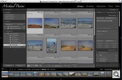
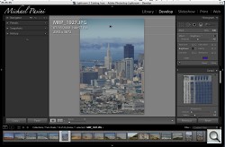
Cleaner Interface. It may look the same from a distance but click to explore the new arrangement, particularly the left and right panels and the new filter bar above the middle panel.
But what you see in 2.0 when you view the Library module screen is quite a different picture from the somewhat cluttered panels of 1.4. Adobe's Phil Clevenger has continued his work on the interface, which he describes in this interview with Frederick Johnson (about the 5 minute mark).
Left Panel. The Left panel in 2.0 has been reserved for image sources only. That not only saves on eyeball rotation, it means you can close the panel once you've loaded the image collection you want to work with.
While the Navigator still sits on top of the left panel, the Library section has been replaced by a Catalog section showing all your photos, all your quick collections (or albums) and the last import.
The Find section, Keyword Tags and Metadata Browser sections have been removed (but not forgotten).
Folders is now a volume browser, showing the name of your device, whether or not it's online, the folders you've imported from it and the available space and its size. The new information helps you manage your devices.
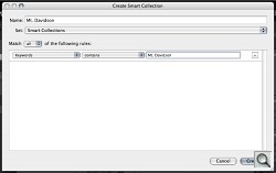
The Collections section now includes a Smart Collections group. Smart Collections populate themselves based on criteria you define when you create them.
At the very bottom of the panel, the Import and Export buttons remain unchanged.
Filter Bar. Adobe has dropped the Find section in favor of a new Library Filter bar above the main panel. That bar has five options: Text, Attribute, Metadata, None (to select all) and a Custom Filter popup.
Text resembles the old Find section with a popup of searchable fields, another for criteria like "Contains All" and finally the field for the search terms.
Attribute filters are based on flag, rating, color or copy status.
By default, Metadata provides four columns from each of which you can select any of 22 criteria to filter your collection. By default the panels are assigned to and display the Dates (including the Day name), Cameras, Lenses and Labels of the current selection. You can add or remove the columns by clicking at the right side of their label bars and you can select a different criteria by clicking on the criteria name, which pops up the whole list. That list includes new fields like GPS, Aspect Ratio and Develop Preset.
None is the equivalent of Select All, disabling any filters so you can see the whole collection again.
Custom Filter can save your settings as a preset, turn them all off, restore the default columns, show flagged images only and more.
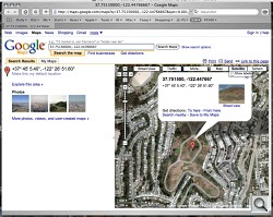
Location, Location, Location. Click that button mentioned above and you can see where the shot was taken.
Right Panel. The Histogram still sits on top of the right panel with the Quick Develop settings right below it.
The Keywording section below them has the Keyword Tags, tag display and entry section as well as the Keyword Set section, but in between them it adds a Keyword Suggestions section. 2.0 will automatically suggest keywords based on what's already in the catalog and the time the image was captured.
There's also a Keyword List from which you can quickly filter the selection based on keyword by clicking on the keyword in the list or entering it in a text box. Immediately, the Filter bar will display the keyword filter and the selected images will be displayed.
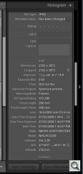
The Metadata section includes GPS data with a click box that will open your browser and show you the location of the image at Google maps.
Finally, at the bottom of the panel there are still the Sync Settings and Sync Metadata buttons.
Toolbar. The toolbar below the main panel remains unchanged.

Dual Monitors. Click No. 2 to select what appears in your second monitor. Simple.
Miscellaneous. Between the three main panels on top and the filmstrip below, there's something of a status bar. This now includes dual monitor support. Just click on the second monitor icon to enable display of any of several views including Grid, Loupe, Compare and Slideshow.
In general, the Library module changes make it a lot easier to find your images, collect them quickly, sort through them, compare them (especially using a dual monitor) and keyword the collection (particularly if you take advantage of the Import action's ability to add keywords on import).
There's never going to be enough room on a monitor to display all the sections of each panel fully expanded. But you can collapse them all and just open what you need to use. Even then, some sections will require scrolling, but 2.0 seemed to require less of it than 1.4.
DEVELOP MODULE | Back to Contents
If the Library module changes are efficient, the Develop module's changes are productive. With the addition of local image correction tools, there's less reason to use an external editor in Lightroom 2. And the side benefit of that is the non-destructive nature of the new edits Lightroom 2 affords.
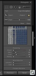
Edit Toolbar. Those start with a new toolbar just below the Histogram in the right panel. The Crop Overlay, Spot Removal (with a new icon), Red-Eye Correction tools have moved from below the image pane to this new toolbar.
Healing and Clone in the Spot Removal tool now include an option to change the opacity.
Added to them are the Graduated Filter and Adjustment Brush tools.
When you click on any of these tools, a panel of options drops down. Click again to hide the panel (or use the Close button at the bottom of the panel). This approach gives a little more room to display and organize the tool's options than the older method on the toolbar.
The Graduated Filter provides a gradient mask through which you can adjust Exposure, Brightness, Contrast, Saturation, Clarity (midtone contrast) or Sharpness. Holding the Shift key down as you draw the mask will restrict the angle. An Amount slider adjusts the effect.
And because this is a non-destructive edit, which does not touch the original data, you can simply select the pinpoint indicator (hidden with the H key) to edit any aspect of the effect. No undo, just fiddle until the cows come home.
But wait (there's more). Click on the Effect popup menu (where is says Custom -- or Brightness or Sharpness in our screen shots) and you can save your settings as a Preset. So you can build a set of brushes to do the kinds of things you often do, call them up and apply them -- and even edit them to suit. All without touching the original data.
Non-destructive edits, incidentally, are stored in the database for JPEGs, in the DNG file itself and in an XMP sidecar file for Raw images. Consequently, to pass these edits along to other applications, JPEGs must be exported and sidecars included with Raw images.
The Adjustment Brush provides exactly the same options as the Graduated Filter but because it's a brush it includes Size, Feather and Flow settings as well. You can also adjust the Density of the effect and set an A or B or Erase mode.
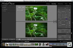
Adjustment Brush. We sharpened the flower with a single, editable brush stroke. Note the pin point indicating the editable stroke.
Using an Adjustment Brush set to Exposure, for example, can dodge or burn an area. Using one set to Sharpen can paint sharpness on to the eyes of a portrait. These are the kinds of things you used to have to export to Photoshop to do.
But for those of us who have trouble coloring between the lines, the Auto Mask check box will be worth the upgrade itself. Auto Mask confines the mask to a similar area, so the roof line of a building or the edge of a hat constrain the effect.
Still, if you went too far or don't like the results, you can simply select the pinpoint representing the mask and change the sliders to improve things. The edits are editable. And you don't have to fiddle with the sliders if you don't want. You can just click and hold in the image area to grab onto an invisible scrubber to increase or decrease the effect.
Holding down the Z key zooms in to magnify the image while retouching, as in 1.4.
We found performance of these two new tools pretty sluggish on our system. They were certainly usable, but they lacked the immediacy of drawing the equivalents in Photoshop.
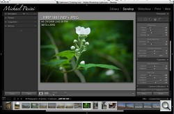
Vignette. New vignette tool let us darken the corners and change the feathering and rounding of the vignette.
Vignettes. New in the right panel is the Vignettes control. You can darken or lighten the edges of an image with the Lens Correction section's Amount slider. The Midpoint slider affects how far the darkening extends into the image. There's also a Post-Crop section to affect Amount, Midpoint, Roundness and Feather.
Camera Calibration. Hogarty spent some time discussing 2.0's expanded Camera Calibration section. At first glance there doesn't seem to be any change from 1.4, but the company did a lot of research to develop a default profile that more closely matched the JPEG thumbnail you see in your camera's LCD when you shoot a Raw image.
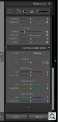
Calibration. A separate download from Adobe Labs provides camera-specific options and a free profile editor to roll your own. Here Profile ACR 4.4 has been used.
Consequently 2.0 ships with a newer default (ACR 4.4) as well as the previous default profile (ACR 3.3). The number corresponds to the Camera Raw release in which they first appeared. But the company has also provided camera-specific profiles with a range of options (faithful, landscape, neutral, portrait, standard for a Canon dSLR) so you can more closely match what you thought you saw in the field. If Lightroom detects a Nikon image, it will display only the Nikon profiles, so you won't be able to use a Nikon profile on a Canon image.
Raw previews are the source of a lot of confusion. The problem is that Raw files are not processed images. The JPEG thumbnail you see on the camera's LCD is just one interpretation of the data. Camera Raw may, by default, make quite another. And Lightroom yet another. None of them are more accurate than the others. But you have to rely on one of them to make your adjustments.
Canon users of 1.4 complained that the Adobe default preview muted the reds they saw on their LCDs, so Adobe's 2.0 default bumps reds up on Canon images to be truer to what the camera's LCD displays.
The profiles Adobe provides are all based on the DNG 1.2 specification. That makes it possible for other applications to read and write them. And the company has already built a DNG profile editor so you can create your own, as well. Adobe's DNG Profiles Editor tutorial shows how to build a profile from a 24-patch ColorChecker Chart that works well under a wide range of light sources.
Beta camera profiles are available from Adobe Labs along with the free profile editor.
OUTPUT MODULES | Back to Contents
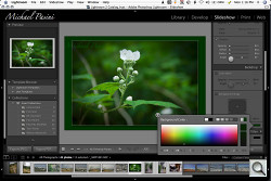
The new Color Picker lets you sample your image to select background colors for various output options like slide shows. Just click the color field to display the color picker and hold the mouse button down over the field before dragging the pointer to a spot on your image. The picker will show that color as the selection.
Another new (and desperately desired) feature for most of the output modules is Sharpening for output. We'll highlight that feature where appropriate. The lack of any kind of output sharpening in previous versions was one of our bigger aggravations, so we're particularly happy to see it implemented in 2.0.
Slideshows. In the Slideshow module, the Titles section lets you add Intro and Ending slides to the show, optionally with an Identify Plate.
And the Playback section lets you indicate which screen to play the slide show on, the duration for slides and fades, whether to use Random Order and in 2.0 whether to Repeat. You can also select a Soundtrack to play with the show.
An Export JPEG option has been added in addition to the Export PDF button. This will write a JPEG file for each image in the show to a folder you specify.
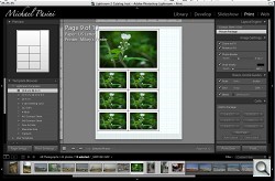
Print Module. The Print module now offers a layout editor with either a Contact Sheet/Grid (the previous approach) or Picture Package approach.
The Contact Sheet/Grid option uses the templates familiar from 1.4 to print multiple images on a page.
With Picture Package you can print various sizes of the same image on a page with the layout designed to minimize the number of cuts you have to make. Since it's template based, you can save your arrangements for reuse, too.
Here, too, is where we first saw the new output sharpening options Adobe developed with the help of the late Bruce Fraser. Fraser's book Image Sharpening with Adobe Photoshop CS2, which we reviewed in the newsletter, is the classic text on the subject, discussing sharpening strategies, tools and techniques.
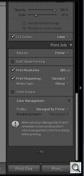
Print Sharpening. Three options (Low, Standard, High) plus two media types (Glossy, Matte). 16 Bit Output enabled on Leopard only.
In the Print module, Print Sharpening can be set in the Print Job section to select Low, Standard or High options. You can also specify whether your media is Glossy or Matte.
The image, which may be of different sizes on any particular page, are sharpened on the fly for the printer and not saved with the image, reducing the chance of oversharpening and the need to remember if the image has already been sharpened for output.
There's also a 16-bit output option enabled on Mac OS X 10.5 Leopard.
Soft proofing is still not available in Lightroom. Hogarty explained that while the feature, which simulates on the screen what the printed image will look like, is already available in Photoshop, the team wants to roll their own version. It's a burning issue they want to address, he said, but it's not a small task.
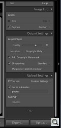
Web Module. The Web module also includes a Sharpening option, a single checkbox in Output Settings with Low, Standard and High options. You can't evaluate the setting on screen because it's only applied on output.
A new Preview-in-Browser button exports the template-based gallery and opens the index page in your browser.
The Web module is an odd duck in that it's one output module in which you may also create content like captions, titles, descriptions. Unfortunately none of that is saved except as the final export HTML or Flash, so subsequent edits all have to be done with another application. It can be confusing to chase down all the places a title or description can hide, so editing these things isn't much fun.
In addition to the templates provided, Lightroom Exchange offers 16 export modules to easily upload your galleries to Flickr, Picasa, SmugMug, Zenfolio, Couture Book and Gallery 2.
Those export modules are based on the export Software Development Kit provided earlier this year by Adobe for Lightroom. The official version of that SDK is about to be released, Hogarty told us.
Export plug-ins are just the tip of the iceberg, though. With the release of the full SDK, you can expect to see image processing plug-ins as well, although they'll have to work seamlessly with Lightroom's non-destructive editing (not, that is, be bit-mapped edits). Photoshop integration plug-ins, for example, might open the current image as Smart Object, or a selection as a Panorama or HDR image or in separate layers.
To manage what Adobe expects to be a wealth of new plug-ins, Lightroom 2 includes a Plug-In Manager. The Manager can load, remove and find new plug-ins with a button to go directly to the Lightroom Exchange.
While we've only had a few days to test drive Lightroom 2.0, that's been enough to remove 1.4 from our drive. We aren't going back.
We were immediately charmed by the friendlier Library module interface, delighted by the new (non-destructive) local editing options and thrilled by the new output sharpening option. Camera profiling is going to be a nice new hobby, too, we suspect.
Lightroom has always made managing our shoots easier and even helped us develop new ways to serve readers of our reports. The new version makes the interface less of a puzzle and provides significantly more functionality. The net effect turns the work of image management and editing more than ever before into creative play. Outright prolonged applause.
