FOCUS ON QUALITY & PERFORMANCE
Inside Adobe's Lightroom 3 Beta

By MIKE PASINI With MICHAEL R. TOMKINS
Editor
The Imaging Resource Digital Photography Newsletter
Preview Date: October 2009
As Lightroom Product Manager Tom Hogarty stepped through his brief demo of the Lightroom 3 beta being released this week, he let slip that this was the seventeenth release of the product in under four years. We gasped.
In January 2006, Adobe surprised not only Apple (hard at work on Aperture) but the rest of us when Shadowland came into the light as Lightroom and was made available to anyone as part of public beta program. The company found the feedback invaluable and has continued to release major revisions to Lightroom as public betas.
And with Lightroom 3, you once again won't need a license number to use the beta.
That, we suspect, is because this beta is, as Hogarty put it, a "very early beta" with no final features set. It won't read your Lightroom 2 catalogs and you really shouldn't work with anything but copies of your images with it, he cautioned. It's a beta release that's been cooked a bit past raw but not quite medium rare, he added.
In contrast, the Lightroom 2 beta was ready for a knife and fork while the original Lightroom 1 beta, which dragged on for over a year, was barely raw, lacking even a crop tool. The current application supports 250 camera models, testifying to the company's commitment to support new hardware.
With Lightroom 3 just entering the public beta phase, Hogarty wasn't ready to set a release schedule. But he did say he expects the product to ship in 2010.
NEW FEATURES | Back to Contents
But the state of the beta doesn't relate to the effort put into it. Hogarty highlighted a few new features, which he divided into three basic Lightroom functions: Manage, Edit and Present.
New Manage features include:
- Redesigned Import experience
- Performance enhancements for growing image collections
- Workflow enhancements throughout the product
- Seamless integration with online photo sharing sites
New Edit features include:
- Sharpening and Noise Reduction improved with new methods
- Versioned processing code to identify which algorithms were used to process the image
- New creative Grain tool for adding texture
- Improvements to Vignetting
New Present features include:
- HD video slideshows with embedded music
- Customized print layouts you create with drag-and-drop ease
- Full watermarking
You'll note that support for video files is not in the list. When asked about that, Hogarty acknowledged video is an important "industry trend" but support for video files is not in the beta.
MADNESS & METHOD | Back to Contents
But behind the laundry list is Adobe's appreciation of Lightroom users as photographers -- either "demanding pro" or "passionate amateur," as Hogarty characterized them -- who 1) do not compromise on image quality, 2) inspire others with their images and 3) need professional presentations.
For them, the company focused their efforts on improving image quality with "best of breed" solutions and ramping up performance so the quality improvements don't slow processing to a crawl.
We were curious how the Lightroom crew approached the performance issue after seeing how the CS4 engineers tapped into OpenCL programming and GPU processing. But the new system requirements, if not a surprise, suggest they haven't gone there yet. And, in fact, Hogarty confirmed "Lightroom does not utilize the GPU in the same way that PS CS4 does."
On the Mac, an Intel-based processor running Leopard (OS X 10.5) or Snow Leopard (OS X 10.6) is now required. On Windows, an Intel Pentium 4 class CPU running Windows 7/Vista/XP. Both platforms support 64-bit processing, as does Lightroom 2.
While the application will run in 1-GB of RAM, Hogarty said feedback from photographers using the application convinced them to set 2-GB as the requirement. Performance was significantly improved with 2-GB available.
You need 1-GB of disk space for the application and a 1024x768-pixel display minimum. Two monitors are supported as well.
UNDER THE HOOD | Back to Contents
The details are in the demo. So we followed Hogarty along as he stepped through a few of the more compelling features in each module.
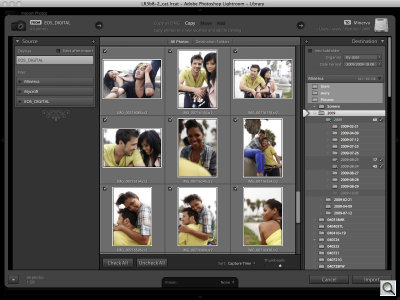
Library Module. The first of which was the redesigned Import function. Lightroom 2 presents a disorienting interface to new users and the new approach tries to minimize the confusion. It does that by laying out the Source and Destination panels in a left-to-right orientation so you can visualize what's going to happen.
Source (your card) is on the left while Destination (your hard disk) is on the right. In between, you see your images, which you can select for import.
Beyond that clarity, Import now has Presets so you can save your import settings for reuse. And the actual file import is faster, he added.
Develop Module. Hogarty showed us half a dozen new tricks in the Develop module where the serious image tweaking gets done.
The first was improvements to noise reduction. The team's goal to provide "best-of-breed" features to the workflow infrastructure Lightroom is famous for has some established and capable competition in the noise reduction arena.
Hogarty showed us three samples from a larger image of Michel Cluizel chocolate boxes in a dimly lit store. The first was Lightroom 2's default rendering, which showed just how noisy the original image was. The second was Lightroom 2 with NR applied and the third was Lightroom 3 with NR. At first glance, the difference between the NR images wasn't apparent, especially next to the noisy camera image. But in reducing the chrominance noise of the dark box, Lightroom 2 had also softened the type. Lightroom 3 had not.
The beta will let you play with the improved algorithm for eliminating chrominance noise, color variation in a flat, usually dark field. But luminance noise, tonal variation, has been disabled.
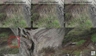
Hogarty did the same thing to demonstrate Lightroom 3's improved sharpening algorithm, showing a sample outdoor image with no sharpening, Lightroom 2 sharpening and Lightroom 3 sharpening. The difference between the two sharpened images was that Lightroom 3 appeared more natural with small branches clearly discernible but without the "crunchy" look to everything in the Lightroom 2 image (and which is pretty much what you want to see when you go to print).
These new algorithms led the team to version the processing code, which Adobe has never done before, Hogarty observed. This simply tracks which version of the Camera Raw or Lightroom code was used to process an image. A warning icon alerts you to images processed with code prior to Lightroom 3. From the Settings menu, you can select Version 2 or Version 1 code to process any image, although by default Lightroom 3 will apply Version 1 processing to older images so they look the way you thought they did.
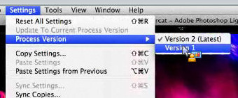
Process Versioning. Which algorithms were used to process the image? The Beta knows.
Improving the old isn't all that's going on in the Develop module, though.
Hogarty showed new options for post-crop vignetting and the new grain filter. Post-crop vignetting, which appeared in Lightroom 2, gets a little more "photographic," Hogarty said. It still offers amount, midpoint, roundness and feather options but adds a new contrast option. Two style settings will be available to play with in the beta but the team wants to release only the most popular one. Grain control provides amount, size and roughness sliders to simulate film grain texture.
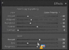
Post-Crop Vignetting & Grain. Improved and new.
Finally, you don't have to sneak back to the Library Module to navigate your collection any more. Lightroom 3 includes the Collections panel in the Develop Module.
Slideshow Module. Along with presets for various video output formats (including iPOD, 1080p HD video, etc.), the Slideshow Module can now embed music. And it can stretch the show to end with the sound track or just fade the audio after the last image.
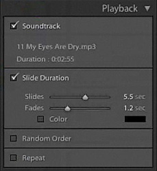
Talkies. The Beta brings sound to slideshows.
Although there are third-party plug-ins that can get the job done, we'd like to see the slideshow option veer toward the narrated audio presentations of still images we're seeing more and more of lately. Music is fine for wedding photographers, but sometimes you have to tell a story, not just set a mood. And if the game is to be best-of-breed, Adobe has some breeding to do here.
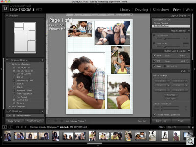
Print Module. In the Print Module, the big news is being able to build your own layout, which joins the traditional contact sheet and picture package layout options.
This takes no more effort than dragging and dropping images onto the sheet and arranging them (Send to Back/Backwards, Send to Front/Forwards, Rotate, Delete, Match Aspect Ratio, Anchor). And you can have more than one page in the custom layout, too.
In another small but welcome touch, you can now change the background color of a contact sheet from white to black.
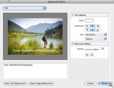
Web Module. The new Watermarking Editor expands the Add Copyright Watermark checkbox in Lightroom 2 into a small side business. In addition to entering custom text, the Text Options include color, alignment and font settings while the Watermark Effects include an opacity setting and rotation buttons. You can also use an image. No blending mode options are available. You can save these as Presets for recall later from the Output Settings panel and is available with printed and exported images as well.
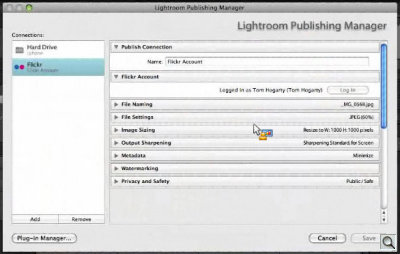
Adobe has expanded the concept of a Collection to include photo sharing sites. So you will be able to transmit your images to a wide variety of online photo sharing sites just by dragging them to the Collection for that site. For the beta, Adobe wrote a Flickr prototype Collection plug-in based on the familiar Export plug-in. Developers at other sharing sites can simply use that model to build a plug-in for their own service.
For the photographer, the Lightroom Publishing Manager collects all the information needed to connect to an account at a service as well as any preferred behavior, then adds the account to the Publish Services panel on the right side of the Lightroom window in the Library Module so it can easily be added to like any Collection. An option will even load the site in your browser, addressed to your new upload.
But Lightroom 3 will also track metadata like comments from the Web. If someone comments on an image you've posted on Flickr, for example, Lightroom 3 can report the comment and let you reply, even updating an image or maintaining an album with a Smart Collection.
Hogarty said Lightroom is "making an important step forward" with this beta, engaging not just what's stored on your desktop but also in the cloud.
CONCLUSION | Back to Contents
One reason Adobe isn't resting on Lightroom's laurels is because Lightroom is developed by avid photographers who happen to be in the driver's seat of the workflow application they most prefer. They use the thing themselves.
Another reason, though, is that development of major releases is driven by a large community of photographers who participate in the public betas to make their preferred imaging solution even better. They get a vote.
The combination has developed one of the few applications you ignore at your peril (because your competition may be using it) -- and done it in less than three years. Take advantage of the opportunity to try it now.
(Special thanks for News Editor Michael R. Tomkins for providing most of the screen shots.)
