ADOBE ANSWERS APPLE
The Lightroom Experience
 By MIKE PASINI
Editor
The Imaging Resource Digital Photography Newsletter
Review Date: January 2006
After a particularly intensive session with Apple's Aperture one day, we wondered why Adobe hadn't come up with something similar. They'd certainly made a few stabs at it with their amateur offerings but the power of Photoshop must have blinded them to simplifying a high end workflow, we thought. There was Bridge and Adobe Camera Raw, but they aren't simple tools.
|
|
Silly us. For a couple of years, Adobe has been working on a secret project code named Shadowland, the ultimate pro photographer workflow tool. They leveraged much of what they built in other products from keywording in Album to Raw processing in ACR.
It evolved into four main functions: building a library of images, editing individual images, creating a slideshow and printing. The interface was designed to get out of the way of the work of evaluating images, enhancing them and presenting them.
It supports open standards like Adobe's Digital Negative format along with broad support for file formats. It's cross platform (although the Windows version is taking a little longer) and asks only "reasonable" system requirements. And it plays well with others.
It's ready to ship except one crucial thing is still missing.
THE MISSING INGREDIENT | Back to Contents
The missing ingredient is your feedback. Taking a new approach to product design, Adobe's digital imaging team decided to hold the commercial release until they'd gotten your opinion of the product. So they've released the product as a public beta which will expire in June.
You can download the newly-christened Lightroom 1.0 beta and contribute your feedback in three forums at the new Adobe Labs site. The forums address General Issues, Bugs and Feature Requests. The company plans to ship the commercial release by the end of the year.
"A good product," said Kevin Connor, senior director of digital imaging at Adobe, "takes on a life of its own." Photoshop, he said, grew into something no one would have guessed when they released the earlier versions. And by getting broad user input from the start, Adobe hopes Lightroom will develop more quickly into the kind of tool you need.
WHAT IT DOES | Back to Contents
Lightroom's job is to help digital photographers with high-volume image workflows get their work done more efficiently. It does that primarily by presenting a streamlined interface targeted to common tasks.
This isn't a tool like Bridge for managing complex publishing projects. Nor is it merely a digital asset manager. It can make swift and significant image edits but it complements Photoshop by handling the simpler work, much as Aperture (or, for that matter, iPhoto) does.
And while it does slideshows and prints, the beta won't build Web pages. It is, in many respects, unfinished.
But its innovation is the interface. Adobe is so sure of the friendliness and efficiency of Lightroom's interface that it offers only five rules to get you started. There's no other documentation.
The five rules appear the first time you launch Lightroom and are available from the Help menu if you want to review them. You won't need to, though.
Rule One explains the Module Picker, otherwise known as the Menu bar. But Menu bars are like closets that never get cleaned out. Programmers toss everything in there they've ever used whether or not it makes sense.
Modules are a bit different, a bit more disciplined like accordion folders. A slot for the mortgage, another for utilities, another for bank statements, etc. There are four modules in 1.0: Library, Develop, Slideshow and Print.
Adobe says they correspond roughly to a photographic workflow. When you select one, the panels on the left and right sides of the screen switch to the appropriate tool sets.
Rule Two explains the Panels. The left panel is a bit more generic than the right panel, which often contains the sliders and checkboxes to do specific tasks. The headers are collapsible and the panels themselves are scrollable using elevators (but not a scroll wheel, unfortunately). Change modules and you get different panels.
Rule Three explains the Filmstrip. The bottom of the screen displays your library of images in a scrollable row. If you are working on a selection of images, they'll be in the Filmstrip.
Rule Four list several important key commands but Lightroom is full of single key commands that are easy to learn.
Rule Five is, well, you'll have to see for yourself.
Missing from the rules is the obvious. The central pane of your screen real estate is the thumbnail panel. By default, Lightroom shows you a Grid view (whatever fits -- and, yes, you can resize them). But there is also a Loupe view (fit in window) and a compare view (which displays any images selected in the Filmstrip).
THE LIBRARY MODULE | Back to Contents
So what can you do in Lightroom?
To find out, we put our laptop to sleep and left the building with a new Fujifilm FinePix S 5200 in the review process. We took a lot of, uh, extreme shots. Then we came back from our shoot and copied the card's contents to our hard drive, like we usually do.
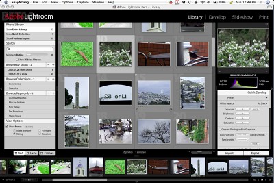
That's when we brought Lightroom up. We clicked the Import button in the right panel and took a look at our options. We liked what we saw.
FILE HANDLING | Back to Contents
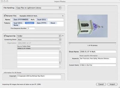
The first thing we liked was our File Handling options. Adobe is letting you have your cake and eat it too, unlike other workflow managers. You can browse your existing collection or you can create a Lightroom Library of your images.
 |
| The Import Dialog Box |
Here are the File Handling options:
- Reference file in existing location. This leaves the originals where you put them. No doubt you have an existing archive and working directories. You don't have to abandon that with Lightroom. Lightroom will build its database and edits of your originals, but it won't copy or move them to its Library.
- Copy file to Lightroom Library. In this case, your originals are copied to the Library, duplicating your collection.
- Move file to Lightroom Library. And here, the originals are copied and then deleted from their original location. So you only have one copy.
- Copy photos as Digital Negative (DNG). Amusingly enough, this will even convert a JPEG into a DNG. In an earlier test, we did just that. It was slow going but it worked and, surprisingly, we were able to make some fairly wide ranging tonal and color adjustments. Not surprisingly, they tended to bring us right back to where we started (the original JPEG) from a rather over-exposed DNG thumbnail.
Under the hood, Lightroom is building at least two SQLite databases. One for the library and another for the thumbnails. Depending on your File Handling options, it can also manage your image files in its own collection.
Adobe told us they're the inventor of non-destructive editing (a bit chagrined at Apple's championing of the concept), but it might be helpful to define the term. It does not mean you can't delete or lose your originals. It does not mean you can't destroy your own work. It does not mean these programs can swallow anything you import into them. What it does mean is pretty simple. Edits to the originals you import will be made to copies of the originals, not the originals themselves.
Rename Files. If you select Copy, Move or Copy as DNG, you can also Rename your files. A name template uses tokens you drag into it, some of which popup to reveal options (like the Date format). You can also set the starting number. And you can certainly just type in a constant, as we did.
Segment. If you're importing a collection that spans more than one day or folder, Lightroom can maintain that organization in its library. You can disable this, too, or define a Containing Shoot to include the whole Import.
Copyright. This is the only metadata that you can plug in on Import, but Adobe assured us they plan to expand this feature. (That's opt-g for the Copyright symbol, BTW.)
You can preview the images in the Import dialog box and you can add a Shoot Name, Keywords and Custom Name, which apparently are written into the database.
 |
| The Interface Just after an import |
Adobe touts the flexibility of Lightroom's file handling and we're sure it will be welcomed by many photographers who are a little wary of letting a database handle their images (as Aperture does). But unless you're the sort who stuffs cash under the mattress, databases are something you already rely on. Probably the worst thing you can do is use both approaches, adding some images to the Library and references others. You may easily lose track of which originals you've asked Lightroom to preserve and which you've taken responsibility for. We find no inherent advantage to either approach, but we caution you to think about your decision.
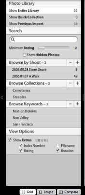
Adobe has added a few terms to the lexicon to explain how your images are organized. The Library contains Shoots. An image can be a member of only one shoot. To organize images outside their shoots, you create Collections.
 |
| Library Panel |
Collections. Press the Plus icon on the Collections bar and type in a new name. Select a few images in your Library and drag them to the new name under the Collections bar and there you have it.
Deleting images from a Collection does not delete them from the Shoot.
Quick Collection. You can tag images temporarily to be included in a Quick Collection. Just click on the empty circle in the top left of the image and it's added to the Quick Collection. This is a nice way to cull a few images from a shoot without the formality of creating a Collection.
Previous Import. You can always display images from just the last import.
Keywords. Assigning Keywords works just like Collections. It's an image-centric way to group shots and keyword them. You aren't working with tags or fields, you're working with images.
View Options. Finally, you can set a few options for what the Library module displays. The Show Extras option enables the display of image Index Numbers (an attractive gray number on the background on which each image sits), a Rating (easily assigned from the keyboard, BTW), Filename and a Rotation control.
We had rotated our images in the camera, but none of that stuck in Lightroom. Selecting a group of images and clicking the Rotate control on any of them rotated all of them. But if the Shift key was held down, the rotation went in the opposite direction. There are two Rotate commands on the image, one clockwise and the other counter.
You can apply a rating of 0 to 5 using the keyboard keys 0 through 5 to any selected image. Or you can switch to Loupe mode, viewing one image at a time as large as it fits in the display pane and press a rating key as you scroll through the set with the arrow keys.
Then you can restrict the view to images with a minimum rating using the Search box Minimum Rating slider.
 |
| Quick Develop |
QUICK DEVELOP | Back to Contents
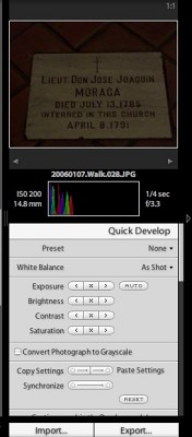
Lightroom (a play on Darkroom) likes to call image editing "development." Even in the Library module, you can apply some quick edits to any image or selection of images using the Quick Develop options.
First, there are a number of Preset edits (which you can create yourself) that you can apply. Second, you can change the White Balance. Third are Exposure, Brightness, Contrast and Saturation options that with a click increase, reset or decrease the option. Exposure also has an Auto option.
You can also Convert Photograph to Grayscale.
Finally, Quick Develop takes advantage of Adobe's non-destructive editing to copy and paste edits from one image to another. You can even Synchronize edits between images. And because it's non-destructive, you can Reset the edits.
In the same pane, BTW, are the Info (with keyword and copyright data) and Exif Metadata displays. Just scroll down to see them.
THE DEVELOP MODULE | Back to Contents
Adobe cautions that Lightroom is no substitute for Photoshop. But where Photoshop has every possible tool hanging from hooks in its menus, Lightroom plays the handyman who can fix just about anything with no more effort than a phone call.
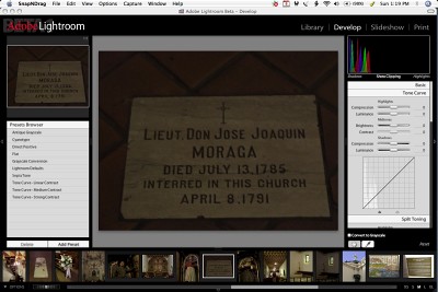
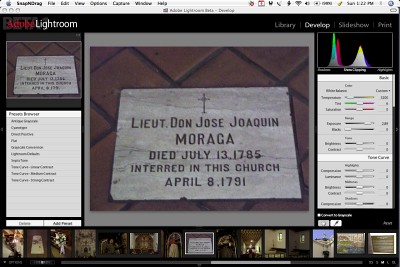
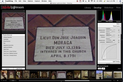
We took a very underexposed image of a grave marker shot in the dark nave of Mission Dolores and used two different techniques available in the Develop module to improve the image.
 |
| Unretouched |
 |
| Basic |
 |
| Tone Curve |
Basic. First, we used two of the Basic adjustments. We knew the image was underexposed, so we simply moved the Exposure slider to the bright end. Ah, much better. We could see the red in the tile floor but the marble marker was quite yellow. To correct the color balance, we selected the White Balance dropper and clicked on the white marble.
Tone Curve. After reverting to the original underexposed image, we used the new Tone Curve tool. Adobe has provided a user-friendly but still powerful Curve tool in this version. O'Connor explained that Curves can do anything but it's hard to get them to do something specific unless you're a master. So Adobe built a better Curves tool.
The usual Curve is there but you don't click on it to anchor points and drag others around. Instead, you observe the new histogram in the background as an aid to setting two markers. One marks the spot between Shadows and Midtones. And the other marks the spot between Midtones and Highlights. Once you've divided the Curve to match the image, you use sliders above the Curve display to modify each part of the Curve.
Highlights has two sliders: Compression and Luminance. Midtones has a Brightness and a Contrast slider. And Shadows gets Compression and Luminance sliders, just like Highlights.
It sounds more complicated than it actually is. The Histogram is a great help in evaluating where to set the markers. And the sliders let you work on just the parts of the image that need it. Curves with training wheels, maybe, but you get where you're going.
Raw images have a good deal more at their disposal, inheriting Adobe Camera Raw functionality and, like the Curves tool, making it a bit friendlier.
THE SLIDESHOW MODULE | Back to Contents
Probably the first thing you want to do after any shoot is see a slide show of the images. But for some inexplicable reason, this is much harder than it should be. Ideally, you'd like to just drag the imported folder of images onto a slide show program's icon and, uh, see the slide show. Unfortunately, you have to jump through other hoops before you ever get that option.
 |
| The Slideshow Module |
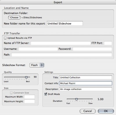
Lightroom doesn't make it any easier and certainly doesn't add any polish to the task, but it is, after all, a beta. There's a rudimentary slide show function that lets you tweak the presentation but doesn't delve into the more powerful world of animated slide shows like Boinx's Fotomagico or Photo to Movie. Even worse, the output options avoid any sort of MPEG or AVI option, relying instead on HTML, PDF and Flash.
But here's one place where Lightroom's branding is useful. Lightroom calls it the Identity Plate. You enter your name (or your business's name) and it appears not only where Adobe Lightroom's name appears on the application but on each slide as well.
THE PRINT MODULE | Back to Contents
A little more attention has been paid to the print functions. There are a number of templates, for one thing, and in the opposite panel a good number of options, too. And everything seems to work well with any printer driver (which, sadly, is not the case with iPhoto, say).
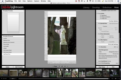 |
| The Print Module |
Here, too, Identity Plates can be applied, varying Opacity and Scale. You can add Exif data, too, and maintain a border, even print multiple images on one sheet. The flexibility is extensive and accessible. If we were disappointed by the slide show options, we were impressed with the printing power.
This is particularly true when it comes to printing a lot of high res images as thumbnails. Lightroom can, when you enable Draft Mode printing, scale the images down and print them very quickly. With sharpening. Very cool.
We should have suggested you download the beta and come back to our first impressions only if you got confused or wanted to compare experiences. But we figured Adobe's servers would be so swamped with requests, you'd have some time to kill. There's nothing like trying it on for size, though, and since it's a free public beta, there's almost no impediment.
But we'd urge you to take your half of the deal seriously, too. Adobe wants your feedback and typically it's the quiet types who have the most to say. Make note of what bothers you, what you miss, what you really like and post a note on the appropriate Lightroom forum.
Lightroom is, no question, a work in progress. In a sense, it's a slave trying to break free of its chains. And you are the one who can help it. The chains are the conventional idea of what you need. Which always falls a bit short of the dog bone. But Lightroom provides an efficient and pleasant approach to the work of being a photographer. And for that alone, it's worth pursuing.