EVERYTHING YOU NEED
Photoshop Album 2.0
-- The Gloves Come Off
 By MIKE PASINI
Editor
The Imaging Resource Digital Photography Newsletter
Review Date: November 2003
In the summer, the Adobe Trio dropped by to sing the praises of the beta of Adobe Photoshop Album 2.0.
Lead singer Jim Mohan (and senior product manager) assured us that they'd carefully studied our quibbles about version 1.0 (http://www.imaging-resource.com/SOFT/PSA/PSA.HTM) and completely redesigned the product.
We were all ears.
THE CATEGORY
This is an important software category. You can drop off your flash memory card as if it were film at some photo finishing shops to get prints. But most digicamers are on their own after they press the shutter.
In the beginning that meant laboriously transferring images from the card to your computer to print from an image editor after setting the image size and resolution and perhaps cropping and fixing red-eye.
What you did with the images after they got to your hard disk was your problem.
That was fine for the pioneering types but now that the rest of us are along for the ride, all-in-one applications that manage the collection organizing, retrieval and sharing of our images matter. A lot.
Apple figured that out early with the introduction of iPhoto. Companies like Kodak and Lifescape with online photofinishing divisions didn't waste time provided front ends for their output services. And finally Adobe itself jumped into the ring with Album.
VERSION 1.0
We thought the original Album acquitted itself very well, taking six rounds in a virtual 10-round bout with Kodak's EasyShare (http://www.imaging-resource.com/SOFT/ESY/ESY.HTM) and Lifescape's Picasa.
The rounds they lost, though, were big ones. Album isn't cross-platform and we found the interface cluttered.
Since then Kodak has released an OS X version of EasyShare and Picasa has had a minor update. But Adobe has taken off the gloves. We went a few rounds with the shipping version recently to see what Jim was talking about.
NEW & IMPROVED
OK, it's still not cross-platform. Adobe is still isn't ruling out a Macintosh version, but we have the feeling they're just humoring our cross-platform preference.
But it isn't compatible with Windows 98 anymore, either. And that disturbs us. There's something sacred about Windows 98, just as there is about Macintosh OS 9 (when we called it System 9).
But we'll chalk it up to a change is how business is done. Registration, security, updates, etc. all profit from the newer operating systems.
On the new _and_ improved front, the user interface has been simplified with a browser-like skin, tagging is more flexibility, the calendar has been revised, proxy collections have been introduced, image editing has been enhanced, there are new options for phones/Palms/Tivos, a Quick Guide and more.
SYSTEM REQUIREMENTS
To run version 2.0, you need a Pentium III or 4 class processor or equivalent, Windows 2000/ME/XP, 128-MB RAM (but 256 are recommended), Explorer 5.01 or later updated with the relevant service packs, a color monitor capable of displaying thousands of colors at a resolution of 800x600 pixels and a CD-ROM drive.
PRICE
You'll have to pay $49.99 for version 2.0, even if you have version 1.0. But if you're upgrading, you can send in the $15 rebate card that comes in the box. You'll need the serial number from 1.0. You can also pick up Album bundled with Elements for $129 ($30 rebate).
We're no fan of rebate programs, which are typically outsourced and whose timeliness is unreliable. Sure, send the card in, we tell ourselves, but forget about it. Some companies let you track the progress of your rebate -- but they should be paying you interest while you track.
Easyshare is free and Picasa is $30.
INSTALLATION
Grumble, grumble. We're pretty religious about maintenance updates but apparently we missed one for Album 1.0. When we tried to update to 2.0, the new version (which removes the old version) couldn't make any sense of our catalog files.
But by the time we found out about that, version 1.0 had already been wiped off our disk by the installer. So we couldn't simply go back to 1.0, install the maintenance update and then reinstall.
The installer should check before removing the earlier version. After all, the code to check is in the application. It's just run at the wrong time.
The solution was to have 2.0 rebuild our collection from scratch, scanning our drive for images. Not a great solution. Any work we'd done in the application (like tagging) was lost and our offline CDs wouldn't be included.
So, if you're upgrading, check for an update to 1.0 before installing 2.0.
THE INTERFACE
Album does a lot of things. It transfers your photos to your hard disk, organizes them so you can find them, touches them up a bit, assembles them into productions you can share and archives them, too. You can enhance the image editing substantially with Elements (or Photoshop for that matter) or any free Windows image editor (Irfanview (http://www.irfanview.com) and Vicman's Photo Editor (http://www.vicman.net) are two).
The doorway into this world is the new Quick Guide. It presents six icons for Album's major functions: Get Photos, Organize, Find, Fix, Create and Share. There's also a button to access an Overview and another to get Help. Finally, a check box disables the doorway, so you just enter the application when you launch it.
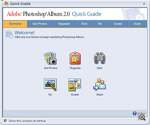 |
| Quick Guide: Welcome |
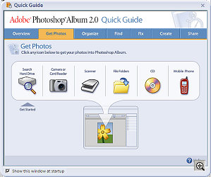 |
| Quick Guide: Get Photos Every source is listed |
But the existence of the Quick Guide suggests a problem. And that problem is an interface that tries to do everything at once.
Album 2.0 is prettier than 1.0 but still jumbled. At first glance, it struck us like a Web browser with a tool bar of familiar icons and a large pane to show thumbnails. But that's where the similarity ends.
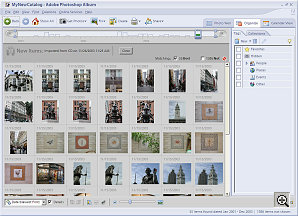 |
| The Interface: Organize Tags and Collections tabs |
The Title Bar of the window itself announces that this is Album with the usual icons to minimize, restore and close. Under that is a small Menu Bar with File, Edit, View, Find, Creations, Online Services and Help commands.
Under that (oops, here we go) is a Shortcuts Bar populated with buttons (some with text) for common commands. The default set includes Back and Forward navigational buttons, a Home icon to select all photos, Get Photos, Fix, Create, Print and Share. Then there are three tabs on the right of the shortcuts bar to display items in the Photo Well, display the Organizer's tags and collections panes and display the Calendar View. Finally, the Shortcuts Bar includes an Adobe logo button to take you to its Web site.
The Menu Bar is easy to overlook (although that's where you backup, adjust dates and set preferences). And the Shortcuts Bar really should be the Menu Bar with the Quick Guide icons.
Under the Shortcuts Bar is the Timeline, a terrific way to navigate your image collection. It's a bar graph of the number of images shot in any particular month. You can drag a marker along the Timeline to display the images for the month it rests on. Or you can set end points for a wider range (narrowing down the display in the Photo Well). In short, it's a convenient way to quickly navigate your collection.
But the marker and end points ought to be one tool. This confusion of options really drove us nuts. We'd rather have one selection tool that can be stretched to cover a range than one tool to pinpoint and another to select a range. It reminded us of Word (and that ain't good).
Sorry, not done with the interface yet.
Under the Timeline is the Find Bar, using a lot of screen space. Drag tags or an image on it for a quick search. Drag the Family tag to it, for example, to see all your family pictures. Drag an image and Album shows other images it thinks look like it. But why is it a full bar?
Then we come to the Photo Well. This is really your work area, your light table, your sorting bin. Each thumbnail includes the date and time of the image and icons for its tags (with medium-sized thumbnails). An icon also indicates if the image is offline.
Album catalogs your image collection, creating a database entry for each image. So it can know about images that are on a CD offsite somewhere.
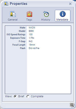 |
| Image Properties: Metadata Brief View |
So why wouldn't you display the Photo Well all the time? Two reasons. The Calendar View and Organize function.
Calendar View replaces your light table with either a year, month or day calendar. In the monthly calendar, a thumbnail of the first picture taken each day fills the square for that day. Next to the monthly calendar is a date display with the starting image and the option to add a Daily Note below it. Controls let you see a slide show of images with their notes for that date.
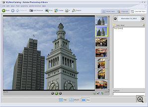 |
| Calendar View: Day |
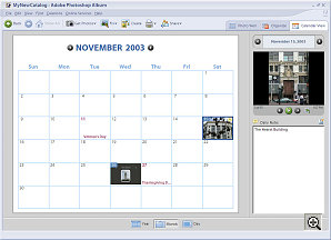 |
| Calendar View: Month |
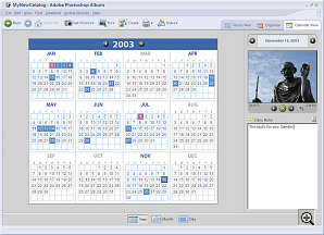 |
| Calendar View: Year |
We thought we'd miss the refrigerator style calendar of 1.0, but we didn't really. The monthly pretty much gives us that, just in a different layout.
The other competition for the Photo Well is the Tags pane. More about that later.
Under all that is the Options Bar. Depending on your view, you can change sort order or thumbnail size here.
And finally, below the Options Bar is the Windows Status Bar.
At first glance, it's confusing. And that's a shame, because Album does a lot of things very well. You should look forward to seeing its shining face as you launch it.
GETTING PHOTOS
The tools are there to do things, of course.
The first thing you'll want to do is get your photos. You can get them from your digicam or mobile phone just by plugging it in -- a big help for occasional photographers. Images are copied onto the hard disk and a record is entered into the Album catalog.
And that includes in-camera movies (which will actually play in the Photo Well).
Remember, you can also just catalog images already stored on CDs, without copying them to the hard disk.
ORGANIZE
Thumbnails of your images are displayed in the Photo Well organized by date. Dates are picked up from the Exif header, which includes the moment the image was captured. If your image doesn't have an Exif header, Album uses the file creation date.
Dates are where organization starts, but there's a lot more to it. Album includes some keywords (like People, Places, Events) but it allows you free reign to create your own categories and subcategories of keywords. An easily editable icon built from the first tagged image helps remind you what the category is all about.
Fortunately, though, it automatically generates keywords from the original folder name using the new Instant Tag. So if you're archiving four years of CDs and you've named the folders in some meaningful way, you've got keywords you can use without keywording anything yourself. Nice.
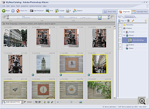 |
| Tags. We created a custom "Ferry Building" tag and applied it to a few images (indicated by the Place tag icon, a globe) |
But adding keywords is just as important, really. And Album 2.0 makes it much easier, fully implementing drag-and-drop keywording. Select a bunch of images, drag a tag (or three) to keyword them. Or drag an image to a tag. Either way, it's keyworded.
FIND
The point of tagging images with keywords is to make it easy to find them in a few years (or days). You don't want to have to look for your vacation photos from Alaska or try to remember what year you went to Niagara Falls. You want Album to look and remember. Keywords do that.
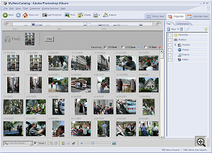 |
| Find shows images that resemble the sample we dragged into the Find Bar |
All you have to do is click on the tag and the Photo Well will display image thumbnails with that tag. Or choose a single picture, drag it to the top of the Photo Well and Album will find other photos that look like it.
Album has some other clever ways of finding things for you, too. You can actually find photos by how you've used them. When you imported them, who you got them from, who you emailed them to, when you printed them, when you exported them, when you ordered online prints or shared them online, when you used them in Creations or Web Galleries or 3D Galleries.
REORGANIZE
One day you'll get a bright idea. It's unfortunate, but it happens to all of us. You may, for example, want to do a CD of images celebrating your in-law's anniversary. You'll want to include all sorts of images, antiques and modern ones. No one category can quite cover it all.
Album 2.0 introduces the concept of a Collection to help you. We've been calling your stash of images a collection. Album extends that concept by letting you make subcollections without moving anything.
Behind the Tags pane is the Collections pane. Create one called Anniversary and, as you scroll through your complete collection of images, drag the ones you want to use to the Anniversary Collection. When you're done, click on the Anniversary Collection and that's what the Photo Well will display.
Collections are ideal for rounding up the posse before you make a new Creation, like a CD or photo book.
FIX
Wish we could skip over this and just point you to an image editor, but Album has made these essential tools hard to gloss over. There are three main fixes.
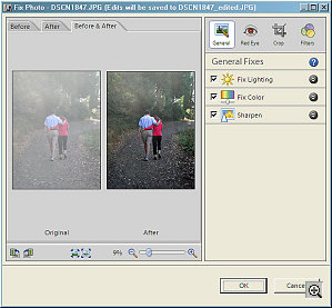 |
| Fix Lighting, Color and Sharpen active |
Single Click Fix can correct lighting or color and sharpen blurred images. Slider controls let you fine-tune the results.
Red Eye Removal and Cropping take no more effort than making a selection (one eye at a time) and clicking the tool.
Filters for Photo Conversion can morph your image into a sepia tone or a black and white image.
You'll want more, but you can do a lot with just these.
CREATE
Jim told us pros really like their keyword tagging system. But the occasional user will appreciate Album because it's comprehensive. You don't have to have an image editor to fix red eye, for example. And it can also print greeting cards.
So the strong suite of Album is what you can make with it. Creations.
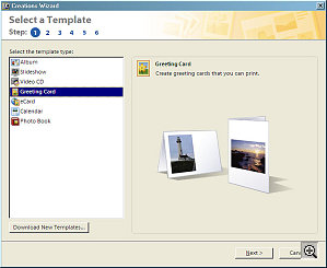 |
| Creation Wizard Templates are available for Albums, Slideshows, Video CDs, Greeting Cards, eCards, Calendars, Photo Books |
You'll want, for example, to print an image now and then. Or create a slide show. Or make a greeting card featuring your photography. You can do all that without leaving Album.
But you can also make calendars, Web pages, 3D galleries and printed photo books (like those iPhoto guys get). And pretty nice ones. The new templates are not all done by designers with crayons.
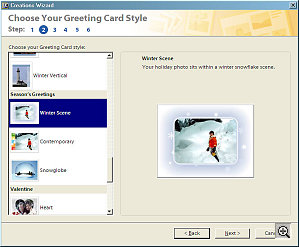 |
| Templates: Greeting Card |
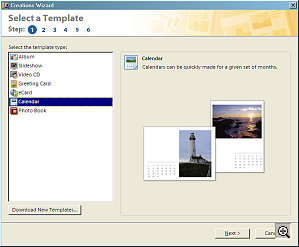 |
| Templates: Calendars |
The requirements for these kind of projects can be complex, particularly when you are asking a third party to make the print or print the book. So Adobe provides Creation Templates and Creation Wizards to guide you.
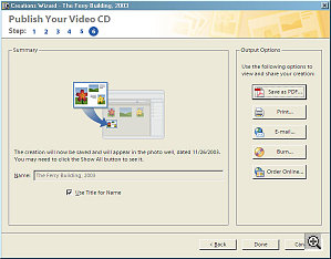 |
| VCD Creation Wizard finishes with output options for our test disc |
And they are cleanly laid out, easy to follow and even check for errors. We made a Video CD in just five minutes, rearranging our images and using a nice template. We could easily have added music (captions would have taken a bit more work). The one image Album warned us would be severely cropped, actually turned out just as we'd hoped. And, yes, it was easy.
SHARE
Sharing has been bumped up a notch, too. Emailing is easier than ever and you can send not just individual images but slide shows exported to PDF. Wizards will take care of that for you, too, sizing your email to match your connection speed.
You can share images in your catalog by synching your Palm OS handheld with your computer and sending pictures to it. You can also send pictures to your mobile phone or TiVo Series 2 DVR.
And, of course, you can burn DVDs and Video CDs for playback on a television without leaving Album. Jim told us Roxio preempts the Album burning software, though, so beware if you've installed a Roxio product. They're discussing the problem (which we've hit too; we never got our Roxio products to run on a Vaio that had CD/DVD burning software already installed).
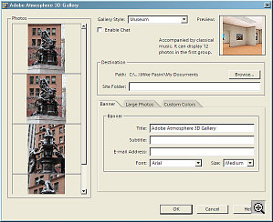 |
| Adobe Atmosphere 3D Galleries |
And, finally, Adobe Atmosphere 3D Galleries are a virtual world your Web visitors can stroll through to see your images.
PROTECT
If you've ever studied the specs for hard drives, you may remember old MTBF. Mean time between failures. Nothing spins forever.
So we gave Adobe big points for providing an archiving and backup solution in version 1.0. And we want to applaud them again. Back up to either CD or DVD with one click. Make two. Then get one backup to a second location. You won't have to reach for your photo albums when the smoke alarm goes off. You can actually grab some clean underwear.
CONCLUSION
Our grumbling about the interface is something personal. When you've worked in Album a while, you get used to it. It isn't a pleasure to use, but it functions. The real pleasure is behind the interface. You'll enjoy it again and again.
Apple and Adobe seem to be working the hardest at this software category. Their second versions are both grand efforts. Mac owners have iPhoto but Windows users need to install their own solution. Don't rely on Windows alone to manage your image collection. Not when there's something as affordable -- and comprehensive -- as Album.