CONTENDER IN CONSUMER MARKET
Adobe Photoshop Album Enters the Ring
By MIKE PASINI
Editor
The Imaging Resource Digital Photography NewsletterReview Date: January 2003
"And in this corner, weighing 325 pounds at six feet ten inches tall, the reigning heavy-weight champion of the image editing world..." the crowd drowns out the introduction but we all know who it is. Adobe has stepped into the low-end be-all imaging software ring with Photoshop Album, a $49.95 retail product targeted for consumers running Windows.
C O N T E N T S
But this fight won't be a walkover.
Among the contenders are Kodak's free EasyShare and Lifescape's $29.95 Picasa. All three offer to import, organize, edit and share your images. All three promise to do it easily.
But this game is won in the ring. We've already reviewed EasyShare and Picasa (see the Archive). So, with no hitting below the belt, let's go 10 rounds with Album.
ROUND 1: SYSTEM REQUIREMENTS | Back to Contents
Adobe told us this is a Windows-only product. Naturally we asked if there were any plans to release a Macintosh version. Tapan Bhat, the group product manager, explained that since this product was aimed at the consumer, Adobe would consider a Mac version when consumers start buying Macs.
We took that for a (not terribly informed) no, but the beta packaging, of all things, makes us wonder. Right next to the Windows system requirements are the Macintosh ones. Moot point. This release is for Windows. And Mac users really can't complain. They have iPhoto. Which, were it in the ring, would retain its title.
Windows 98SE/ME/2000/XP with 128-MB RAM (though 256-MB are recommended) running on a Pentium III-class processor or higher. (OK, Mac PowerPC 603e 180-Mhz PPC, OS 8.6, same RAM -- but don't hold your breath.) 150-MB hard disk space, 24-bit video, 800x600 monitor, CD-ROM drive, too. Adobe also recommends at least Internet Explorer 5.x (for the help system).
But since this is a beta, we recommend visiting Adobe's Album page for current specs.
Meanwhile, give this round to EasyShare for being cross-platform.
INSTALLATION | Back to Contents
We popped the beta CD with build 8533 into a Sony Vaio Digital Studio PC with a Pentium 4 and 512-MB RAM. It took 121-MB of disk space but quickly and easily installed.
That hefty space requirement is an indication that a lot of extras come with the program, including MP3s and CD/DVD templates.
ROUND 2: INTERFACE | Back to Contents
We like Picasa's interface. We admire EasyShare's. Both are simple, uncluttered screens that let thumbnails of your images speak for themselves.
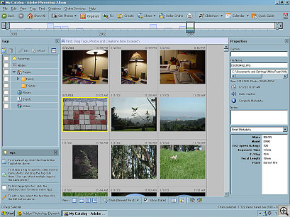
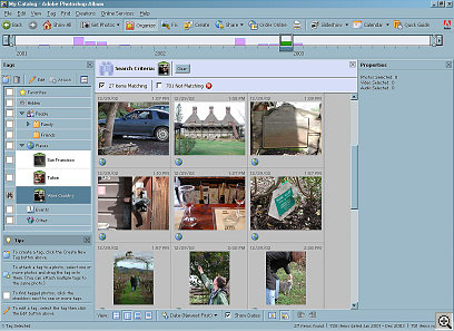
Album's Interface Album is complex and cluttered. Its very busy screen reminds us of rush hour traffic. This is just what "consumers" need? Maybe consumers raised on video games won't mind, but consumers who saw Spot run and those who see spots will certainly appreciate a less congested environment.
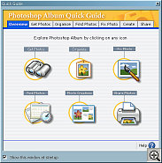
The Quick Guide
Floating WindowAdobe itself seems to suspect the interface is too much. They float a Quick Guide window on launch that hovers above the interface. The floating window solution employed by Quick Guide is, in fact, used extensively in Album.
We like the Quick Guide. It takes you smoothly through the program's capabilities (and it is a very capable program) and possibilities (it simply does more than its competitors). We'll try to do the same.
Round 2 goes to Picasa, though, for the cleanest interface.ROUND 3: GET PHOTOS | Back to Contents
The first thing you'll want to do after installation is to get some images.
After you've taken digital pictures for a while, you'll have a lot of images to get. Some on CD, some on your hard disk and new ones all the time in your camera. Album can handle all of those sources.
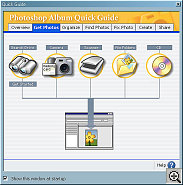
Get Images
From the Quick GuideClick on Get Photos from the Quick Guide or the Tool Bar or in the File menu, select your source and watch your images as one by one each thumbnail is displayed in a floating window above a progress bar. When the import is complete, you see the thumbnails in Album's Photo Well. We imported about 500 images from a CD in just a couple of minutes.
Copying images from a camera was easy if the camera appeared to XP as a USB storage device. But older cameras, like our Average digicam, just weren't visible to Album (even though iPhoto finds it just fine). We used the Average's import program to copy its photos to our hard disk and then had Album get them. So you can't, but you can.
Our hard disk images are already on the hard disk, of course, and our camera images are copied there. Our CD images were also copied to the hard disk (in an Adobe folder in My Pictures) -- but Album gives you the option of just indexing your originals rather than collecting them.
The dialog window for getting images from a CD includes a checkbox for Keep Original Offline, which copies only a small proxy of the image to your hard disk. It's an option because, if you have the disk space, having the original online is more convenient.
In fact keeping everything online is the only option in most do-all programs. Naturally, if you're going to edit, email, print and publish an image on the Web, it has to be handy. So all these programs keep a copy of the image on your hard disk.
Real image organizers just index the image, without copying it. You can store it anywhere, the organizer doesn't care. If you want to use it, the organizer will tell you where it is.
This approach works well over time. It's the only scalable approach, really. The other approach -- a local copy -- isn't really scalable. What happens when you fill your hard disk?
Fortunately, Album gives you the option. And if your disk does one day fill up anyway, Album even has an answer for that. Archiving, which we discuss below.
For that alone, give this round to Album.KILLER FEATURE | Back to Contents
Once you've got images in Album, you can immediately enjoy the one feature worth every penny, the one feature that compensates for any shortcomings, the, well, knock-out punch.
Right below the Menu Bar is a Tool Bar and right below that (well, we told you it was cluttered), is a Timeline. The Timeline is cool, but it isn't the knock-out punch. The Timeline is just a bar graph of your collection. The more pictures you shot on one day, the taller the bar is at that point on the Timeline. You can scroll through the Timeline to quickly locate images. Very, very nice, but perch yourself on the edge of your seat and scream for blood.
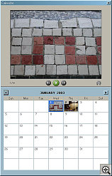
Killer Feature The knock-out punch is Calendar View.
Click Calendar on the Tool Bar and suddenly your collection is transformed into a kitchen calendar. On the bottom half is the month (the current month if no images are selected or the month the selected image was shot) but instead of annotating the days with things like "Valentine's Day" the days are illustrated with a thumbnail of the first shot you took that day.
No, wait, that's just a hint. The top of the calendar is a larger thumbnail of that image -- but that's not all, either. The larger image functions as a slide show. Just click on the Play button to see all your images from that day in the top panel.
Is that cool or what? How come nobody else has thought of that?
It is, after all, the way you take pictures. So why not display them that way, too?
You know John's birthday is April 6, so shoot over to any April 6 to see his birthday pictures. Fourth of July, no sweat. Christmas? New Years? Festivus? You know the day, look up the pictures.
Oh yeah, click the small binocular icon to select any image displayed in the top panel.
ROUND 4: ORGANIZE | Back to Contents
Grumble, grumble. Organizing your photos is as much fun as cleaning a closet. Except the closet really needs it.
Album is the helpful assistant you always dreamed of (except it doesn't do closets). When you bring images into Album, it sorts them by date. For images stored on disk, Album uses the file creation date. For images from your camera, it uses a date stored in the Exif header of the image. If you don't bother setting the clock in your camera, you'll bother.
We archive our images to CD in large batches, so we were afraid Album's file date sort would lose the original order, preferring the file date over the Exif information. But Album sorted our photos correctly.
And you can always adjust the date info for an image within Album.
But sorting is not always enough. Sometimes you have to label your images by the kind of thing they are. Album makes this pretty easy.
In fact, Bhat told us that, while the program was designed for consumers, Album's organizing power really excited the professionals who saw it.
Tags
See the left side in the enlargementAlbum uses tags to label your photos. You create a tag by clicking on the New Tag icon at the top of the tag window. You can even label the tag itself, storing it in Album's built-in hierarchy of tags, which includes People (like Family, which includes yourself by default, and Friends), Places (we set up San Francisco, Tahoe and Wine Country for our collection), Events (like Weddings, Birthdays, etc.) and Other.
We weren't too jazzed about this enforced hierarchy when we first heard about it. But Album does some smart things with it, so we played along.
Once you have a tag defined, you apply it to a photo by dragging it to the photo. Or a selection of photos. Any time you want. Very easy.
The only thing easier would be to apply some tags on import -- but Album doesn't do that.
The first photo you apply the tag to lends its image to the tag. If you don't like it, though, just double click the tag to pick another. The icon and text label attached to each tag make them a good deal more meaningful than either alone.
Album was prettier but no more functional that EasyShare, so call this round a draw between the two.ROUND 5: FINDING IMAGES | Back to Contents
Click on the checkbox next to any tag and you've instantly selected all the images with that tag. It's a checkbox because you can click on more than one. Weddings in the Wine Country, for example.
The Photo Well drops down a bit to reveal the search criteria you selected, and checkboxes for how many items matched, how many closely matched and how many didn't match. Matched items are already checked -- and you can check closely matched items to expand your results.
But Album takes Finding further than tags with the Find menu option. You can hunt your images by date range (adjustable using the Timeline, too), filename, caption, history (what you did with them) and audio.
And don't forget that Calendar view.
But probably the most fun we had was searching for similar images.
Select an image, any image. Under the Find menu, select By Color Similarity with Selected Photo(s). Album retrieves images that are like the one you selected.
This gets you all your cloud shots, or green fields or sunsets or ... well, you get the idea. It's a retrieval function we haven't seen elsewhere but could really make use of now and then. If you find yourself screaming at your monitor, "Hey, it looks like this!" you could use it, too.
This round goes to Album.ROUND 6: FIX IT | Back to Contents
If there's one aspect of Album that really disappointed us, it was the image editing capabilities. Considering they seemed lifted from Photoshop Elements, we were surprised. But maybe we shouldn't have been. Elements integrates nicely into Album by design.
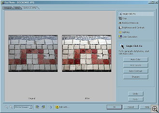
Select an image that needs help, and click on the Fix button in the Tool Bar. You get a floating window with tabs to display the Original, After (default) or both Before and After (our preference). You can zoom in if you need to, but with the After image displayed, it was large enough for us.
You never work on the actual original image, however. Album makes a copy for you. That's very important because you can never reconstruct an original. Its exposure data, for one thing, will no longer be valid. And you can always repeat your edits.
Image Editing To the right are six possible corrections: Single Click Fix, Crop, Red Eye Removal, Brightness and Contrast, Lighting and Color Saturation.
It's astonishing how many images can be helped by either strengthening or diluting their color saturation. Don't neglect that tool.
Cropping and removing red eye need no introduction. When you need them, you need them, and Album will take care of it for you easily. Red Eye Removal lets you adjust a crop around the eyes before applying its fix.
Lighting can lighten a dark shadow in the foreground using its Fill Flash slider. It can also darken washed out areas with its Backlighting slider.
Our preferred tool, however, is the Single Click Fix (and, yes, we know we haven't mentioned Brightness and Contrast). Take a look at our screen shot of a mosaic. You might be tempted to jazz that up with Brightness and Contrast. But we used Auto Levels in Single Click Fix instead. One click, with no slipping around on a slider.
Other Single Click Fixes include Auto Color, Auto Contrast and Sharpen. Sharpen was a bit too crude for us, which is a shame considering how a little sharpening is often a big help. Michael Slater, one of Album's originators, told us, "This is an artifact of the beta version that you are using and will be corrected in the shipping product."
You can Undo or Redo all these changes and even Cancel the whole thing if it gets out of hand. Changes are cumulative. You can pile them up on an image, although that rarely works well.
So why were we disappointed? The crudeness of some of the changes and the slowness of our pretty quick system. Changes simply took too long.
And we'd really like to see a batch mode to fix color. If your digicam's CCD shoots too warm or too cool, you'll want to correct every image you shoot. And not one at a time.
Call this round a three-way draw.ROUND 7: SLIDESHOW | Back to Contents
Album does two kinds of slide shows. One is simply impromptu. The other is for reproduction.
Album's slideshows can include both music (some MP3s are included with the package) and transitions (but not very smooth ones).
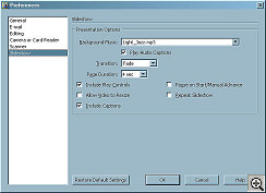
Slideshow Preferences We really liked Album's impromptu slideshows because they resembled iPhoto's. Just select some images, click the Slideshow icon in the Tool Bar and you're watching your slides set to music. Pop into the Preferences panel for Slideshow to change duration, music, whatever you like. Really easy, very gratifying, a joy.
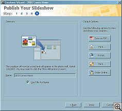
Publishing a Slideshow If you want to save your slideshow to send to people (email or CD), you use a slightly different approach.
Select your images, but then use the Creations menu item's Slideshow option. A Creation Wizard steps you through a more elaborate presentation, which even includes some attractive layouts.
Album takes another page from Elements by creating these slideshows as PDFs. The free Acrobat Reader (which also comes with a plug-in for your Web browser), easily handles these on either the Mac or Windows.
The PDF can be saved on disk, sent as email or burned on CD (either for viewing on your computer or as a VCD for viewing on a DVD player). You can also print it or order a professionally printed version.
We scored this round for Album.ROUND 8: SHARING | Back to Contents
Slideshows are just a hint of some really marvelous capabilities tucked into Album. Adobe wants you to do everything but creative image editing with Album and that includes making Web pages of your images, printing books and custom calendars of them, making eCards or just printing greeting cards, burning them on everything from CDs to VCDs to DVDs, you name it.
But they've also paid a lot of attention to making it easy to do these sometimes fiendishly complex things. And, like Apple, they've taken pains to provide a few attractive designs so you don't spend hours trying to make things line up right.
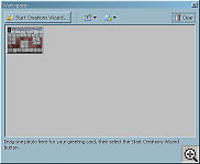
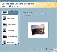
Creation Wizard Greeting Card All these options begin with a selection (or you can drag an image into the Creation Wizard's workspace -- in a floating window). Once you have a selection, you click on the Start Creation Wizard button.
The Wiz shows you the built-in templates (which may be augmented with downloaded additions), customizes your creation, previews it page by page and then presents the output options mentioned in the previous section. Very simple, five-step process (including the selection).
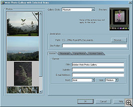
Web Page Production Web page production is handled a little differently, but very ably.
And just to knock your socks off, an Adobe Atmosphere 3D Gallery option will let you walk through a museum of your images. It's cute but, to avoid embarrassment, buy Album for the Calendar view.
Score another round for Album.ROUND 9: ONLINE SERVICES | Back to Contents
The Online Services menu option includes Setup where you can contract with online service providers like MyPublisher to print calendars and books or online photofinishers to order prints.
We didn't test this, but liked how neatly it was organized, how nicely integrated into the other output options and what a variety of options were available.
Bhat brought along some sample output, too. The book was identical to the iPhoto printed book (down to the linen cover) but the calendar was special. We've seen our share of inkjet calendars but this one stood out for its professional production printed on nice paper.
This round goes to Album.HELP | Back to Contents
Who doesn't need help from time to time? Reviewers certainly do. We found Album's online help, in this beta, to be a little slight if nicely produced. Fortunately, Adobe creates Help from the same source files used to create the printed User Guide, so we hope the shipping version is a bit more thorough.
But Help is about Album not imaging, another important distinction between Album and Elements. We still rave about Elements for its fabulous image editing instruction.
ROUND 10: BACKUP | Back to Contents
Album avoids the big failing of iPhoto -- failure to provide any kind of archiving.
Archiving Backing Up With a CD or DVD burner, Album can create archive discs that can be played on a Mac, PC or DVD player.
When you create the archive, you move the selected items offline, removing them from your computer's hard disk. At the same time, Album's reference to the photo is reset to the archive disk.
Album also offers a similar option for burning your collection to CD as a backup, keeping track of which images have already been backed up since last time.
Round 10 to Album.CONCLUSION | Back to Contents
Bhat told us Adobe wanted to build an application for digital photographers unchained from the analog model. It had to:
- Be a complete solution and scalable throughout one's lifetime;
- Protect the original images, keeping them safe and accessible; and
- Be simple, easy and integrated.
So Adobe designed Album to do four things:
- Find your images, no matter how many you have or where you store them;
- Fix them by providing simple tools to handle the most common problems;
- Share your photos in more ways than any other single program; and
- Protect your images from accidental deletion, disaster, overwriting, etc.
So how'd they do?
We think they did very well, winning six rounds outright, tying two others and losing only two.
OK, we aren't impressed with the interface. It's in third place behind Picasa and EasyShare (fourth, if you count our favorite, iPhoto).
But building your collection is as painless in Album as in any other product. We'd like to see support for older cameras (anything with a USB connection, say), but you can work around that.
Basic view options using the Timeline are probably more than enough, but the Calendar view was stunning.
Tags are so well implemented you might be tempted to use them. And if you do, you'll enjoy some very fast searches and selections as your photo collection grows otherwise out of control.
While the tools to make quick and simple fixes to your images are provided, they are oddly slow and cumbersome to use and offer no batch option to correct for the, uh, personalities of some digicams.
The output options are extensive but simple to use. Outright prolonged applause for making VCD and DVD production simple enough for even us. And tie-ins to companies like MyPublisher are to be applauded, too. Why should Mac users have all the fun?
But we're most impressed that Adobe provided archiving and backup functions. That isn't as glamorous as a 3D museum walk-through of your images, but you can measure your IQ be counting how many times you use which.
Are they the new World Champ? Well, they do have that knock-out punch....
