PHOTOSHOP ELEMENTS
Adobe Makes It Elementary
By MIKE PASINIEditor, The Imaging Resource Digital Photography Newsletter
Review Date: September 2001
 The
recent release of Adobe
Photoshop Elements 1.0 is a little like seeing a mouth-watering dessert
arrive at the table just after you've polished off a seven course meal. Great,
but who needs it?
We took a few weeks to see just what the $99 Elements (with a $30 rebate for owners of Photoshop LE and competing products) can do that our old shareware image processing friends can't. And which we prefer.
SYSTEM REQUIREMENTS
Unlike shareware and low-end image processors, Elements assumes you have a pretty new Mac or Windows machine. Which means a PowerPC or Pentium with 64-MB of RAM, 150-MB of free disk space, a CD-ROM drive, 256 colors or more (8-bit video, but frankly if you're using anything less than 24-bit video you aren't getting the picture), 800x600 monitor resolution (but the palette well requires even more). Mac OS 8.6/9.1 or Windows 98/ME/2000/NT 4.0 are supported.
INSTALLATION
One glitch. The registration number is a long one, printed with hyphens on the CD case to help you get through it. But the dialog box prompt is in discrete little fields for each clump of numbers. Typing hyphens is not required -- but if you do, even erasing them won't work. You'll get part-way through the install before it complains the number is wrong. Seems like Adobe engineers work overtime to make installs difficult.
Eventually we managed a clean one and our first launch of the program prompted us to register online. We did. We think. We've registered other products there before, so it knew everything without asking us to enter anything but our password. Still, we didn't sail through cleanly. We decided to let Adobe worry about that.
AFTER THE PARTY
After the installation party, you clean up.
Full installation fortunately included a log of what was installed where. Adobe insists on installing Gamma (for color profiling your monitor). If you've calibrated your monitor with some other utility, disable Gamma.
Very little of the installation modified our OS (an HTML Renderer was added and some application support for Acrobat Reader). We already had the latest ATM and Reader installed, though.
The actual installation used only 61-MB of the 150-MB required. Elements itself is a 15-MB application set for a 32-MB memory partition.
Nearly 500 files of the install (about 5.4-MB) is devoted to a wonderful HTML help system designed to make working on color images comprehensible in bit-sized pieces. It doesn't just explain Elements' menus and commands, but tackles everything from color theory to tutorials on common tasks. This little jewel is worth the price of admission alone.
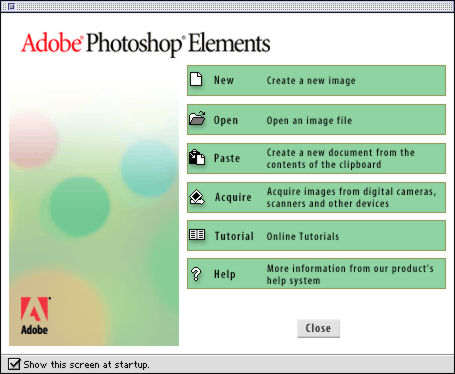 |
| The Opening Dialog Window Note the checkbox at the bottom to disabled it. |
Books can't do justice to image editing. eBooks are a big improvement over the printed page because they can show the actual RGB images you have to work with. A printed page only shows you a CMYK image twice removed from the desktop (halftoned and printed). So an HTML tour of image editing that you can run locally (not over a phone line) is a godsend. You can look things up quickly and color is true.
Elements relies on HTML and an installed browser quite a bit. But running the HTML apart from Elements didn't work too well. Files couldn't be found by the browser that Elements knew about or needed.
Since Elements supports the Adobe plug-in architecture, this is a great time to copy your favorite plug-ins to its plug-ins folder. You might check, though, for updates first. Some plug-ins require an update to run under Element.
In fact, we asked the Photoshop Elements engineering team for a clue about which plug-ins can be expected to run. Here's what they said:
"Elements has the same plug-ins scheme as Photoshop, however it only supports RGB and Grayscale color modes. Plug-ins that are [not] dependant on these color modes for operation are therefore of little value. However most plug-ins require just RGB, so there should be few exceptions among the vast library of Photoshop plug-ins available."
Once you've setup your plug-ins, you're ready to go.
WHERE YOU CAN GO
So what can this mini version of Photoshop actually do? Rather than tour the menus and list what's here and what's not in a feature-by-feature comparison with Photoshop itself, we thought we'd try the Uncle Artie Cheesecake test.
 |
| The Uncle Artie Cheesecake Test |
Uncle Artie is a Texan. And when he makes his family-famous cheesecake, he doesn't follow the instructions on the back of the Philadelphia Cream Cheese wrapper. He brings his special food processor, which looks like a B-52 propeller blade in a wind tunnel and gets up on Texas time (two hours too early, in our opinion) to begin a mysterious process that takes three hours. That food processor, we suspect, changes the molecular structure of the cream cheese into something closer to cumulus clouds.
Artie's developed a technique for cutting his cheesecake that produces a nearly transparent slice. So instead of a table full of stuffed relatives and friends pleading, "Make mine thin, Artie!" you have the same crowd demanding, "Double up on mine!" Which gets a grin out of Artie as he fiendishly continues to slice them thin.
I was sitting next to Artie the other day and grabbed my digicam to record this event. My favorite shot was Artie smiling with the knife poised just over the still whole cheesecake. But it also had a few very common defects that made a perfect test for Elements.
ROTATION
The first problem was that I hadn't held the camera straight. Ever do that? In this case, the problem was too serious to ignore. Just behind Artie were some strong vertical elements: the glass door frames leading to the deck.
Elements has two special Straighten commands (one that crops the image and one that doesn't). You don't have to set it up at all, just tell it to get to work. A progress bar told us what was going on (it isn't slow, but it isn't quick) and a few seconds later, those door frames were straight in the middle and converged evenly from the sides. Very nice.
Of course, this isn't always a good idea. We'd tightly framed our shot of Artie and his cheesecake so we would have had to lop off a rather large slice of cheesecake and a bit of Artie too, to make the image's edges perpendicular to the straightened frames. We opted for the "action" version of the shot.
RED-EYE
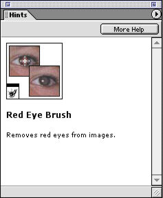 |
| A 'Hint' on the Red-Eye Brush |
Fixing red-eye (a perennial problem with on-camera flash) is never as easy as it should be or as tough as it sounds. We've described our favorite technique before, but Elements seems to appreciate that most digicamers will not have read it (in the Dec. 31, 1999 issue). They provide a Red-Eye Brush.
Select the red-eye brush and go over the eyes (magnify them first to make it easy) and your red-eye is desaturated. Simple as that. And it won't get any simpler until some program learns how to identify an eye. Nothing to select, but you can alter the target and replacement colors and tolerance. Just paint.
Fortunately, the room was pretty bright so Artie didn't have red-eye. But we thought this was a pretty straightforward way to handle the problem. Paint Shop Pro [W] is vastly more sophisticated about this (well, you have more options) but the solution doesn't require sophistication.
OVEREXPOSURE
We were too close when we took the picture, so the flash burned out Artie's white T-shirt and made the cheesecake look like Cool Whip.
Elements has two menu commands to improve exposure. Fill Flash lets you lighten up the dark parts of a picture with a Lighten slider, as if you had used your flash at less than full power to boost the available light. And Adjust Backlighting will do just the opposite, providing a slider that Darkens the light parts of an image (like those burned out skies). We tried that but we didn't like what we got. Our problem was simply too severe for this solution.
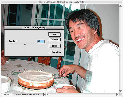 |
| Adjust Backlighting Compare to our Layers Technique |
Instead we used our favorite Photoshop technique for fixing overexposed shots. We used the Layers palette to duplicate the image, set the Mode of the top layer to Multiply and scaled back its Opacity, in this case, to 50 percent. Perfect!
If you just want to build density in your highlights, you can multiply a gradient as a mask. We tried that, too.
To appreciate the difference, compare Artie's tan and his shirt in both images.
| Two
Ways to Fix Overexposure (Note the Opacity settings) |
||
| Multiply a Duplicate Layer | ||
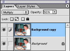 |
Black produces black and white is unchanged with the Multiply blending
mode. Here color is enriched by multiplying colors. Note, for example, the
effect in the face.
|
|
 |
||
| Multiply a Gradient | ||
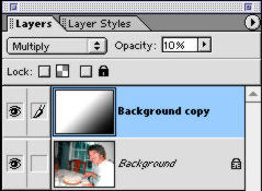 |
Here we're only multiplying shades of gray, building density, not enriching
the color. But not uniformly, to compensate for light fall-off from the
flash.
|
|
 |
||
| Neither image is quite optimized to highlight the difference
between the approaches. In fact, there's no reason not to combine both approaches,
adding color lost in overexposure and fixing the flash fall-off.
|
||
Adobe has designed Elements with a lot of help and some short-cut commands to fix common problems, but it also left room for more sophisticated solutions like this one. We're very glad to see Layers and Modes in Elements.
COLOR CORRECTION
What good is macro mode if you can't take a scrumptious picture of a piece of Artie's cheesecake without flash? And so we did, but the room light was more romantic than appetizing, making for a somewhat yellowed cheesecake. How could Elements get rid of the overall yellow cast?
 |
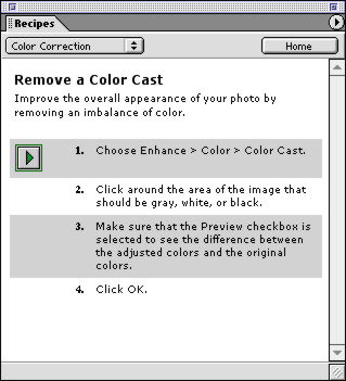 |
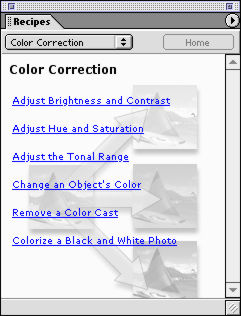
| The Recipes for Color Correction | Removing a Color Cast |
|
|
|
There are a lot of ways to approach this problem. We've explained how to use the Levels command (look for Histograms in the Index) to quickly restore color balance, a number of plug-ins address the problem (iCorrect among the best) and some stand-alone programs (Photogenetics, for example) provide yet another approach.
To find out what Elements suggests, we used its Recipes window. Recipes tells you how to use Elements with short explanations of what to do and why you're doing it as well as a button to bring up the tool you need to use.
We found Color Correction among the topics and followed the suggestions to Remove a Color Cast. Which was to Enhance|Color|Color Cast. That lead us to the gray color eyedropper and the advice to "click around the area of the image that should be gray, white or black." This gave us a rather blue cake (we didn't have a gray, white or black area in the image).
 |
 |
 |
| Too Yellow (Original) |
Too Blue (Color Cast) |
Just Right (Levels) |
|
|
||
So we tried the Recipe called Adjust the Tonal Range. That lead us to Levels. Which did the trick.
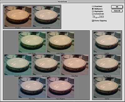 |
| Variations Before/After pair (top left), Darker/Lighter options (right) |
But the best news is that you can do your color correction by comparison using Variations. This tool shows thumbnails of alternative color, contrast and saturation settings. You just pick the one that looks best.
FUN
Among the filters are all sorts of artistic effects that are fun to play with but one really stands out. Liquify lets you stretch and shrink aspects of your image into almost cartoon-like exaggerations. It's been a favorite trick of programs like Goo! for years and it's nicely implemented in Elements.
 |
| Artie Liquified Note how the effect does not distort the background. |
We couldn't risk Texas-izing Uncle Artie a bit. We lengthened his nose and turned his jaw into something fit for Mount Rushmore. And we increased the size of those thin slices of his by raising the flat top of his cheesecake into a dome. Fiendish indeed.
Who says image editing isn't fun?
We even enjoyed Photomerge, which makes it pretty easy to build a panoramic image from any number of shots (as subscriber Tams Terra reminded us). We were pretty bad about the shots we gave it, but when it got confused it was very gracious about letting us finish the job.
NICETIES
We found some nice touches in Elements, too.
File Info was one. With a digicam image open, you can see some Exif header information (we'd have liked to see all of it but only camera make, model orientation, resolution, firmware version, some color positioning data, date and time and JPEG compression setting were available). You can also use this dialog window to enter copyright information.
Automate builds a letter-size contact sheet of thumbnails for any directory you choose. It also provides an option to print a single image in several "Picture Packages" (which you can customize yourself) like two 5x7s. And it can build a Web page.
Elements also makes it easy to embed a color profile with your image. And the printed documentation clearly explains why you might want to do that.
WHAT WE MISSED
Like Artie's cheesecake, Elements is very satisfying -- but you can never get enough of some things.
We'd have liked to see an Action to resize an image for email (although the manual explains how to use the Batch command to do it). And we're sorry that Actions are read-only (you can't write your own). Image editing cries out for automation.
We don't think many people will miss channels or CMYK mode (especially printing to inkjet printers, whose drivers prefer RGB data).
Don't buy Elements for the so-called digicam connectivity. You should be working on duplicates of your images to begin with (not camera originals that have never been copied) and this won't work anyway without a driver for Elements.
We like to divulge our secret recipes for fixing things like red-eye or color casts and for doing tricks like 3D imaging. When we write on those topics we try to imagine our readers are using an image editor with a basic set of commands, so whether you're using Paint Shop Pro or Photoshop you can follow the bouncing ball.
Elements has (almost) all the elements we hope you'll find when you follow our instructions, we're delighted to say.
But it is missing the single most important tool in any image editor's bag. Whether you are comfortable using it or not, we feel it really should be available. We're talking about Curves.
We promise to provide more than the two minute course on Curves we gave in our Correcting Color Negatives article (especially how to exactly match a color with it). You can do just about anything with Curves. Which is why we miss it in Elements.
Fortunately, Adobe left the back door open by providing the plug-in architecture. We hope some enterprising soul will leap in with an Elements Curves plug-in.
IN CONTEXT
Elements is both a new product and as old as Photoshop. Adobe is to be commended for not simply shoving Photoshop 3.0 out the door as Elements. And commended for adding short-cuts and simplifications to Photoshop 6 that make working with Elements easier for the beginner.
But its biggest advantage over the competition is the extensive multi-layered help. Nothing quite prepares you for image editing. It isn't obvious what you can do or how to go about it. Elements makes that about as clear as it can be made.
There is some sacrifice in performance over the competition, though. The program is bigger than most and slower. The Tips window changes every time you select a new tool, after all. You can disable all that, but it's one of the big advantages -- like training wheels on your first bicycle.
So if you're comfortable using the competition, we don't see a compelling reason to move to Elements. But if you're new to image editing, this is a very good place to start. You'll have the basic tools you need to do almost anything and excellent support.
And that can be almost as satisfying as a slice of Uncle Artie's cheesecake.