Andromeda's VariFocus Plug-in
 By MIKE PASINI
Editor
The Imaging Resource
Digital Photography Newsletter
Review Date: February 2001
Controlling depth of field has, traditionally, been a camera technique. Stopping down the lens provides more depth of field and opening up the lens less. Isolating focus to a narrow plane of a scene can have a dramatic effect. And it's a popular enough one to have a name: selective focus.
But digital photography is a funny thing. Some things, like double exposure, that have been camera techniques, become image editing tricks. And others, like selective focus, can be either.
But there is a very fine line any image editor must learn to observe. It's the line beyond which believability dissolves. Image editors make it very easy to composite images, moving a gorilla shot at the local zoo to your living room couch, say. But it isn't believable (generally speaking) because you are mixing outdoor light and indoor with completely different shadow effects to boot.
So when we say you can do selective focus in your image editor, we aren't talking about your everyday Guassian blur. We're talking about using a sophisticated Photoshop-compatible plug-in like Andromeda's VariFocus. This tool applies a believable gradient to a focus mask. A demo is available at http://www.andromeda.com.
KEEP IT SIMPLE, SPORT
But let's start simple.
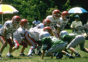
We have a number of images of the nationally-ranked Pasini Academy football team (no relation). One of our favorites is taken from the sidelines as the Pasini Eagles, on defense, threaten to thwart the plans of the El Cajon Braves. Nothing is actually happening at the moment the shutter is snapped. Which is the whole point of defense.
| El Cajon Braves Pasini vs. Academy Eagles (Click for 80K full-size original) |
What the high school year book art director would like us to do (hey, it always helps to imagine yourself employed) is to keep the one unobscured P on a lineman's helmet in focus and gradually blur the rest of offense and defense. This, he tells us, indicates our man is thinking. Not speculating, not day dreaming, but thinking.
Piece of cake (well, with this filter, anyway).
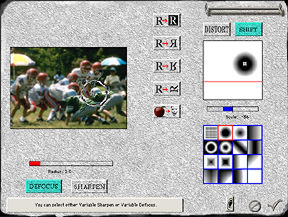
| The VariFocus Interface (Click for the 107K full-size screen shot) |
Open the image in your image editor and select the VariFocus filter from the Andromeda option in the Filters menu. You have a moveable dialog box with a preview of your image on the left and Andromeda's (less-than-intuitive) icons for About/Cancel/OK buttons. That much is (fairly) clear.
 |
| About, Cancel and OK |
The About button, by the way, sports a Preferences button. Its No Change and OK buttons let you set the filter's Photoshop support level.
Below the preview is a Help pane which reveals in plain English what the (odd looking) icons actually do whenever you roll your mouse over them. There are a lot of them, so this isn't just handy, it's a lifesaver.
| The (Indispensable) Help Pane |
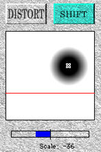
On the right side of the dialog box is where we'll actually be working.
 |
| The Work Pad |
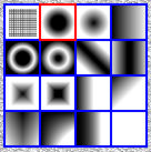 |
| Focus Masks |
The upper pane contains a representation of the active mask. What, in gray, the blurring will look like. Below that is a group of 16 possible masks. All sorts of shapes. For our job, we need Number 3. It's a small dark circle that grays gradually out to a white background. Just the ticket.
So we click on it to make it active.
This is where the work starts. The first problem is to align the center of the mask to the helmet with the visible P in the image. VariFocus makes this easy. You can either click in the preview or the active mask pane to position the center of the mask. A small progress bar pops up on the preview while it is being redrawn.
Once the mask is aligned, we have to adjust the rate at which the image blurs. We want to be able to tell, for example, that beyond the helmet there is a body and beyond that a team. But we don't want to be able to recognize any of the truants. Might not graduate.
This refinement isn't too laborious either. But a bit tricky. We can change the size of the mask with a little slider just under the active mask pane. That's probably all we have to do. But we can also change the degree of defocusing with another slide just under the preview. These are not quite the same thing. But working first with the scale and then with the degree we can precisely control the effect.
Don't blink, we're done!
VARIATIONS ON A THEME
There are 19 user interface elements in the dialog box. We didn't need them all for this project.
We defocused but we might have sharpened instead by clicking on the Sharpen button (which unclicks the Defocus button). Another example of the non-intuitive interface design.
 |
| The Defocus/Sharpen Buttons |
We might also not have moved the center of the mask to the center of the helmet by clicking on either the preview or the active mask. We might, instead, have stretched the mask in the direction we were dragging, turning our circular mask into an ellipse.
 |
| Orientations |
We could also have reversed, flipped (along either the horizontal or vertical axis) or rotated the mask. With our circular mask these options weren't particularly tempting, but it's nice to know they'll be there when we need them.
Finally a bar icon at the top right lets us move the whole dialog box around.
| The Bar |
THE KEY TO THE THING
The trick to getting the effect you want is having the right mask. Our simple example, spotlighting a helmet, used a circular mask. The other 15 options are various graduated patterns ranging from linear wipes to radial blurs (including an option to apply the effect uniformly). You can exclude any part of your original image from their powers simply by selecting it (usually using the lasso) and inversing the selection. VariFocus will tamper only with the selection.
Chapter Three of the PDF manual gives several real world examples of the filter in use. Defocusing with a selection or a mask and creating a glow and a halo illustrate the use of the Defocus/Sharpen modes and their Amount/Radius sliders.
It even shows how to build your own blur/sharpen masks (you can see ours in the first pane of the focus masks illustration above). Which is nice to have but not something you'll often need.
 |
| Our Man Thinking (Click for 46K full-size original) |
But the beauty of VariFocus is having at your disposal a variable blur mask. The blur (or sharpen) can be applied in a number of graduated patterns. Focus is the obvious application, but we couldn't help but wonder why not apply any other filter (besides blur/sharpen) to the variable mask engine in this filter.
CONCLUSION
Thumbs down on the interface. Clearly labeled buttons would be a big improvement (imagine what the world would be like if every filter had a unique user interface). We liked the separate (rather than stacked, like layers) preview and active mask planes, but the progress bar should draw itself somewhere else rather than on top of the preview. It's annoying there.
But those are quibbles. VariFocus does indeed provide an easy-to-use graduated blur with a comprehensive set of masks. And it's fun, too!
