Microsoft Surface Pro 2017 Review: A faster, more precise computer for the mobile creator
posted Thursday, June 15, 2017 at 8:00 AM EST

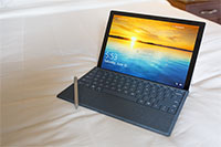
Microsoft’s latest portable tablet/computer hybrid was announced last month to much fanfare. Touted as a perfect blend of portable and powerful, the new Surface Pro (no longer burdened with a model number) aims to appeal to mobile creative professionals as a perfect companion to their art. More specifically, we’ve been told that it is photographers and illustrators who are specifically targeted for this product, and design choices and accessory compatibilities Microsoft have made for it are much the same as the ones made for the Surface Pro Studio desktop computer. The new Surface Dial, which still needs to see more mainstream application support, and a new Surface Pen both work with and are major marketing benchmarks for the new 2017 Surface Pro.
From a hardware perspective, the computer is not Microsoft’s most powerful mobile computing machine (the Surface Book receives that accolade), but it’s no slouch either. It can be outfitted with one of three Intel processors (7th generation Core m3, the i5 or the i7) and one of three integrated graphics processors (Intel HD Graphics 615 (m3), 620 (i5) and 640 (i7)). The base model will retail for $800, while the fully specced model will retail for $2199 with a 512GB SSD or $2699 with a 1TB SSD. For this review, we had the Intel Core i7 with Iris Plus Graphics 640 and the 512GB SSD.
The battery life is said to be 13.5 hours of video playback, and we found it to be pretty much “all day use” even when tasked with something more processor-heavy, such as retouching in Adobe Photoshop.
Speaking of Adobe Photoshop, we pushed the tablet as hard as we could, asking it to handle a 50MP Hasselblad X1D RAW file. If you watch our video review, you’ll notice that the Surface Pro did not struggle at all with that image. Despite being huge (Hasselblad X1D RAW files are about 110 megabytes, and the TIFFs were up around 295 megabytes), the tablet continued to be as responsive as ever, and two different retouchers agreed that although the responsiveness was just a bit better on the Surface Book, there was absolutely no problem with accessing and manipulating files on the Surface Pro.

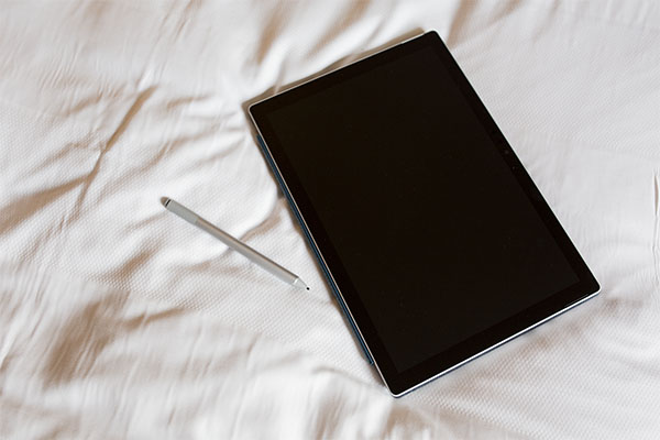
The Surface Pro was announced with a new Surface Pen, which does have some major differences compared to the previous model. For one, the toggle button on the side of the pen was moved about a half an inch closer to the tip of the pen, making accessing it feel more natural when holding it, especially if you’re the kind of person who chokes up when writing or using a stylus. The pen itself was also dramatically improved, with better sensitivity and reduced latency. It features 4096 pressure points, and the lack of lag is impressive.

We had accomplished stylist and clothing designer Jessie Shroyer sketch a design for us on the tablet and spoke to her about how it felt to use the Surface over a real pen and paper. “Honestly,” she said. “The only real difference and feeling you have to get used to is the slickness of the screen vs. how a pencil and paper feel.” Using it myself, I have to agree. The Surface Pen actually feels like a pen, something I have not been able to say before about a stylus made by Microsoft.
Handing the Surface Pro to retoucher Chris Lambeth, we asked him to start retouching an image using the previous model Surface Pen (the one that shipped with the Surface Book), and midway through retouching, we swapped it with the new Pen. “It was immediately noticeably different,” he told us. “It just feels better. More responsive.”
The Surface Dial is a very cool idea, and one that we are excited to see expanded upon in the future. Unfortunately, right now, the dial does very little outside of a select few Microsoft apps. Though Adobe has shown they have beta versions of Photoshop with Dial connectivity, such features were not available to us at the time of this review. The best we could do was Undo, Zoom, adjust volume, and other very basic features. If we eventually can map our own keys to the dial (like Alt and Option), retouchers will be much more on board with the Surface line.
Presently, to do proper retouching, post-productionists will use hotkeys to quickly move among tools and sampling points. At current, to really “get in there” and retouch a photo, you have to treat the Surface like how you would a piece of paper you were going to write on, and forgo using the keyboard. If you did want to try and use the keyboard, you can imagine how awkward it would be as it would lie in your way since you're working on the screen directly. But if you remove the Surface Pro keyboard, you therefore lose the ability to access critical keyboard shortcuts. The lack of key-mapping to the Dial will dramatically slow down the speed of a retoucher’s workflow and therefore make the Surface system far less viable until the Dial can fill in those gaps.
Because of the aforementioned emphasis on artists, and because it is genuinely a curious product from a photographer’s perspective, we thought it was important to review it in precisely the situation Microsoft envisions for it. One of the prominent marketing images features the tablet in a beach scene, so we decided to do exactly what it suggested: we did a photo shoot on the beach, and retouched it on location.
In my experience, seeing marketing materials rarely translates into real world success. However, in the case of the Surface Pro, the tablet’s extreme light weight, bright screen and powerful processing capability made Microsoft’s “vision” of a mobile photographer actually pretty realistic. Outside of the aforementioned awkwardness of trying to retouch without a keyboard, the Surface Pro is absolutely capable of that which Microsoft promises.
What’s nice is that the Surface Pro is fast. Really fast. It’s reliable, the touch screen feels great, and the new Pen is the best Pen we’ve seen yet from Microsoft (though we really do need to compare how it feels vs. something like a Wacom Cintiq).
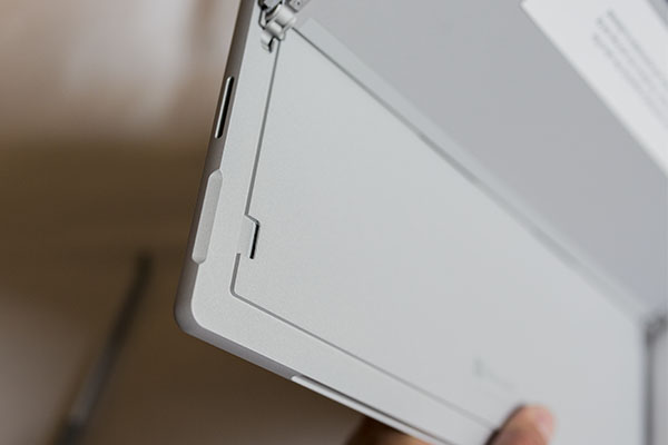
The Surface Pro has six total ports, but they aren’t perhaps what you were hoping for or expecting. It has a full sized USB 3.0, headphone jack, microSD card reader and a mini display port. The other ports are the Surface Connect (charger), keyboard cover port.
That’s it.


And that, unfortunately, is the only real glaring problem with the Surface Pro. It is pretty challenging as a “pro” to fully take advantage of a computer that limits you to one port, and that one port is the now aging USB 3.0. That, mixed with the lack of a full-sized SD port puts the same complaints many toss at the latest Apple MacBook Pros right back at Microsoft.
I would be slightly more forgiving if the single port was a Thunderbolt 3 (which would allow for daisy chain) or at least USB-C (since that’s where everyone is moving). Unfortunately, it’s a big downside for this product and leaves you questioning how long it will remain relevant/top-of-the-line.
The lack of an SD card slot is the biggest knock against the Surface Pro. None of the Surface products that have used this design have an SD reader, but it doesn’t forgive it being left out here. Photographers overwhelmingly use SD over any other card type, and likely will for some time. Not being able to just throw a card directly into the computer is frustrating. If we are going to be hard on Apple for not including one, we absolutely can’t easily forgive Microsoft for not including one either.

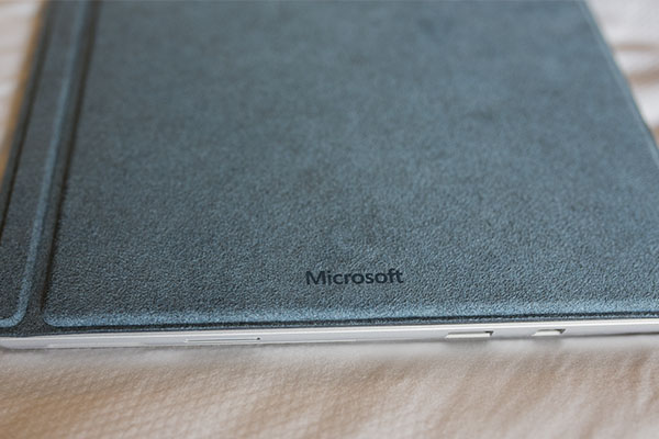
Using the Surface as a laptop is still a bit awkward, but this isn't a new issue to the Surface Pro. Previous iterations have the same problem, thanks mainly to the way the keyboard hinges to the Surface screen. The kickstand, hinge, and somewhat floppy keyboard don't really sit on a lap well, but you can do it. It's not the best, but it is manageable.
Overall, the Surface Pro is a great laptop. It’s fast, powerful and extremely lightweight. The screen is bright and responsive to both touch and pen, and the colors pop. You can easily use the laptop outside in the blazing sun or in a dark room. It folds up and is easily manipulated to fit whatever task you may ask of it, be it in draw mode for sketching, tasked with intense retouching of high-resolution files, or used for simple word processing.
Pros:
- Fast performance
- Lightweight
- Strong battery life, even if used heavily
- Can be configured in multiple ways, and keyboard can be detached completely
- Easily handles large image files
- Bright, beautiful screen
- Very responsive touchscreen, and the new Pen works great
- Retouchers and artists alike will enjoy the new pen-Surface combo. Much improved over previous generations.
- Compatible with the new Surface Pen and Surface Dial
- Multiple configurations for different end users and budgets
Cons:
- microSD card port is still in a bizarre location, behind the kickstand
- Only one USB-3.0 port, not even USB-C or Thunderbolt 3, is a big downer
- No built-in full-size SD reader
- Still a bit awkward to use on your lap
- Surface Dial still needs support from Adobe and others software makers

The 2017 Microsoft Surface Pro gets a lot right, and if looked at from a wider scope of the Surface machines that came before it, is a vast improvement and wholly different computer than even the last generation laptop/tablet hybrid. For those who tried the Surface and did not find it to their liking, the 2017 Surface Pro deserves a second look. The pen is much improved over all other predecessors, and the sheer computing power of the Surface Pro is enough to support any photographer while on location. Aside from the woeful state of its ports, having only a single USB-3.0, the Surface Pro is an excellent computer and worthy of your attention.