The HP ZBook x2 may be heavy and look funny, but it’s got a lot of great features for working photographers
posted Monday, June 18, 2018 at 3:40 PM EST

Though it's not going to win any beauty pageants, after a few months of using the HP ZBook x2 I have to say... it's one of the better PCs I have come across if you're specifically looking to edit photos or if you are a graphic designer. I use the word specifically very consciously though, because as I hope to show, this isn't a great "all around" computer. It's built for artists, and that definitely shows. With that said, it has some really smart features that are absent on its closest competitors, and aside from a short list of downsides, it does a pretty good job showing that HP is serious about artists.
To preface, this is not going to be a deep dive on computer hardware specs, as that to me is less important than how it actually functions doing necessary tasks as a photo editor. Additionally, I sought the help of a friend of mine, Karaminder Ghuman, who is a headshot photographer and regularly uses Lightroom and Photoshop to cull and process his images. The Zbook is built for guys like Karaminder, so I thought it prudent to seek his input in this review. His opinions frame much of what you will read below.
The HP Zbook is a computer designed specifically, and I really mean that word with emphasis, folks who use tablets or the Wacom Cintiq line. For those who aren't that target market, this computer is going to seem really weird.
To start with, let's address the build and design of the ZBook. Out of the box, it's hard to imagine a clunkier looking computer. The Zbook shuns traditional rectangle design for a polygon, and though it's a bold choice, I can't say it's pretty. Sure, it's an eye catcher and conversation starter, but I generally end up apologizing for how the computer looks, which isn't the best result. It doesn't help that it is also way heavier than you would expect out of a laptop, but considering what they pack into this thing it's not entirely surprising. This thing has some serious heft and considering it's supposed to take the place of a desktop and Wacom combo, I guess that is unavoidable.
But despite the weird looks, it serves its intended purpose extremely well. Firstly, the Zbook has a set of buttons up and down the sides of the monitor that map to certain features in applications, though remapping them isn't possible, unfortunately. If you're big into using those on your Wacom tablet, you'll feel right at home here.
The Keyboard
One of the major downfalls I've found on computers that feature a touchscreen is the pain of figuring out what to do with the keyboard. If you lean forward to use a pen on the screen, the keyboard gets in the way. If you detach the keyboard, you lose the hotkey functionality that is critical for retouchers (honestly, it's pretty crucial now for just about anyone who uses a program on a computer). It feels like a no-win situation. HP seems to have thought of this, and their keyboard is detachable but continues to function even if it's not connected to the laptop. Using Bluetooth, which is connected and in place out of the box, the keyboard can continue to operate for hours apart from the main body of the computer. In this way, you can position the monitor any way you like and still keep access to the keyboard for when you need to use a hotkey.
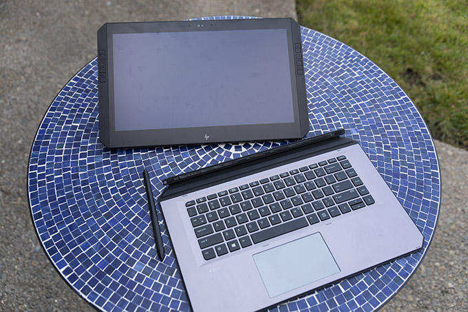
It's not the most elegant solution since the keyboard is rather large and it can be challenging to position it so that it is not in your way while you're trying to use the pen directly on the screen, but at least it's an option.
The keyboard itself is... fine. It's not outstanding in any way, and the trackpad is about the same. The point where the keyboard connects to the computer has a magnetized folding hinge that puts the keyboard up and an angle (the Surface Pro products from Microsoft do this too), and I personally just don't like this. When a keyboard is as thin as this one is (same for those Surface Pros), typing can feel hollow since you're banging the keys above... well, air. Luckily you can lay the keyboard flat on a table and when you do that, it feels at its best. I can also attest that my typing speed saw no dip when I was writing, and overall the keys feel good to use.

One last note on the trackpad: it's totally average. Don't expect it to feel as nice as a standalone Apple Magic Trackpad for the iMac, but it's also not a garbage experience. It's just kind of forgettable.
Additionally, HP made a big point of stating that they don't bisect the power of their computer between the monitor and the keyboard, like their main competitor the Microsoft Surface Book. This has its advantages, as you don't have to worry about keeping the keyboard attached in order to get maximum horsepower out of the CPU or better graphics performance, and using the computer in any configuration you like requires you to sacrifice nothing to get to that point.
It also has a disadvantage of making the computer really lopsided to use. I keep coming back to build design choices mostly because this is the only place the HP ZBook struggles. The monitor "half" is much, MUCH heavier than the keyboard, so using it on your lap is almost impossible. Because it uses a rear-mounted flip-out hinge to help prop-up the screen and all the weight of the entire machine is compressed onto that one point, it digs into your lap and is extremely uncomfortable. Not only that but because all the weight is at the back end of the machine, it is very unbalanced and ungainly when it isn't on a table. I dropped the computer three times in the first hour I was using it because of this. Luckily, this thing is built like a tank and seems to be none the worse for wear.
In short, this isn't the most easy-to-use computer if you don't have a table. It's large, heavy, bulky and poorly balanced, so using it on a train or bus while on the way to work is not going to be a pleasant experience. For a laptop, it does a pretty poor job of exiting on your lap, and pretty much needs a desk in order to function properly. So, it's a laptop in name only. Really, I consider it more of a mobile desktop, and if you look at it that way too you'll probably have better expectations for it and be less frustrated by it.
Lots of ports
HP did really well when it comes to connectivity and ports available on the HP ZBook. It has an absolute ton, which runs the gamut of what you could expect out of a laptop. In addition to the older USB-A type connection (you know, the one everyone still uses), it also has a full-size HDMI port and two Thunderbolt 3 ports (that are also compatible with USB-C cables). You can choose to charge the ZBook using the dedicated power port, or you can use either of the Thunderbolt ports as well (just note, you won't get the fastest charge this way, and charging via the Thunderbolt 3 will not charge as fast as the computer draws when operating. Use this as an optional last resort and not your main charging option). Finally, it also has a full-size SD card reader, so you don't need to worry about adapters if you need to ingest images from your camera.
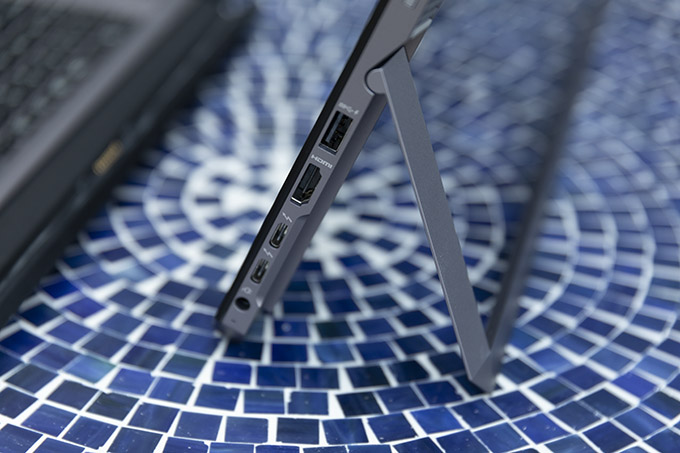
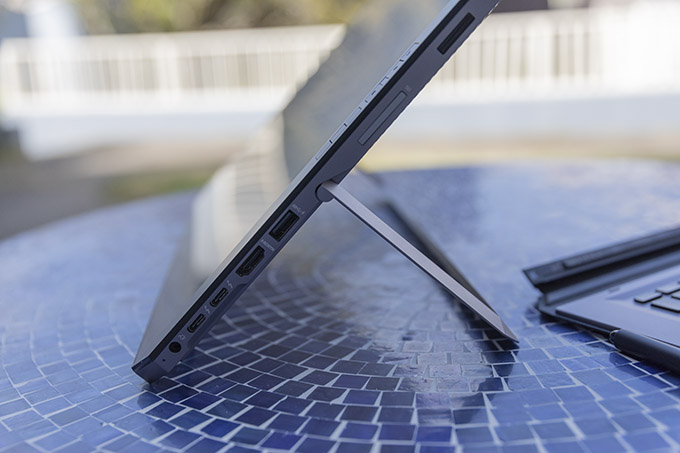
I'm not used to seeing Thunderbolt on anything other than a Mac, so the inclusion of two is a boon. This is a huge plus for creatives who are actually looking for a legit option to move away from Apple since you don't lose any connectivity to devices with the ZBook.
Bang & Olufsen is supposed to be amazing
I was pretty excited to hear the sound quality out of the ZBook when I saw the speaker system was by Bang & Olufsen, but unfortunately, this is my least favorite part of the whole computer (yes, it's even more of a drag than the weird design).
These speakers sound terrible.
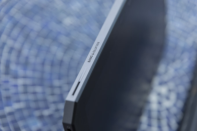
I don't know if that sentence does a good job of expressing how disappointing the sound system is on this laptop, but these have to be some of the worst speakers I have ever encountered. My iPad Pro puts this thing to shame not only being straight up louder, but with the actual fidelity of the sound. Honestly, iPhones might sound better.
Not only are the speakers very weak (I had to strain my ears to hear this even at max volume), but they just completely drop the bass and midtones of any sound. What's left is extremely tinny, like how old computers used to sound before companies got better at making quality speakers smaller (think back to 2002).
It's really a let-down, especially when they carry the Bang & Olufsen name. If you want to use this computer to listen to music or watch videos, use headphones.
The screen is somewhat unique
The ZBook's monitor is kind of a conundrum because despite not being very bright, it's usable in just about any light condition. This is because the monitor isn't a traditional glossy screen like you see on just about every modern computer. It is instead a "matte" screen like what used to exist on older laptops (again, think like 2002). It is, of course, different and better than back then, especially since it's a touchscreen and compatible with a pen, but looking at it on a desk will immediately bring back memories of those old monitors.
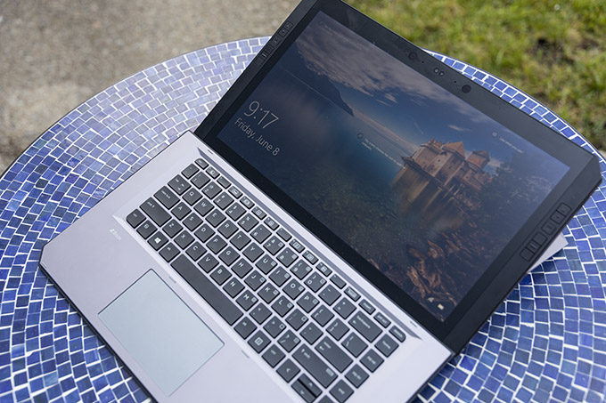
The thing is, though they aren't very bright or sharp, they do a really good job fighting glare. So while you may find yourself leaning extra close to the monitor even under normal office lighting conditions, you also won't notice if someone shines a very bright light behind you, or if you choose to work outside in direct sunlight. One of the tests we did involved using it in an extremely bright studio, and while most other computers were very hard to see in that kind of brightness, the HP ZBook remained totally usable.
It is worth noting that this is a 4K display that displays 1 billion colors in 10-bit, 100% Adobe RGB. I will say though that despite the resolution, the style of the screen can detract from perceived sharpness. I never felt that edges were that crisp when I was looking at images. This could just be me, however.
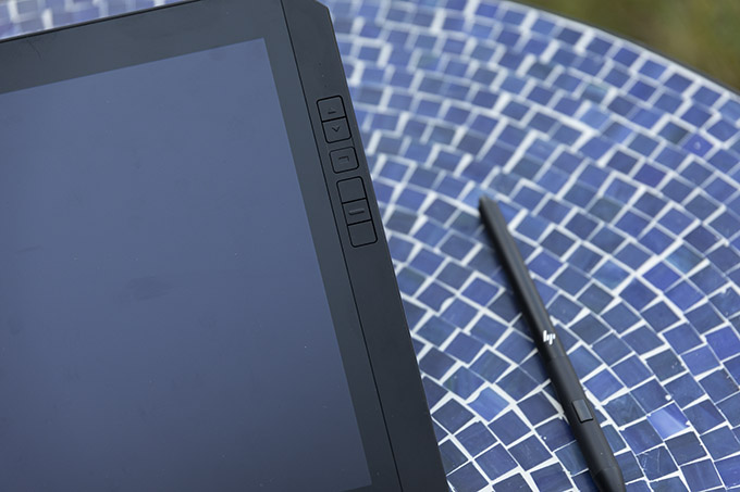
So do I personally like the screen? I'm not sure. I like that it doesn't glare much at all, but I do wish they put more horsepower behind the backlight. I don't mind the matte screen look, but I do want to be able to feel like I can see it without squinting. I think it's going to come down to preference, so I think if you're interested in the ZBook, you should check it out in person first if possible.
Getting work done
As far as using the screen with a pen, it's excellent. If you like using a Wacom tablet or if you have enjoyed their Cintiq line, you'll definitely feel right at home here. Speaking of the pen, it's designed pretty much identically to the Wacom pens (probably because it was made in tandem with Wacom developers) and works just like you would hope it would. The ZBook even ships with several different nibs so that you can change out the tips of the pen to fit your liking.
The computer itself seems powerful enough to handle anything I could throw at it, likely because of what it has going on under the hood. There are four different configurations you can get, and we were loaned their most powerful, which features an Intel Core i7-8650, 32GB RAM and an Intel UHD Graphics 620 and NVIDIA Quatro M620. This loadout will set you back $3279 MSRP though, so it's no drop in the bucket. Their basic version will drop your processor down to the I7-855OU and reduce your memory to 16GB, but still costs $2699 MSRP. It's not much of a discount, and you most certainly are going to feel that drop in memory. Suffice to say, it's an expensive machine.
But the important question still hasn't been addressed: Can you get work done on it? To find out, I asked Karaminder to process a recent shoot on the ZBook. Karaminder comes from an all-Apple workflow, so he is particularly critical of all other machines (as Apple folks tend to be). The thing is, after a couple minutes of getting used to the laptop, Karaminder went silent and zoned in on the tasks at hand. After a few more minutes, I interrupted him and asked how it was going.
He laughed, and responded: "I can get work done on this."
The ZBook is powerful enough to keep up with a photographer's demands, has a screen that works regardless of your environment, and allows you to immerse yourself in your editing much like the larger, chained-to-a-desk Wacom Cintiq series does. You can use a pen, as you can on many other computers but... the key difference is here, you may actually want to on the HP ZBook. Because HP worked with Wacom to develop that pen tech, it feels good to someone who is used to the pen ecosystem. This is the computer designed exactly for that kind of person, so it succeeds in that respect.
Back to the point about getting work done, I think that's the key takeaway. You can harp on the laptop for having a weird, top-heavy design. You can hate the speaker system (I certainly do). You can even dislike the Microsoft operating system, but if you can get work done, and feel progress, how bad can it really be? There are many computers that I have tested over the years that have a lot of cool bells and whistles, but when it comes down to actually trying to do work on them, they aren't up to snuff.
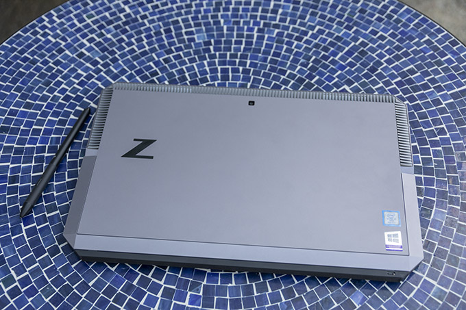
The HP ZBook, despite some weird design choices, is a working man's computer. It is fast, it is efficient, it loves a pen-centric workflow, and it helps you finish tasks and move on to the next. And when it comes down to it, that's all any of us are looking for.
A final note: HP gave me the expectation of the battery lasting 10 hours, but I found that it doesn't quite get there with continuous use. You can expect 6 to 8 depending on how much you're taxing the capabilities of the laptop, which isn't great but it's not the worst either. Do I wish it was better? Sure. Is it changing much about my expectation for a laptop? Not really.
Pros:
- Screen works in any environment & combats glare very well
- Offers USB-A, USB-C, Thunderbolt 3, SD, HDMI and a headphone jack
- Quiet operation (fan noise is minimal)
- Keyboard can be used even when separated from the computer (via Bluetooth. Keyboard charges when connected to the computer)
- Decent battery life (about 6 to 8 hours of continuous use)
- Has a very Wacom-esque user experience
- Interchangeable nibs on the pen, which never requires charging
- Has great horsepower, and handles multiple operations in the Adobe suite well
Cons:
- Heavy and awkwardly-shaped
- Poor weight distribution and a hinge-design makes this exceedingly uncomfortable and hard to use on a lap
- Just awful speakers
- Screen never really feels sharp or bright
- Very expensive
HP has created a computer that is somewhat unique in its target. Most manufacturers are looking to make a computer that has some features creative professionals will like while still aiming to please the average consumer so they can sell as many units as possible.
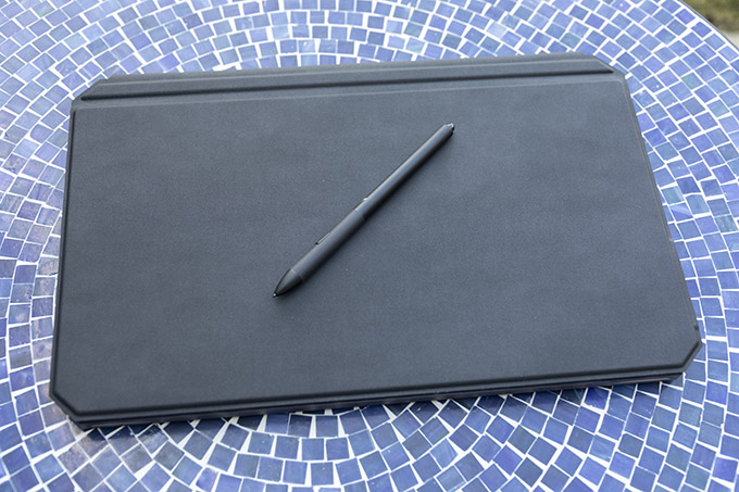
The ZBook x2 flipped that narrative, and offers more features a creative would be specifically looking for and sacrifices much of what the average consumer would find attractive. The design is kinda clunky, it does not work well on your lap, and the screen isn't going to impress the average user. But it's powerful, it's sturdy when on a desk, the keyboard design means you can use it even when it's not physically connected, and the monitor will never be bothered by glare. Plus it feels like a Wacom tablet, which is what a lot of creatives are specifically looking for.
The ZBook is a pretty mundane all-around computer, but it's an excellent artist's working device, and luckily that's exactly what it is supposed to be. It's a shame the price tag is through the roof though because if it were even a third less expensive I think it would be a lot more attractive to anyone looking to ditch a totally useless Touch Bar and gain a full touchscreen with familiar, industry standard-esque, pen support.