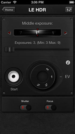
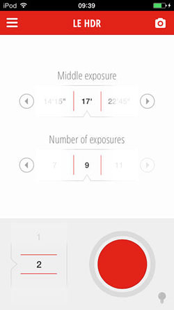
Just in time for iOS 7, TriggerTrap Mobile app gets a cleaner, skeumorph-free interface
posted Thursday, September 19, 2013 at 5:18 PM EDT
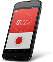
Good news, iOS fans! Popular remote release app TriggerTrap Mobile has just received a major overhaul, and it now sports a brand-new, much cleaner user interface. (Not coincidentally, it looks a whole lot like the interface used by the current Android beta release, which got underway a month ago.)
If you're not familiar with TriggerTrap Mobile, it's something of a swiss army knife for remote shutter release control, able to trip your shutter on a vast array of events. If you've ever wished you could shoot a time-lapse with images captured at equally-spaced distances while driving, capture a group portrait only when a certain number of faces are seen in front of the camera, or trip the shutter at the precise moment of a loud noise, this is the app for you. (There are other trigger types, too, and they're unchanged from the previous version -- check the TriggerTrap website for a full list.)
Arriving just a day after Apple released its iOS 7, TriggerTrap Mobile 2.0.0 follows much the same path as the Jony Ive-driven iOS update. It's out with the skeuomorphic -- that is, user interface elements which try to look like design features of earlier products -- and in with a much simpler, more modern aesthetic.
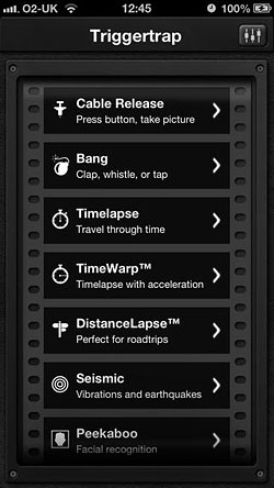
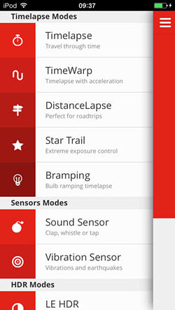
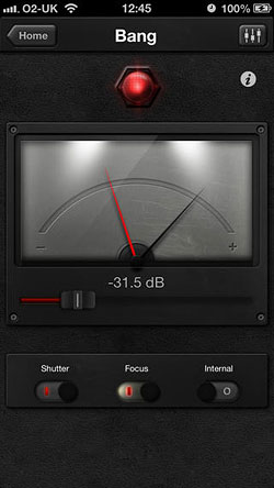
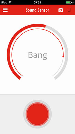
Faux-film strips, indicator lamps and gauges are gone, along with the pseudo-3D knobs, levers and buttons of TriggerTrap Mobile 1.5.5. In their place is a clean, bold interface that matches the simultaneously-updated, red-and-white TriggerTrap logo. Thanks to the reduction in clutter and increase in contrast, TriggerTrap Mobile's various controls should be much easier to read without having to crank the brightness on your iPhone, iPad, or iPod Touch to the maximum.
If you haven't updated to iOS 7 yet -- or your device isn't compatible with the new version -- then fear not! TriggerTrap 2.0.0 still works on devices running iOS 6.1 or higher, so you'll get the new interface regardless. That's good news, because the difference is night-and-day, as you can see in the comparisons of old and new versions below. (We really don't need to tell you which is which, do we?)
