by
Dave Pardue
posted Saturday, April 5, 2014 at 11:10 AM EST
It's that time again, folks, when we have the honor of honoring you, our best photographers.
Below are our distinguished winners from March in our Photo of the Day contest. Thanks to everyone who entered, as your awesome photographs make our jobs all the more enjoyable, and give your fellow readers the pleasure of enjoying the fruits of your craft.
The top three winners all receive gift certificates from Adorama of $300, $200 and $100, respectively. Congratulations to these winners and to the worthy runners-up. Please keep the terrific submissions coming our way!
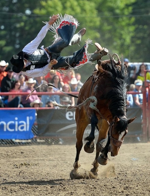
First Place • Ride em Cowboy by Sean Rooney • Nikon D4
Yikes! This is definitely what
Henri Cartier-Bresson would call "the decisive moment!" It's hard enough keeping the camera on a fast-moving subject like this, but to end up with such great framing, and perfect timing is a real feat. As noted, the composition here is great, the body of the horse and the line of the rider's body actually surround the central portion of the frame, naturally hitting two sides of the "rule of thirds" box. The conventional wisdom is that a totally blurred background is best, to isolate your subject, but the spectators in the background here are an integral part of the shot. It's good that they're softened to the degree that they are, to avoid too much distraction, but the horse and rider frame the crowd, naturally drawing our eyes to them, but their gaze directs us back to the subject(s). That, combined with the two separate subjects creates great tension and movement, sending our eyes back and forth between the three points of interest. Congrats to Sean on a great shot and fast reflexes to capture it!
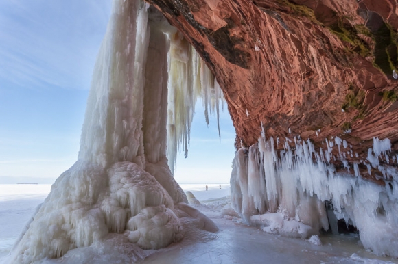
Second Place • Sea Cave Majesty by Melissa Anderson • Canon 5D Mark II
Wow, what an incredible display of Nature's majesty! Being much closer to the camera, the figures in the background are obviously not to scale, but the perspective thus created helps convey a sense of immensity, and the tiny scale of humans in nature. The composition and framing are fantastic, not to mention the great exposure balance between the bright background and cliff and ice forms in shadow. We love the contrast between the warm tones of the cliff face, and the cold blue of the sky and ice, dividing the frame in two. The position of the humans is perfect, too, right on the dividing line between the sun and shadow; either above or below that point wouldn't have worked nearly as well. We love the jagged points of the icicles directing attention to and almost seeming to threaten the people. A gorgeous shot, kudos to Melissa for capturing it!
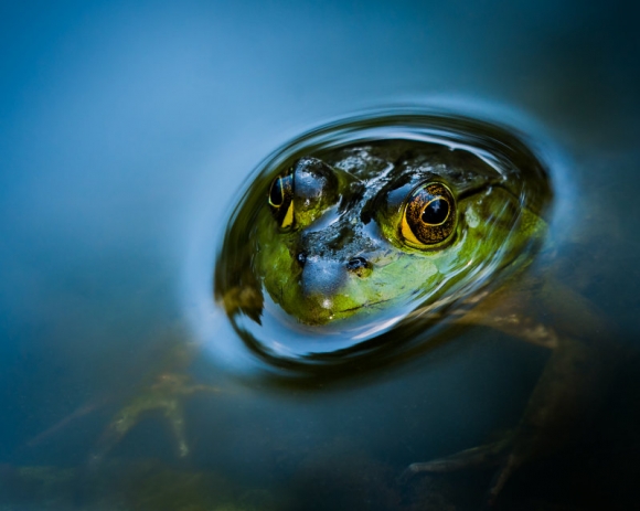
Third Place • Curious Bullfrog by Abeselom Zerit • Nikon D800
The previous two winning images had a lot of complexity to them, but we really appreciate simplicity in photos too. This is a really lovely "portrait" of a frog, the smoothness of the water proving contrast to the textures of the frog's skin and eyes. It's interesting to note that this wouldn't be nearly as good or interesting a photograph if you couldn't see the frog's legs and body underwater. (As a mental exercise, try imagining the image without those elements: A lot less interesting, isn't it?) The plane of focus here is also exactly where it should be, with the iris and pupil of the frog's right eye razor-sharp. (It can be especially hard to get the focus exactly where it needs to be in macro shots, but that can be the difference between a dud and a great image.) It may just be a happy accident, but the tiny catchlight in the corner of the frog's eye also creates a point of central focus, making the shot much more riveting than it would be otherwise. We get a lot of macro images submitted to this contest, it takes a lot more than just a highly magnified image of a small object to constitute a great photo. This is an example of that, big congrats to Abeselom on this great photo!
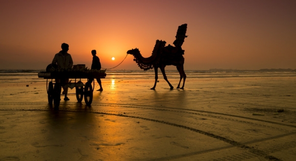
First runner-up • Life by Salman • Canon 1DX
Sunsets are another popular theme we see in contest submissions, but they're often just lucky shots of a particularly pretty sky. By comparison, Salman's shot here is beautifully composed, with interesting subjects, positioned perfectly relative to the sun and surroundings. A subtle point: Horizons are sometimes hard to position subjects against, because they can create such a strong line that they overcome the subject compositionally. Here, the horizon cleanly splits the camel's body from its legs, and neatly picks up the visual mass of the cart. It thus supports natural divisions within the subjects, rather than being at odds with them. (The camel in particular is interesting in this respect: A little higher and the horizon would split its body, a little lower, and it would split the legs unnaturally. As it is, the camel's body rests gently on the horizon line, a perfect alignment.) Really great work, Salman!
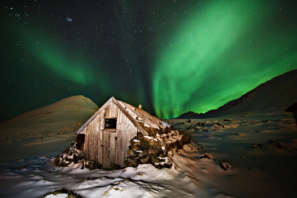
Second runner-up • Santas hut by Gisli Kristinsson • Canon 5D Mark II
Wow! (I seem to use that exclamation a lot, when writing about our winners :-)
Again, we've seen a lot of photos of the Northern Lights, so it takes something special to stand out. Usually, the Lights themselves are set up as the subjects, here, they're a background to the cabin, which is the primary subject. They're not just randomly positioned, though, this shot has great leading lines, created by both the lights and the surrounding terrain. There's great tonal contrast between the flash-illuminated cabin in the foreground and the dark surroundings, plus a great color contrast between the green of the Lights and the warm hues of the cabin's wood. Congrats on a great shot, Gisli!
(Commentary and analysis compliments of our publisher, Dave Etchells)
For anyone wanting to know more about our competition please visit this news story which describes our contest and also offers some useful tips to help you succeed. To see camera and exposure information on this month's winners or to visit previous months please visit our POTD winner's gallery.
[Ready to submit a photo of your own? Just click here! And to compliment these photographers on their submissions or offer your own analysis, please use the comments section below.]
