Behind the scenes: The design process that led to the creation of the Olympus E-M10
posted Wednesday, April 16, 2014 at 2:16 PM EST
Shortly after the CP+ show in Yokohama last February, I was able to visit Olympus' R&D headquarters in Hachioji, Japan, where I had the privilege of extensive discussions with the heads of a number of deparments there. One very interesting presentation was by Mr. Setsuya Kataoka, General Manager of the Product Development Department 1, R&D Division, who described the series of steps involved in bringing the recently released Olympus OM-D E-M10 camera design from concept to reality.
At IR, we often see so-called "wood block" examples of upcoming camera designs (they haven't been made from wood for years now, but the name lingers), but until now had never heard what the process was that leads to them. It's an interesting process, and some of the examples Kataoka-san showed give an idea of the extent to which a design can change from first concept to final production.
Here's what Mr. Kataoka shared; the shot below shows examples of various parts of the process, which we'll discuss separately below:

The earliest stage of a design is actually in the form of pencil-sketches by the designers, which I unfortunately don't have samples of to show you. These are just freehand explorations of concepts, and there may be quite a number of them. The best of these are eventually selected to pass on to others within the company for review. Mr. Kataoka explained that he encourages his designers to constantly be thinking about new ideas and approaches, and doodling (my term) design concepts.
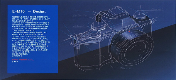
Usually, these design doodles are presented to other levels of the organization, and then a few are reduced to mechanical drawings, as shown above. (It's interesting to note that the image above is actually from a later stage in the design of the E-M10, as we'll see below; note how many dials are on the top of the camera.)
Once a general design direction has been decided on, a preliminary mock-up is commissioned, so people can actually hold it in their hands and comment on the placement of controls, shape of the grip, etc, as well as get an idea of the overall aesthetics of the design. These cosmetic mock-ups are quite convincing; they really look and feel a lot like a finished camera. The main difference is that none of the controls actually operate, so they're purely static models. There are independent companies that specialize in making these product mock-ups, and the mock-ups aren't cheap. The Olympus execs didn't give a specific number, but said that each one "cost as much as a small car," so I'm guessing they're on the order of $15,000 - $20,000 in US dollars. As a result, they're only used at steps in the process where it's important to have a good sense of the aesthetics of the design or fine details of the physical configuration.
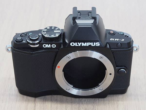
The shot above shows the initial mock-up for the E-M10 design. What I find most interesting about this first-round design is that the mode dial is on the right side of the camera (as viewed from behind the camera, when shooting with it), and the mode dial is the only rotary control on the camera's top. It's a much more minimalist user interface than ended up in the final product.

After the initial mock-up has been made and passed around and comments received back, there begins a long process of design tweaking. At this stage, the exploration involves things like overall shape, grip design and control locations. Here, the considerations are more functional and ergonomic than cosmetic. There are also a lot of iterations involved, so the time and expense of mock-ups such as we discussed earlier would be prohibitive. Instead, the designers rely upon block models created in-house, using a substance Mr. Kataoka referred to as "Plastic Wood." (I'm pretty sure that's just a convenient name the designers use for the product; the manufacturer doubtless calls it something else.)
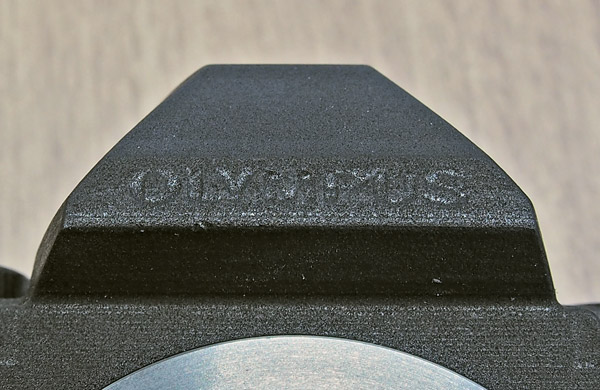
Although it's a plastic compound, Plastic Wood has something of the heft and texture of wood, hence it's name. I don't know whether it contains any wood fibers or not; it might just be that it has a slight texture that looks a bit like end grain in wood. It's relatively inexpensive, though, can hold reasonably fine details, and is very easily machined in-house with even a small CNC machine. As a result, the designers can quickly and easily try out variations in things such as grip, body dimensions, control placement, etc. The close-up above gives you an idea of the texture of Plastic Wood. As noted, my impression was that a lot of this sort of mock-ups are made, as they experiment with the nuances of grip design, etc.
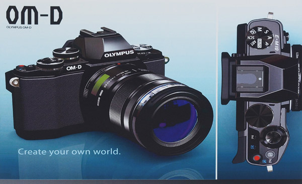
Once they're to the point of being able to make CNC models of the product, the design is fully in their CAD system, so they can also produce 3D renderings of the product, as seen above. These are helpful for judging aesthetics, without requiring an expensive physical mock-up
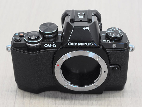
When everyone agrees that they have a final design, Olympus commissions another high-end product mock-up like we saw above, this one intended to represent the final product in every respect. These are the models that we often see in NDA briefings on press tours, so they get a lot of handling. (This perhaps explains the rather "well-used" appearance of the model above.)

|

|
I found it particularly interesting to compare where the design ended up, relative to where it began. Comparing the original model on top and the final one on the bottom in the images above, the latter looks a lot more like an enthusiast camera, with three external control dials vs. just the single mode dial on the original. The EVF bulge (what would be the pentaprism housing in an SLR) is also a little more squared off and "muscular" looking, for lack of a better word. There's a bit more body to the right of the lens flange in the view above, and the grip appears to be slightly more sculpted.
|
|
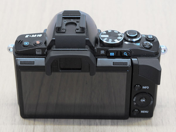
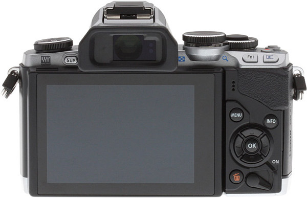
These shots showing the backs of the original concept mock-up vs. the final mock-up show even more differences. The production version (again on the bottom) looks to have a bit thinner LCD panel, the flash-up button is on the back of the body now (I'm actually not sure where it was on the original version), the eyecup is larger, a power lever and the delete button have been added to the right control group, an extra Fn button has been added to the design (what was the Fn1 button is now labeled Fn2), and the Fn1 and playback buttons are now on an angled panel on the right of the body, for easier access. The result of the process was a very appealing camera design that feels great in the hand. (To me, at least; YMMV)
All in all, I found this a fascinating peek behind the scenes at how a camera design evolves, and just how different the final version can be from to the starting point. Many thanks to Kataoka-san for putting together this presentation for me!
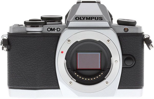
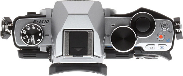
And, just for reference, the three shots below are of a full-production E-M10, shot in our studio. It's a silver and black model, but other than that, it seems to follow the design of the final mock-up shown above very closely.
|
|
|
|
|
|
[For more information on the Olympus E-M10, follow along with our currently in-progress E-M10 review]


