Google Camera app for Android adds slightly dubious, Lytro-like refocusing, depth-of-field effects
posted Wednesday, April 16, 2014 at 4:43 PM EST

Do you have a Google Android smartphone or tablet running Android 4.4+ KitKat or higher, or are you willing to root and install a third-party ROM to get it? If so, you can also have the company's just released Google Camera app, which overhauls the user interface yet again, and adds a new, Lytro-like post-capture depth-of-field effect.
At the moment, Android 4.4 KitKat is only available on a fairly limited number of devices, although that should be improving over time. Of the devices I have at my disposal, only one is on KitKat: a Google Nexus 10 tablet. It didn't take me long to download Google Camera for myself and give it a whirl.
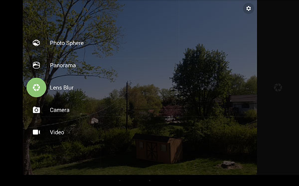
My initial reaction was a sigh of mild frustration, as soon as I realized that Google has, once again, radically overhauled the user interface of its Camera app. Not every user will be familiar with it, as previously it was available only to Nexus device owners and those running third-party ROMs, but it's now available as a Play Store download. I'd rather grown to like the previous pie-like radial menu design, revealed with a quick tap-and-hold on my device's screen, but like the interfaces that have been assigned to the trashcan before it, this too is gone.
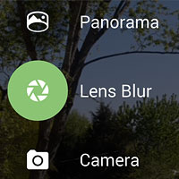
Camera modes are now selected with a swipe in from the left of the screen, and the scant few settings -- resolution and quality, save location, exposure compensation, flash, camera selection, grid overlay, and panorama direction -- are accessed from two separate menus, brought up with a tiny button at top right of the screen in either the camera app or the mode selection screen. And by default, exposure compensation isn't available at all -- you have to navigate three layers deep into the menu system to enable it.

I'm sure Google put a lot of work into this new interface, but as far as I'm concerned, it's a big step backwards. And it didn't take me long to find my first bug, either. Touch focusing pops up a small target on the screen -- or at least, it does until you visit the gallery. For me, after returning from the gallery to the camera app, the target never appeared again during touch focus operation. I also realized fairly quickly that the solid-white icons and slider used for post-capture depth-of-field adjustment disappear on a white background.
But perhaps the new depth-of-field simulation function -- or Lens Blur, as Google calls it -- would make up for all of this. It's certainly got cool factor going for it, and the fact that the effect can be completely changed post-capture reminds me of Lytro's nifty -- if extremely limited -- light-field cameras. Not only can you adjust the strength of the depth-of-field blur effect with a slider, but you can also tap on the screen to identify a subject that should be in focus. (A preview of the effect is rendered quite quickly; the final image once saved takes a good few seconds to render even on my fairly powerful Nexus 10 tablet.)
In a Google Research blog post announcing the new feature, the company details how it works. On capturing your image, Google gains depth information by having you raise the camera slightly so that it can capture a series of frames. This allows a depth map to be generated. For best results, your subject should be within five feet of the camera. Note that in my demonstration images below, the items on table were two to three feet from camera, the fence at perhaps six feet, and most everything else effectively near infinity.
There are several downsides to the Lens Blur tool. Not unlike the Lytro, Google Camera's Lens Blur images have greatly reduced resolution. At 4.9 megapixels, my Nexus 10's camera isn't exactly high-res to start off with, but once the Lens Blur effect is applied, the resulting image has just 0.7 megapixel (1024 x 768 pixel) resolution.
The effect also isn't terribly convincing. It likely works better with less complex subjects, and especially those which already have better background separation, but that rather defeats the purpose of the feature. And of course, it only works for relatively static subjects, and doesn't allow use of flash at all.


So, is this a worthwhile addition to the Android camera app, or just a gimmick? For now, we'll file it in the latter category, although with some development it could turn out to be useful. The effect -- at least, on a Nexus 10 tablet -- shows obvious issues, and the resolution limit of just 1,024 pixels on the longer side means you're not going to get a decent print.
For a quick throwaway shot on Facebook or other social networks, though, it could prove quite fun. Expect to see more of this effect from the KitKat device-owning friends in your timeline pretty much immediately, as the app is available for download today.