Latest Flickr update is the Instagramiest Flickr ever
posted Friday, April 18, 2014 at 11:03 AM EST

"Awesome! Another way to comment about pictures on my phone!"
--No one, ever
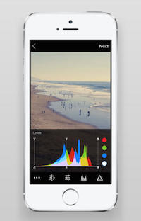
Ok, we'll admit to some undue snark there. Let's be clear: Flickr's progress this year has been great to witness. The latest update, version 3.0, of its iOS and Android apps shows Yahoo! is still hard at work. The web giant revamped big parts of the layout and navigation, added live-view filters, and incorporated Instagram-ish elements that encourage social sharing and commenting on photos. It’s not changing the core purpose of Flickr—a place for your photos—but it is trying to give mobile shooters more reasons to use the app on the go.
Photos now sit in a single column, rather than a split double column and the feed is faster and more fluid than it was previously. Following last fall's social-centric additions to the browser-based version of Flickr, options to favorite, share, and comment on photos are now an obvious part of the mobile design—a lot like Instagram and other imaging apps. The mobile app now allows 30-second video uploads, and supports live-view filters (previously, the filters could only be applied after the shot was taken).
There are tons of solid photo and video apps out there, but Flickr is now one of the few that integrates top-tier capture software with a very solid storage and sharing service. Is it a reason to ditch Instagram if all your friends are already there? Probably not. But if you’re already a heavy Flickr user, it’s another useful tool in the arsenal.
All of these Flickr updates over the past year—the total redesign last May, the social integration, regular app redesigns—are pretty impressive for a service that looked like a dinosaur not long ago. It's getting pretty Facebook-y in a sense, but at least it's not bogged down with ads and Candy Crush invitations... yet.
(Via The Verge)