Black & White photos steal the show: We vote in our April Photo of the Month winners
posted Thursday, May 8, 2014 at 11:16 AM EST
We tend to be happier when there's good variety in our Photo of the Day monthly winners. A portrait here, a landscape there and perhaps a new take on an animal photo or even something extreme. But it's also interesting to note when there's a commonality to the winners of any given month, and this month we noticed one big obvious: all three prize winning photographs are black and whites.
Also of special interest to point out is that, for the first time in the history of our contest, we have the same first and second place winner as the previous month, Sean Rooney and Melissa Anderson. Congratulations to these two wonderful photographers, whose names you may already know from all of their terrific previous daily winners. We're grateful for the quality you bring to our contest.
Thanks to everyone who entered this month. The top three winners all receive gift certificates from Adorama of $300, $200 and $100, respectively. Congratulations to these winners and to the worthy runners-up.
Please keep the terrific submissions coming our way!
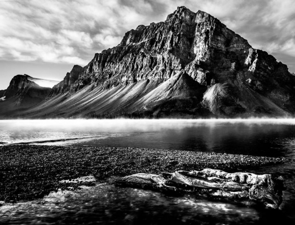
Wow! I seem to use that word a lot with our POTD winners, and for good reason. This is an absolutely stunning image, with a number of elements contributing to its appeal. At a very broad level, the contrast of the jagged mountain crags and contrasty foreground elements with the soft layer of mist and the clouds above provide a great deal of visual interest. One thing that immediately struck me is the way the contrast and mass of the driftwood and reflections in the foreground balance the mass of the mountain above, "reflecting" each other across the dividing line created by the mist. Without the mist above the water, the image would be much less interesting. It's a superb composition. The other thing that I noticed was the excellent tonality. Sean created a very high-contrast image here, but one that uses the available dynamic range of our 8-bit displays perfectly: There are only a very few areas of the image that go all the way to 0-black or 255-white; there's detail even in the bright highlights and deep shadows. If this were a film image enlarged and developed into a print, I'd say it was a perfect example of Ansel Adam's "Zone System" put into practice. (Actually, the principles of the Zone System apply equally to digital photography, but a lot of it had to do with how the film and paper were exposed and developed, to fit the tonal range of the subject into that achievable in a photo print.) An absolutely fantastic image, with brilliant composition and incredible tonality. Congrats, Sean!
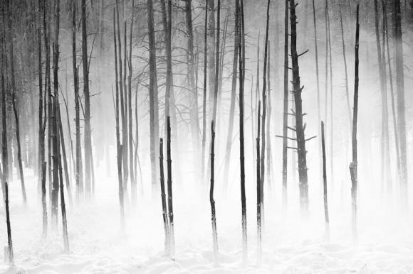
This must be "Tonality Month" for the IR POTD contest - Just as Sean's did above, Melissa's lovely image here uses every bit of the monitor's tonal scale; only a few bits of the image go either totally black or totally white, and the scale in between is used to wonderful effect. There's an awful lot to like here; it's hard to decide what to talk about first. I guess first is the wonderful sense of depth, created by the fog and the way the trees fade gently into the background. We're accustomed to seeing fog or haze like this in daily life, so our eyes and brain immediately translate this effect into an indication of depth or distance. Here, the starkness of the black trunks in the foreground heightens that sensation. Then there's the obvious contrast between the stark, vertical trunks and the soft blanket of snow on the forest floor. There's an added detail, though, that really makes the picture for me, and that's the snow clinging to the bottoms of the trunks. It's almost as if the blanket of snow was reaching up to cover the trees as well. Beyond any fantasized emotional contribution, the show on the trunks provides an excellent and needed transition from the soft mounds of snow to the stark trunks. If the snow on the trunks was removed but everything else held constant, It would still be an interesting picture, but I don't think it'd be the great one that Melissa captured. Big congrats to Melissa, not only for her photo skills, but the perseverance to apply them - my feet feel cold and wet from tramping through the snow just looking at this!
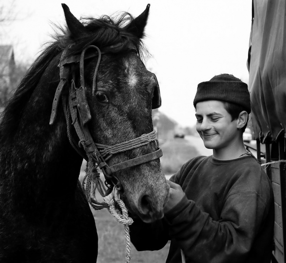
Landscapes and still lifes have to stand solely on composition, tonality, and/or color, but portraits are all about emotion and revealed character. This shot does a great job in that regard, while (once again) making good, intelligent use of tonality. It does lose detail in the deepest shadows, but I don't see it as a major issue, and the blown-out sky is important in isolating the subject(s). Compositionally, it could be an illustration for the rule of thirds, with both subjects well-positioned, roughly at the two top corners of the central area. Stepping back from the image a little, I'm struck by how effectively the composition draws attention to the young man's face. Some of it simply that his face anchors a large and generally triangular-shaped area of white at the top of the picture, but it perhaps goes even a bit deeper than that. Our eyes always want to "connect the dots," to understand the structure of our surroundings, and I think there's a little of that going on here. Notice the angle of the roof in the background, between the horse and the boy, and note how that angle connects with background elements in the far upper lefthand corner of the frame. The line thus formed points directly at the main subject's face, and I think plays a big role in giving the picture the impact it has. Having started by saying that portraits are all about emotion and revealed character, I've now droned on at length about composition, but my first, visceral reaction to this image is all about the young man's expression. It's always risky, trying to be too specific about reading others' emotions from pictures, but I get a strong sense of the boy's amused affection towards the horse. It's enormously engaging; I find it impossible to look at without smiling myself. All in all, a beautiful portrait, beautifully composed.
Congrats, Goran!
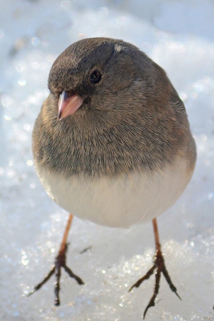
This is just a great little nature shot, but one that probably took a lot of patience, time, and care to pull off. Not only is the focus perfectly placed, but the slight 3/4 (7/8?) angle of the bird's body and its slightly cocked head make for a pretty much perfect portrait shot of the little guy. Great work, Steve!
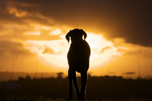
Some shots just tug at our heart strings (a lot of us at IR are dog-lovers), and this photo combines the memes of a faithful dog and the relaxation and peace of a beautiful sunset. It has something else going for it as well, though, namely the highlighted fur on the dog's legs. That provides great separation from the background, helping us see the dog as more of a complete subject, and lending great depth to the shot that otherwise would be missing.
Really nice work, Scott!
[Commentary and analysis compliments of our publisher, Dave Etchells]
For anyone wanting to know more about our competition please visit this news story which describes our contest and also offers some useful tips to help you succeed. To see camera and exposure information on this month's winners or to visit previous months please visit our POTD winner's gallery.
[Ready to submit a photo of your own? Just click here! And to compliment these photographers on their submissions or offer your own analysis, please use the comments section below.]