Bracket fungus, flowers and flight: We present our June POTD contest winners
posted Monday, July 14, 2014 at 2:30 PM EST
We have a nice variety of prize winning photographs to showcase for the month of June! From a gorgeous shot of colorful fungus to a really great shot of barbed plant life from Steve Webb, these images are worth taking a look at.
The top three winners from this month all receive gift certificates from Adorama of $300, $200 and $100, respectively, so if you've been on the fence about entering our contest, don't wait any longer! Entering is free and easy - just click here for all the details.
Below are our contest winners for the month of June, with commentary for each from our publisher Dave Etchells:
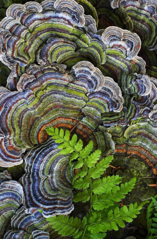
Pattern-of-nature shots can be tough to pull off sometimes. While interesting in themselves as abstract art, randomly repeating patterns can often leave you hunting for a "subject" for your photo, to capture and direct your viewers' eyes. LB's winning photo solves that problem beautifully, with the little fern frond popping up from the lower right. It nicely reinforces the orange bands of the largest fungi at center and lower right, and directs your eye to one of the classic "rule of thirds" points within the frame. There's also the vivid contrast between the soft, rich green fern frond and the hard-edged, complex patterns of the fungi, which adds visual contrast, and helps frame the frond as the primary "subject". (It's interesting, in that the real subject here is the fungi, but the fern serves that purpose compositionally.) All analysis aside, it's a beautiful shot, congrats to LB for seeing and capturing it!
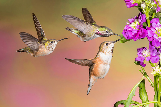
Wow, what a great action shot! Melissa must have had a pretty quick flash, to be able freeze the hummers' wings so sharply. It varies a lot by species, but these little guys are probably beating their wings about 50 times per second. So they'll go from up to down or down to up in just 1/100 second. Even a 1/1000 second strobe would result in a good bit of blur, so Melissa's had to be firing at a fraction of full output to be fast enough to freeze them so completely. It's likewise interesting to note that she was shooting at f/20, to have enough depth of field to get everything in focus. Given how blurred the background is, we suspect Melissa may also have selected her subjects and then blurred the background in Photoshop - All entirely legitimate, just mentioned here to suggest the technique to others. It's also possible that this is a composite of three separate shots of the birds, which would be OK as well.
All the technical details aside, though, this is a great shot artistically as well. The lines of the birds bodies and beaks direct your gaze to a focal point on the flower clump, but the little guy on the left keeps tugging your eyes back, to repeat the journey. I've always found images that pull my eyes around like this the most interesting. Rather than just glancing and saying to myself "oh yeah, a pretty picture", they draw me in and keep me engaged with them much longer than otherwise. It's important, though, that the other elements tugging at my eye be part of the picture, as in this case, rather than some random, distracting detail. I also like just the shapes and positions of the birds' bodies here, and how they fill the space. If it is a composite, it's well done; if it isn't, then I'm sure Melissa took a lot more shots in total that I'd already been thinking she had. (Another side note about composites: One thing about this shot that would make it work well for compositing is that the light source and camera would always be in the same place. Different lighting angles in images being composited together almost invariably trip you up and produce unnatural-looking results.) All in all, a beautiful photo, that took technical mastery, patience, and a good eye to pull off. Big props to Melissa on this one, really well done!
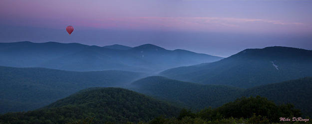
Mike's no stranger to these pages; he has a really great eye, and consistently turns in some great work. This is a lovely, moody shot, brought to life by the hot-air balloon in the upper left. The mist filling in the valleys, with the mountain peaks rising above it creates a heightened sense of dimensionality in the mountains, and the general atmospheric haze lends great depth to the image. This is another image where a dynamic tension between elements adds interest. On the one hand, the leading lines in the middle distance and tonality of the mist and mountains draw your eyes to the central valley, but the ridges of the two closest ranges of hills point to the balloon, and the contrast of the balloon itself commands attention. I spent a peaceful minute or two, just letting my eyes wander across the scene. Another beautiful shot, congrats to Mike (again!)
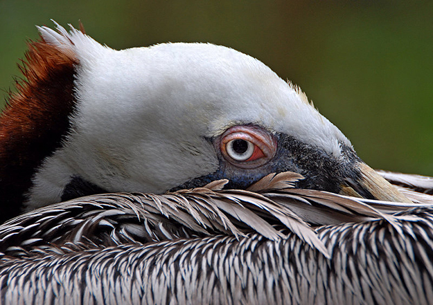
What a commanding, visually interesting portrait! The bird's coloring, the layering within the image, and the just off-center position of the bird's eye capture your gaze immediately. I love the base the foreground feathers provide for the composition, and how the strong contrast between the brown and white features on its head separates it so well from the deep green background. The center of focus is perfectly placed here as well; the slight softening of the bottom layer of feathers prevents their strong contrast from drawing too much attention away from the central subject. It's a good exposure too, taking maximum advantage of the available tonal range. Some of the feathers on the very top of the birds head just edge into being blown out in the blue channel, but I don't think you'd want to knock the exposure down or reduce the contrast by much, as the strong highlight plays so well with the background and lower parts of the bird's face. All in all, a great nature shot, congratulations to Lorenzo for capturing it!
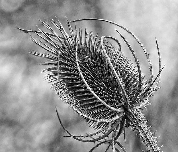
Steve Webb will be another familiar name to anyone who's been following this contest for a while; he's turned in a lot of really great shots. This is a really nice macro study in black and white, I like how the larger, outer branches contain the spines on the inside. The curving, stepped shapes formed by the rows of spines is fascinating as well. I'm a little unsure about the background here, though - While on the one hand, the broad dark lines (branches in the background, I'd assume) appear to radiate from and draw attention to the central subject, I also find them a little distracting. The lens used also produces slightly hard-edged bokeh patterns in the background that compete for attention with the subject. That said, though, I'm not sure that the same subject against a perfectly smooth or at least very soft background would be as interesting. At the end of the day, it's a great macro shot, a perfect subject for rendering in black and white, and another very nice piece of work from Steve. (Keep them coming! :-)
Congratulations to these worthy photographers, and thanks to all of you who bring us great photos each month!
For anyone wanting to know more about our competition please visit this news story which describes our contest and also offers some useful tips to help you succeed. To see camera and exposure information on this month's winners or to visit previous months please visit our POTD winner's gallery.
[And to enter this contest with one of your awesome photographs, just click here!]