Red Dot Camera app turns your iPhone into an iconic Leica rangefinder
posted Sunday, September 13, 2015 at 11:55 AM EST

Camera apps are anything but few and far between. However, every once in a while, there’s one that stands out amongst the crowd. One of those is Red Dot Camera, an iOS app that takes inspiration from Leica’s iconic rangefinder camera lineup and beautifully translates that into an intuitive interface on your iPhone for the nostalgic feel without the weight (or cost).
Now, even within the niche of retro-inspired camera apps, there are many to chose from. Many times though, the interfaces are clunky and the overall user experience is a mess because many developers and designers don’t take the time to think about how a retro design should be implemented on a screen, where the physical, tactile interactions that make analogue cameras so lovable isn’t present. This usually manifests in too many skeumorphic1 dials that are there purely for form, not at all function.
Red Dot Camera is different in the sense that its developers, Lifelike Apps, have carefully chosen the elements of Leica’s rangefinder lineup to implement into their digital design. By doing this, and also utilizing the technical advantages iPhones (and other smartphones) offer, they’ve created an app that gives you a slight hint of the retro feel without bogging you down with unnecessary interface elements.

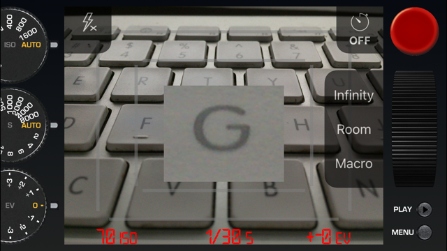
With the exception of the menu, the app is only one screen, which offers three dials on the left-hand side, two overlay buttons for flash and timer, a large red shutter button and an unusual-looking scroll wheel, which I’ll get to in a minute. Also displayed on top of the viewfinder are the settings used when taking the photograph.
First thing worth mentioning are the dials. Whereas other retro-inspired apps offer multiple dials as well, they tend to be over-thought with too many options or unclear affordance2 as to how to easily change the appropriate settings. Red Dot Camera has only three dials: ISO, shutter speed and exposure compensation.
Each dial ‘clicks’ into place in one stop intervals, leaving out the 1/3rd stops we often see in camera apps. Sure, this means there are times when your exposures aren’t 100% accurate, but when taking smartphone photos 1/3rd–2/3rd a stop isn’t going to make a huge difference.

This decision to simplify the dials ensures it’s easy, not cumbersome, to quickly use the app and change settings when trying to capture a fleeting moment. The design of the buttons also plays an important role, as the designers have used a rectilinear geometric sans-serif typeface that resembles what Leica uses on its camera’s dials and menus.
Second component worth mentioning is the scroll wheel on the right-hand side of the screen. While the app can use iPhones’ tap-to-focus technology, you can also manually focus using the scroll wheel, which cleverly resembles a focusing ring you’ll find on most lenses.

When you begin to move the scroll wheel up and down, a rectangular loupe effect appears in the middle of the viewfinder. This gives you a closer look to ensure focus is tack-sharp where it counts. It’s a small touch, but of all the camera apps that allow manual focus, this is by far one of the best implementations the ability.
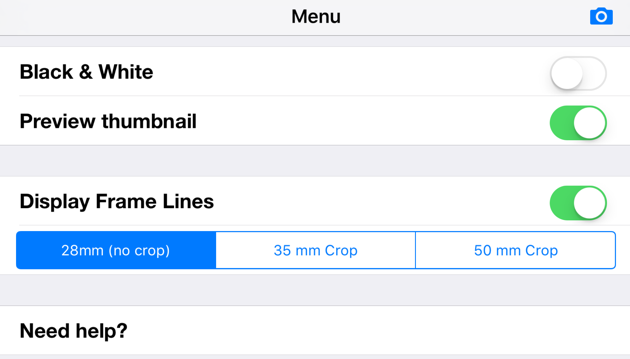
Inside the settings of the app you can also choose to shoot in black and white, select what focal length frame lines to display over the viewfinder, and choose whether or not you want a little thumbnail of each image you capture to be automatically displayed in the upper-right-hand corner of the viewfinder.

Photos captured automatically include all metadata the stock camera app inserts, including location (if you give the app permission to). Photos are saved in your Camera Roll like as well, so you don’t have to worry about exporting them and managing two libraries.
You can purchase Red Dot Camera in the iOS App Store for $2.99, a steal considering you could add three zeros to that price and would still need twice as much to start shooting with a real ‘Red Dot’ device.
1 In terms of interface design, skeumorphism is the aesthetic choice to make design elements resemble their real-world counterparts; i.e. the use of dials in Red Dot Camera to represent the physical dial seen on Leica rangefinder cameras.
2 Affordance is the relationship between an object (or design element) and its intended use; i.e. the red shutter button in Red Camera App implies it’s meant to be pressed, whereas the use of a dial alludes to the need to turn it to change the settings.