Using visual balance to compose better images
posted Wednesday, December 23, 2015 at 5:17 PM EST

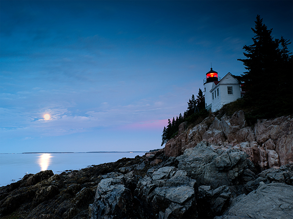
Visual balance is crucial to making a good image. Photographer Eva Polak has written an article, 7 Quick Tips on How to Use Visual Balance to Make Better Photographs, for Digital Photography School that outlines ways to use visual balance to create well-composed and visually interesting images.
Of the seven factors you must consider when composing your visually-balanced image, Eva starts with color. There are a wide variety of properties associated with color that affect visual weight, such as "saturation, brightness, darkness, and hue." Warm colors have more impact in an image than cool colors, and red has the most weight of all colors. The brighter a color, the more attention it'll attract as well.

Another important factor of visual weight is texture. The more texture a subject has, the more visual weight that it will have and the more attention it'll draw. In contrast, smoother objects are visually lighter and are more likely to recede in an image. Consider the image below, despite the bright clouds in the background, the tree in the foreground has such a strong texture that it draws a lot of attention and serves to balance the overall composition. Without the strong texture, the image would be heavily-weighted toward the upper left half. With that said, the sky does have some texture as well and is not entirely smooth. Ultimately, texture and value (the third factor that Eva discusses in her article) work together to create a balanced composition.
To see the rest of Eva Polak's seven tips for using visual balance in your photography, check out the full article here.
Visit Eva's website to see her work and to read more free resources.
(Seen via Digital Photography School)