Visual storytelling: WIRED launches redesigned Photo site, puts photography front and center
posted Monday, December 5, 2016 at 12:38 PM EST

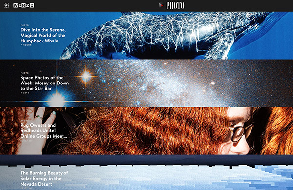
WIRED has long been an excellent source of technology and culture news, including photography news, but it is now an even better place to view incredible photography. Wired has relaunched WIRED Photo to make it much more visual and put photography at the forefront.
The site offers a variety of regularly updated articles about various photographic projects, but at the top of every article are photos. Rather than WIRED’s typical balance of media and text, WIRED Photo is very much about the images. In most cases, scrolling down past the slideshows will let you read the related text. Right now, their home page features a wide array of stories which run the gamut from humpback whales to space photos and much more, but the unifying theme is fantastic photos.

Of the new site, WIRED editor in chief Scott Dadich says, “Photography is an integral part of how we tell stories. We’re excited to further expand WIRED’s visual storytelling into an immersive experience for all screen sizes, from desktop to mobile. Photos are no longer solely set within a story’s margins or constrained within the framework of a website ecosystem. Now you have the ability to browse, as you would on Instagram or Pinterest, and lose yourself down a visual rabbit hole, in a good way.” It was no easy feat to bring WIRED Photo to life, however, as it took the WIRED engineering group months to make the site work and load quickly, including the parallax animation effect.
It looks great and has a lot of interesting content, so head over to WIRED Photo and check it out.