You can now use Adobe Spark with your own custom logos and colors
posted Tuesday, September 19, 2017 at 8:30 AM EST

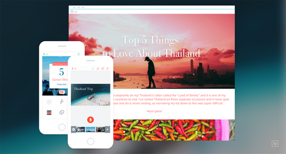
Adobe Spark is a web-based platform for blogging and storytelling, and it got an update with "premium features," which lets you create and share branded stories in all three Spark formats: Post (for graphics), Page (for web pages), and Video (for video stories). Now instead of carrying Adobe's branding wherever it went, Spark stories can carry your own and be a better representation of you and your business.
Adobe has baked in what they are calling "design intelligence," so all you need to do is add your brand ingredients to get started. Seeing it demonstrated, it does look incredibly simple.
To start using the branded stories, you really only need these three steps:
- Upload a logo. If you don’t have one, Spark will auto-generate a simple one for you.
- Choose your brand colors. Spark automatically detects the colors from your logo, but you can customize your look by cycling through the suggested combinations or inputting the hex codes.
- Pick your fonts. Typography can be complicated, but Spark makes it easy by categorizing fonts by style. Browse from classic, natural, loud, clean, and modern fonts to find something that you like. Adobe has created font pairs in each of these categories to set your content up for success.
And that's it. Spark uses that information to create a design palate for you using that information. It makes each Spark story unique to you, and should make the platform more enticing for all.

The premium features come included with both CC and CC for Photography, which means if you're already using Adobe Photoshop, you have access to these new features. For an even more in-depth breakdown of the new features, visit Adobe's blog.