Hands-On with Adobe Lightroom’s first new feature to the editing stack since Dehaze: Texture
posted Tuesday, May 14, 2019 at 9:00 AM EDT

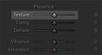
Today Adobe announced three key updates to the Lightroom platform: Tutorials, Shared Albums (not in Lightroom Classic), and the first new control added to the "editing stack" since Dehaze: the Texture slider. It's been a while since we've seen a feature update like this, four years to be exact, and of course, that means expectations are high. Though we will touch on the Tutorials and Shared Albums below, I want to start with Texture, since it is likely to be the most read-about part of today's update.
Texture
Initially, the goal with Texture from Adobe was to provide a high-quality skin-smoothing effect that the team was happy with, but by the end of the process, it had become more than that, allowing for the enhancement of textures or the diminishment of them. To understand what Texture does, we have to first talk about Spatial Frequencies. Just like you can break an image into color channels (red, greens and blues for example), an image can also be broken into different "frequencies." There are high frequency details, such as a photo of sand, and low frequency details like you would find in a photo of a blue sky, and then everything in between.

The Texture adjustment is designed to target that middle frequency zone like with hair, tree bark and skin, for example, to both smooth or enhance details. Adobe says the tech will allow skin pore details to be omitted, and blurry or out of focus areas are also unaffected. In the ideal use case, this tool will allow you to smooth skin without reducing pore detail or fine wrinkles, while avoiding the plastic, blurred skin look you can get with most other types of skin smoothing.
It's the easiest to understand when you see it in action, so we urge you to watch the video below where we use the new tool on a few different images and in a variety of ways so you can see what you can expect out of the tool in your own work.
In experimentation, I actually found that I liked the detail enhancement more than its diminishing capabilities. While you probably can get good results from the skin smoothing, I wasn't able to get results that I was particularly satisfied with. It's highly likely I need to spend more time with the tool and be selective about how I implement it.
Below is a close-up of one of the images featured in the video above, in one of four configurations: original, +100 on the Texture slider, -100 on the Texture slider, and what I would actually use which was +32 on the Texture slider:


For me, I personally found the detail enhancement to be much more gratifying to use. Using both global and selective adjustments, I was able to see leaps in the quality of the sharpness in hair, feathers, plants and rocks. When applied to certain images, I can see this tool giving folks a lot to be excited about.
Tutorials and In-App Learning
In addition to Texture, Adobe also announced the addition of In-App learning features being added to the platform, directly as a result of customer requests. Adobe has 60 tutorials at launch, with more to come. These interactive learning tools have been built into both the desktop and mobile products, but coming to iOS and Android first.
"Discover" vs "Tutorials"
Discover shows how an image was made, down to the specifics of each slider, for a given image, allowing you to inspect a finished image and see what specific adjustments do for a final image. In contrast, Tutorials is a place to "learn by doing" and is more akin to the traditional hands-on tutorial.
On the Desktop, they’re releasing Contextual Help, which is an interactive, dynamic help tool that shows you how to use a tool inside the app itself. The goal is to reduce the amount of time you have to spend going to Google or Youtube to find an answer to your question.
Shared Albums (added to all formats except Lightroom Classic)
This is a feature that is more of an extension/expansion of the toolset that already exists. You can now share an album via email (in addition to the previous link option) and is protected (via email address) and that person can also contribute to an album. The idea is that Lightroom is shifting from less about you and your photos, and more about a "community" of photographers or friends.
Performance Update
In one final thing that probably won't be seen in most summaries or patch notes, Adobe did make a performance update to Lightroom CC: On Lightroom for Mac OS, the scrolling of the grid view has become 2.5x faster. Though Windows machines were already quite fast, this should get the Mac scrolling speed to the same speed as Windows. This is specific to Lightroom and not Lightroom Classic.
For more about all the new updates to Lightroom, head over to Adobe's blog.