
|
|
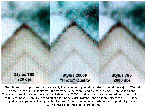
Test Results The color gamut on the 2000P is also somewhat restricted relative to that of the 780, 1280, and 785 models, although again the difference will not likely be evident on photographs of natural objects. Most colors you'll find in nature will fall within the range that the 2000P can reproduce. I did find that the color on the 2000P required more attention than that demanded by Epson's dye-based printers. Epson's default driver settings produced photos that looked slightly flat to my eye, with a somewhat restricted tonal range, and a noticeable bias toward the green end of the spectrum, both in the rendering of pure colors, and in the overall cast of the prints. Make no mistake, the printer is capable of truly excellent prints, but achieving the full measure of its capabilities requires some twiddling of the input images, the driver settings, or both. However, I did find that using a custom ICC color profile (obtained through Chromix) noticeably improved the dynamic range of the prints, and corrected the greenish tinge. The custom ICC profile wasn't a panacea though, as the resulting prints were somewhat overcompensated toward a warm tone, particularly in subtle highlights. I think some hand-optimization of the custom profile could have produced perfect results, but I lacked the tools or time to perform that optimization. (I also think the necessary optimization could be accomplished in Photoshop directly, with the curves tool, since the adjustments needed didn't appear to be very color-dependent.) See my discussion of "Color Rendering and Calibration" below for more discussion of this topic. While not by any means the primary focus of my testing, the 2000P produces very readable text in any of its higher quality printing modes. You definitely wouldn't want to use it for a text printer if you had any volume of pages to produce though, because it's so much slower than general-purpose office inkjets when printing acceptable quality text pages. It would work fine for an occasional invoice or cover letter, but that's about the extent of it. With some printers, I've occasionally seen odd "jaggies" in photos when the image resolution didn't exactly match the resolution of the output device. For the record, I've seen very little of this in Epson's printers, at least when running at their 1,440-pixel and higher resolution settings. The greatly enlarged samples below compare the 2000P's output with that from Epson's own Stylus Photo 785, a high-end dye-sublimation printer (the Olympus P-400), and a competing high-end photo printer (the Canon S800). As noted above, the 2000P isn't quite as smooth in the quarter tones, but does quite well in the highlights and fine detail.
I was frankly a little puzzled by how prominent the 2000P's dot pattern was in the photomicrographs above, when it was so nearly invisible when viewing the original prints with my naked eye. I think the trick lies in the fact that, for whatever reason, the 2000P actually renders highlights with exceptional delicacy, in many cases even better than dye-based photo inkjet printers. Stepping up to an even greater magnification in the shot below, we can see that the 2000P's dot pattern is really only visible in the darker portions of the image. I'm speculating here, but it seems that our eyes are much more able to discern dot patterns in highlight areas than in midtones or shadows. Epson apparently took some advantage of this in their design of the 2000P's ink system and dot-dithering algorithms.
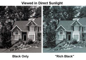
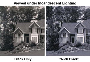
In color-theory parlance, metamers are different colors that appear the same when viewed under certain lighting conditions. A full discussion of the mechanism for this is way beyond the scope of this review. However, the basic reason for this is that our eyes integrate the spectral response of objects across fairly broad swaths of the color spectrum, boiling the results down into the response of three (or for some rare individuals four) different types of light receptors on our retinas. An enormous amount of detailed spectral information is thus thrown away, reduced to just three values representing the response of the three different types of light-receiving cells in our eyes. The result is that we don't perceive sharp spikes or notches in the color spectrum produced by different objects, but only an "average" sort of color response. Most of the time, the sort of "color averaging" our eyes do is of little consequence. In fact, it's worked pretty well for the last million years or so. In the modern world though, we end up dealing with a wide range of different light sources, with very different spectral content. If we happen to see two objects with very different spectral curves illuminated by different light sources that themselves have somewhat "spiky" spectra, the results can be quite startling. Colors that appear identical under one light source can look very different under another. As it turns out, this is what happens with printed output from the 2000P. Its prints can appear to have a very different color cast when viewed in daylight than when seen under incandescent or fluorescent illumination. I'd heard a good bit about this before I received a 2000P to test, and frankly had largely written it off to the phenomena of "Internet issue amplification," where a tiny issue gets magnified out of proportion by the rapid and largely unfiltered exchange of information. Once I began working with the 2000P though, I found it was a very real phenomena, and a significant issue for critical images. The short of it is that prints from the 2000P tend a bit toward the greenish side when viewed under indirect daylight, but show a considerably warmer appearance when seen in incandescent lighting. (By this I mean, they'll appear warmer relative to a neutral grey object viewed under similar conditions, more than just the natural increase in warmth of ambient lighting.) The photos below illustrate the phenomena pretty well. Thanks to the inclusion of some reference white/grey/black chips in my photos of the prints, and careful adjustment of the resulting images with Photoshop's "Levels" control, the photos show a very good representation of how the respective prints appeared to my eyes under the different lighting conditions.
So there you have it. A reasonable rendering of at least one example of the metameric shift in the 2000P's color balance when moving from daylight to tungsten lighting. The next question is how big an issue this might be for potential users of the printer. How big an issue the 2000P's metamerism will be is something that each user will have to evaluate for themselves. For what it's worth, the photos above really show the absolute worst case of it, showing images that should be a neutral grey, where any shift in hue is immediately apparent. The effect is much less evident on full-color photos. It does seem that the photographer will need to at least somewhat take into account the lighting that the final prints will be viewed under. In many situations, this will be a non-issue, if the prints will primarily be viewed under constant lighting conditions, as in an interior room, office, or hallway where the only light will be artificial. Likewise, some prints may be displayed next to a window, and mainly viewed by daylight. ("Public" artwork would fall into this category.) This also wouldn't pose a problem. Metamerism will be more of an issue for photos displayed in a typical home environment, where the primary lighting would be indirect daylight during the day, and incandescent by night. Under such conditions, the color balance of the prints will shift somewhat between daylight and nighttime viewing. Somewhat mitigating this issue though, is the fact that prints displayed in homes are likely to be less critically regarded than those shown in more commercial settings. (Art collectors being an obvious exception.) For those needing the 2000P's archival print life, but having a low tolerance for metamerism, there may be another solution available, although I'm not yet able to vouch for it personally: Epson's professional-series 5500 printer uses the same micropigmented ink technology as the 2000P, but apparently exhibits much lower levels of metamerism in its prints. (Allegedly due to a smaller minimum dot size, although I confess I can't imagine why that would be a factor.) At a current price of $3,500, it's a considerably more expensive option, but could well be justified for a pro wishing to bring all his/her printing work in-house.
The first thing I noticed about the 2000P was that it seems to expect input data to arrive in a different color space than the sRGB environment common in consumer-level digital cameras and printers. A check with Epson confirmed that the printer should by default be set up to use an Adobe RGB color space for its input images. (Actually, Epson said that all their printers make this assumption, but my prior experience had been that their consumer-level printers really seemed to work best when I used sRGB as the default.) Even with Adobe RGB selected as the input color space in the driver though, I felt that the output from the 2000P lacked a little depth, with the shadows and quarter-tones a little weak and washed-out looking. Highlights also looked a bit weak, and it seemed easy to lose subtle detail in them. Interested to see what difference a color-managed workflow might make, I shipped a test print from the 2000P off to Chromix to have Steve Upton make a custom ICC profile for the printer. The results were very interesting, and I felt that the exercise was worthwhile. I will say though, that the final profile could have used a little manual tweaking. (Beyond the scope of my own abilities, I really need to learn more about color management!) Images processed through the Chromix-generated ICC profile looked much richer and more vibrant. The most obvious impact was that the shadows had much more tonal depth, with denser blacks and richer shadows. The images were also somewhat warmer overall, correcting the slight greenish tinge I noticed in many of the 2000P's default prints. I really don't have the time or expertise to delve further into the details of color management with the 2000P, but felt that the results of my limited experimentation were significant enough to mention here. For any serious user, I'd highly recommend investing the additional $99 to have Chromix generate a custom ICC profile for you to use with the 2000P, applying it in Photoshop or any other ICC-aware application. (Be sure to make careful note of *all* the print-driver parameters you use when printing out the test image for Chromix though, as the driver settings can drastically alter the results. Likewise, be sure to have the profile generated for the same paper as you'll use for most of your printing. There's a fair bit of commonality between the results you'll see on different papers, but the profile is really only optimized for a single paper type.) The more general conclusion I drew from playing with the 2000P's color management and output parameters was that this is a printer with more to it than initially meets the eye. Plan on investing a full package of paper and set of ink cartridges in experimenting with driver settings and image adjustments in Photoshop. If my experience is any indication, the 2000P is capable of generating significantly better-looking images than the (admittedly pretty decent) ones produced by its default settings, and will richly reward time spent learning its idiosyncrasies.
The 2000P's metamerism has been widely reported on the Internet, and it will clearly be an issue for some prints under certain viewing conditions. Metamerism will be most visible in black and white printing, and I found it to be significant enough there that I'd not recommend the printer for black and white work. While it will be a decision for each photographer to make for him/herself, I personally found the 2000P's metamerism tractable in full-color images. Print speed is another area where the 2000P has received a good bit of online criticism, but this is one parameter where I think the criticism is a bit less deserved relative to other products on the market. In its highest quality print mode, it is indeed very slow, but I found virtually no discernible difference in the output between the highest quality ("Photo/Super") and next-highest quality ("Photo/non-Super") print modes. It thus makes most sense to view its print speed based on its non-Super printing mode. In that mode, printing times are more equivalent to those of other printers I've tested. Epson's spooling print driver works very well also, with surprisingly little impact on computer performance when the printing is relegated to background status. The 2000P wouldn't be the printer of choice if you had dozens of 11 x 14-inch prints to crank out on a tight schedule, but if you can be content to let it crank away in the background, it's not all that much slower than many dye-based photo printers. Overall, I found the 2000P to be a genuine breakthrough product, thanks mainly to a print life rating exceeding that of virtually any conventional photographic printing process. It requires some attention and tweaking to obtain the best results, but if you're willing to invest that effort, you'll be well rewarded. Bottom line, it offers professional photographers and serious amateurs the ability to make archival color prints from their digital files without the need to resort to expensive lab services. Visiting commercial photo galleries on vacation over the last year, I gained some sense of the magnitude of the impact the 2000P has had on commercial photography. Fully half of the color prints I saw displayed for sale were produced on a 2000P. This is admittedly an awfully small sample of the market, but I was still surprised by how quickly the 2000P has been accepted by photographers selling their prints to the general public. I guess my final comment on the 2000P's quality and capabilities is the most personal one of all. Out of all the photo printers I've tested over the last year or so, it's the one I finally decided to own myself and use for printing my own photos.
Reader Comments!
|
||||||||||||||||


|
||||